Tile
A simple, visual container for content regions.
Page sections
Types
Default

Usage
Tile can be used to create explicit visual borders around content regions. This can be useful when trying to communicate content structures, and because these structures may vary in size, Tile could also be used to communicate page structure.
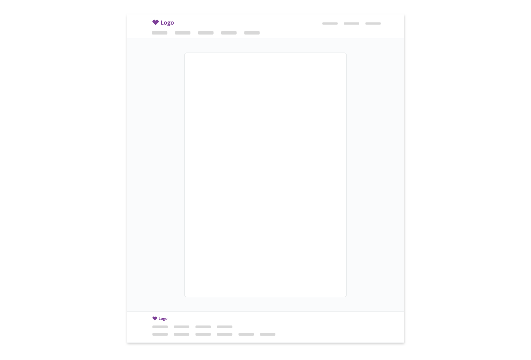
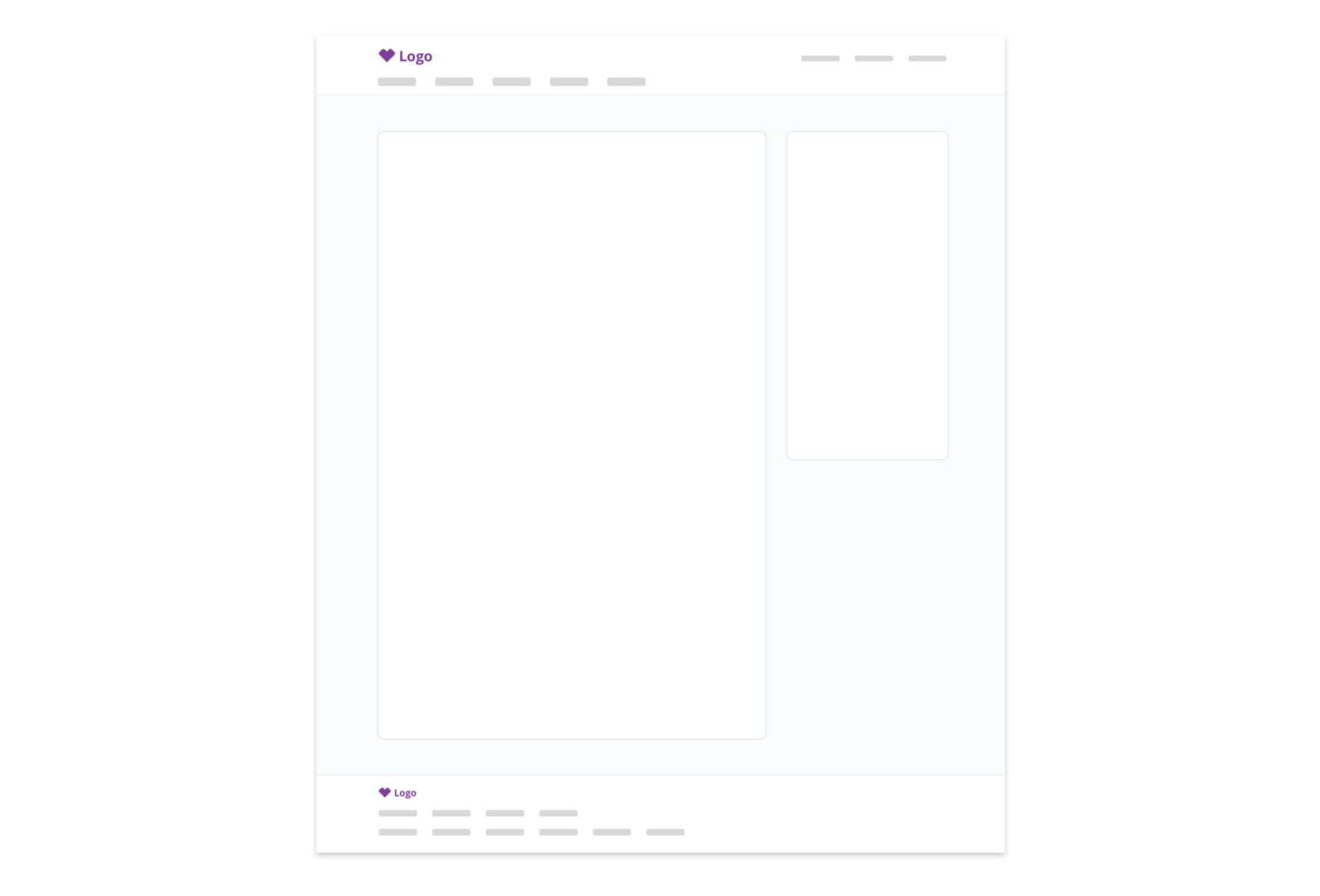
Take care not to over-use Tile. Collaborate closely with UX, Content Strategy, and Product Design to identify content regions, and use headers, horizontal rules, and white space to organize content within those regions.
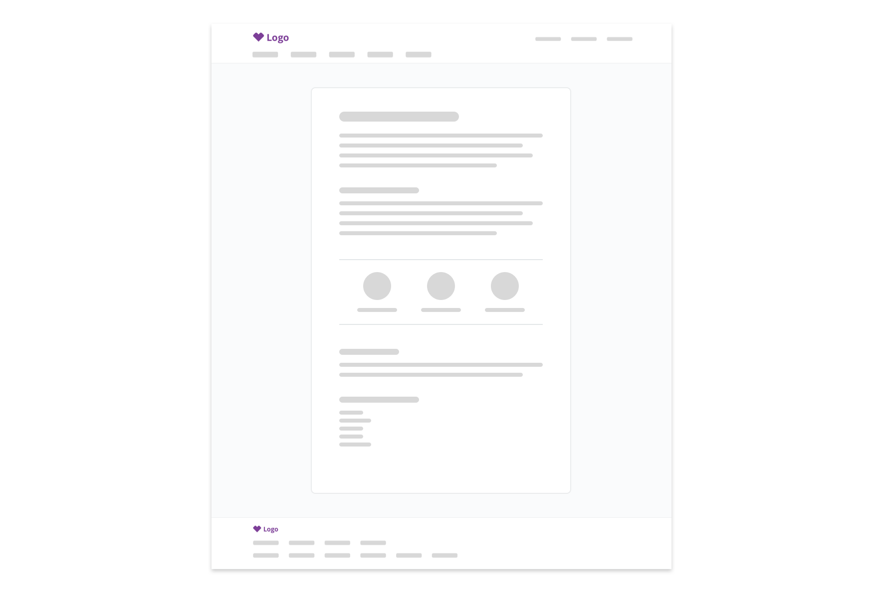
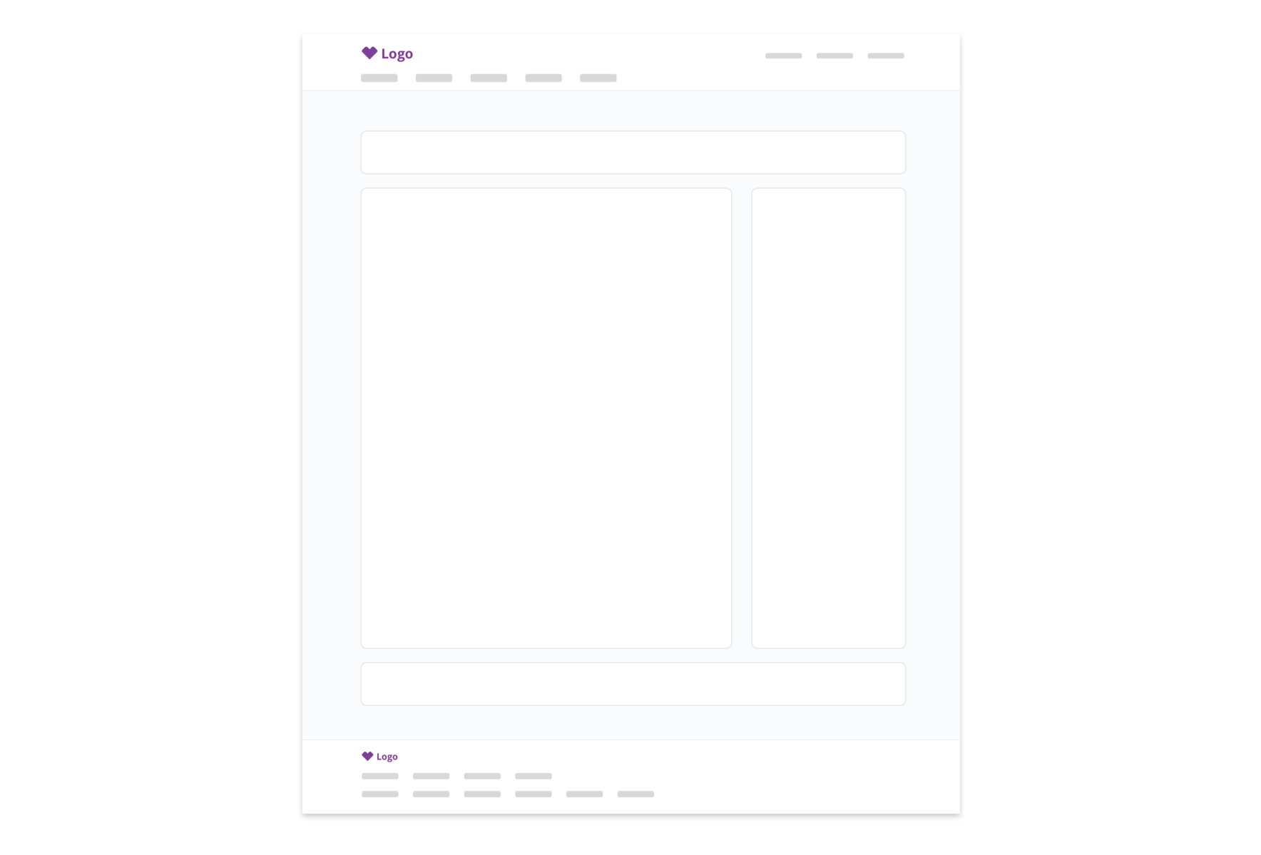
Nesting Tiles within Tiles may overcomplicate the interface, undermine content hierarchy, and cause an inefficient use of space.
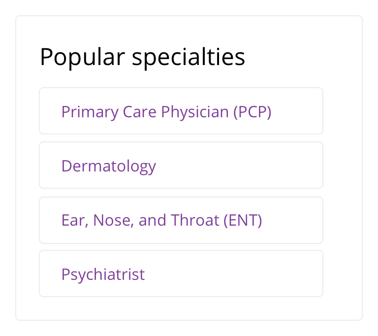
 Use caution when nesting Tiles within Tiles
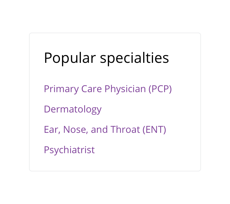
 Use white space and horizontal rules within Tile where possible
Even at the page level, nesting Tiles can be problematic.
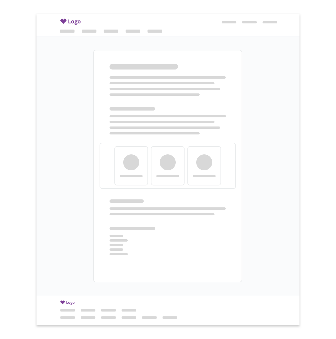
 Use caution when nesting Tiles within Tiles
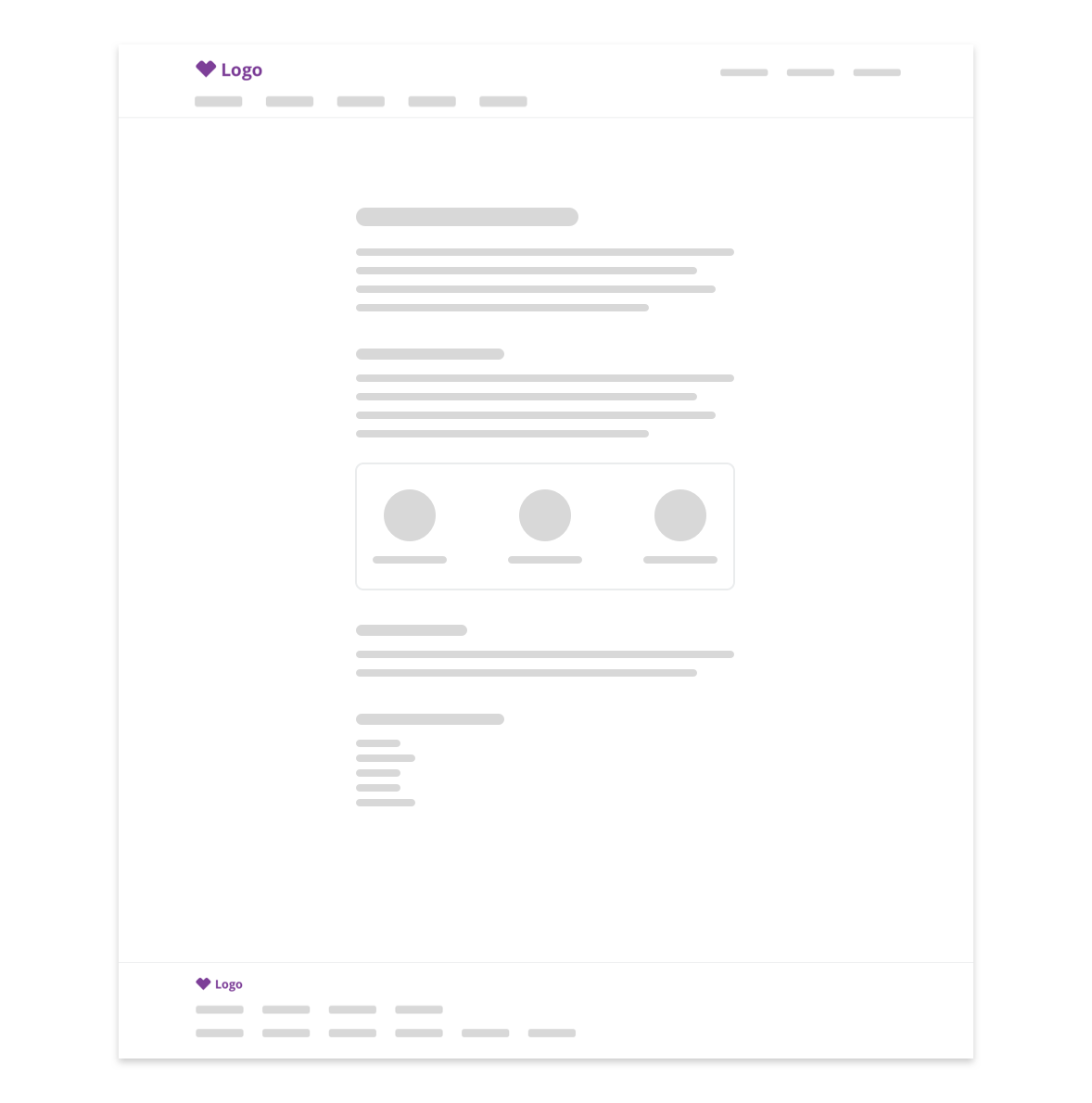
 Use white space and horizontal rules within Tile where possible
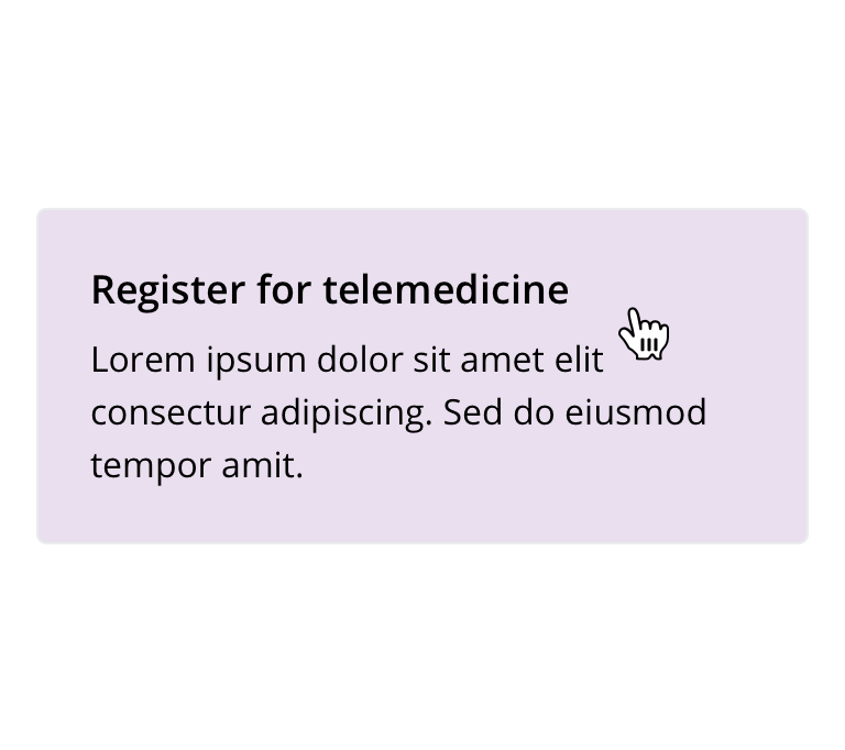
 Don't use if Tile if clickable or tappable. Use Card.
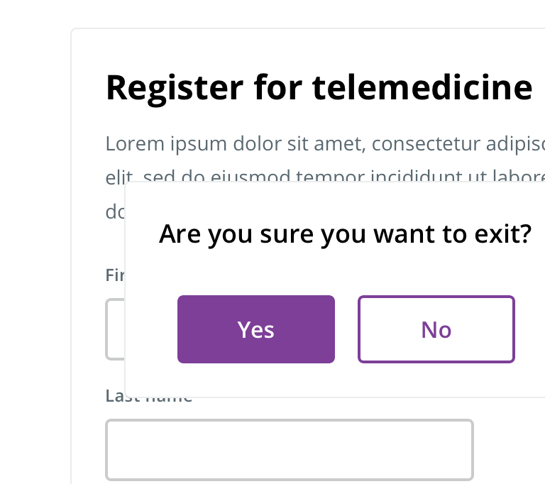
 Don't use if layering on top of the underlying page
Behavior
- Tile will rely on its parent container for layout and width styles
Visual style
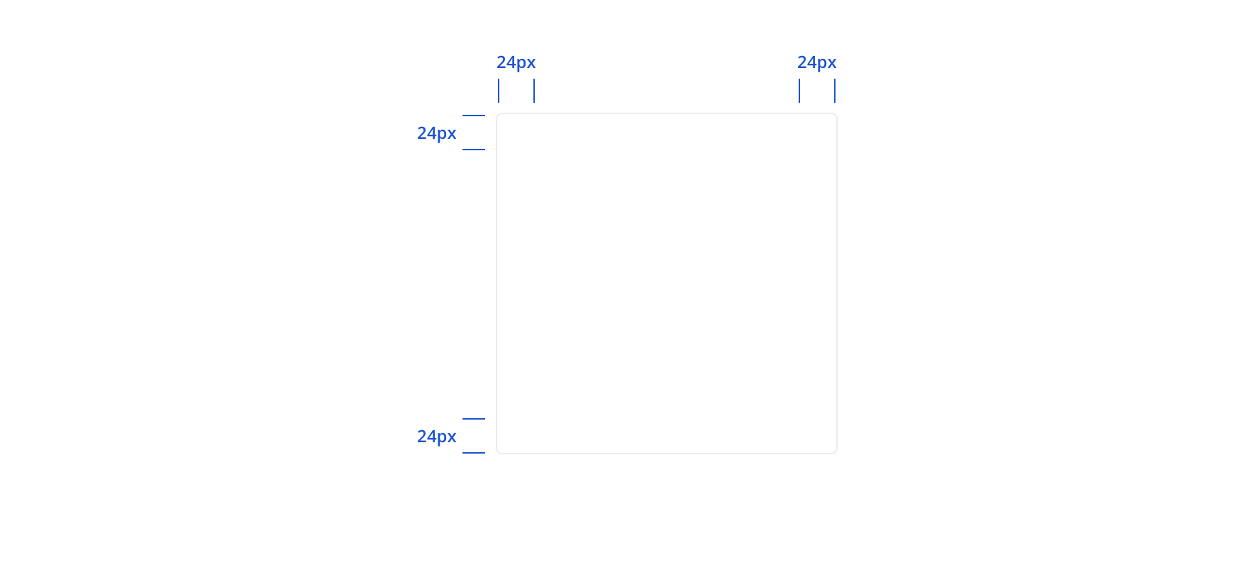
Desktop
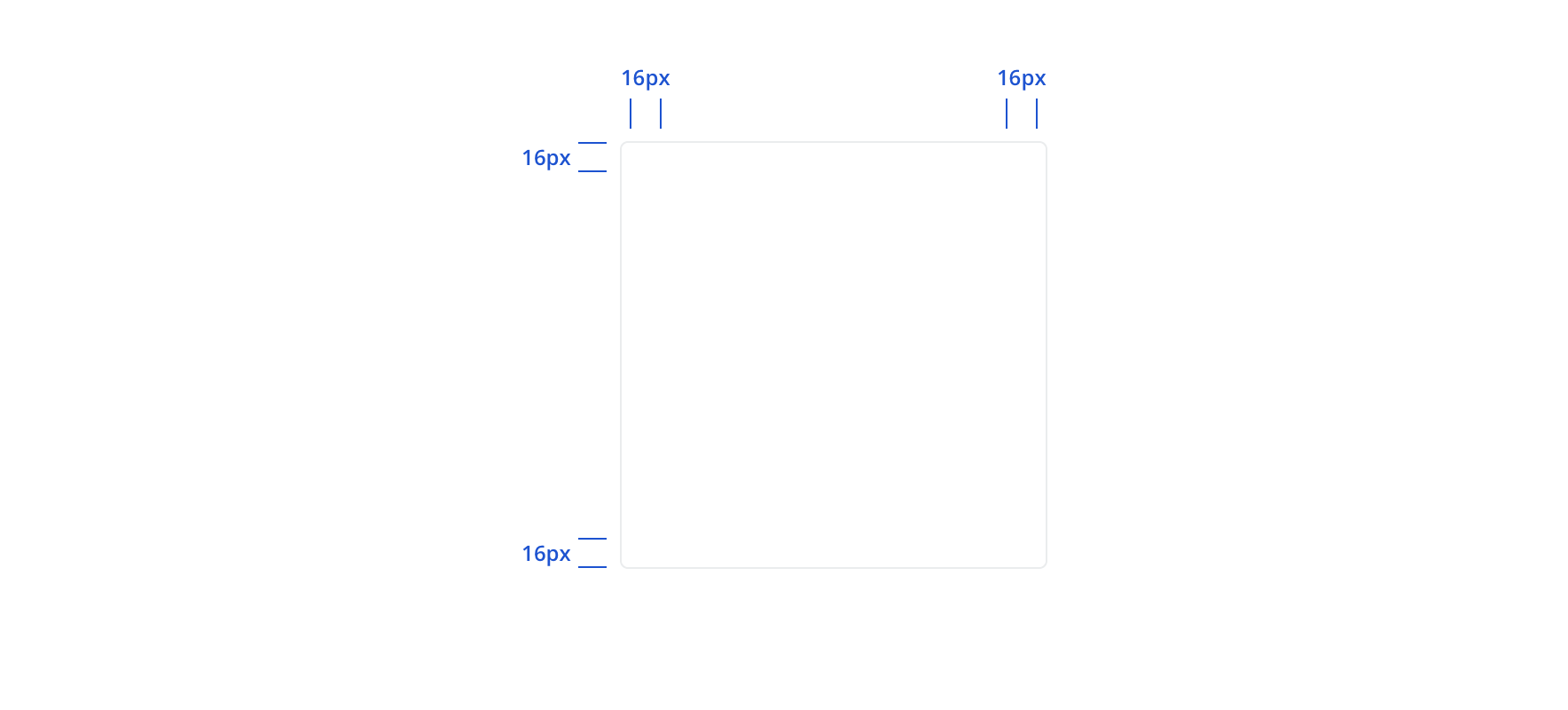
Mobile
Content strategy
As a purely visual container, Tile has no content guidelines itself. But exercises like content framing can play a key role in defining requirements for Tile and spark collaboration between content and design. Some common considerations include:
- Overall scope of content: Is there enough variation to require separate visual containers? How can Tiles be organized to highlight content hierarchy? Can Tiles break up a large amount of content into more readable parts?
- Options within Tile: What additional components do you need to pair with the content to provide a the best experience? Labels or horizontal rules to bring structure and organization? Expand/collapse options to manage long content? Buttons to highlight key actions? Tile can contain it all.
- Precedents & best practices: Are there content models to match if you’re adding a new Tile to an existing page or flow? Have you consulted with design and a11y on usability (e.g. Tiles typically have headlines)? Do you need to provide guidance on reading order?
Accessibility
Characteristics
- Allows for user settings to resize, space, and reflow content as needed
- Typically includes a heading with additional related elements
Keyboard/focus expectations
- Tile should not receive focus
- Maintain expected keyboard navigation for content
Screen reader expectations
- Visual hierarchy must match DOM element order
- Work with A11y Design to determine if a role is recommended to further define elements
