Dropdown Picker
A menu that allows users to pick an option that changes some or all of the page. It's always paired with a button to trigger the menu.
Page sections
Type
Default
Usage
Overview
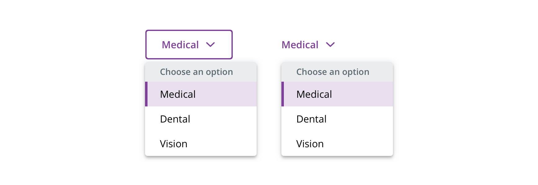
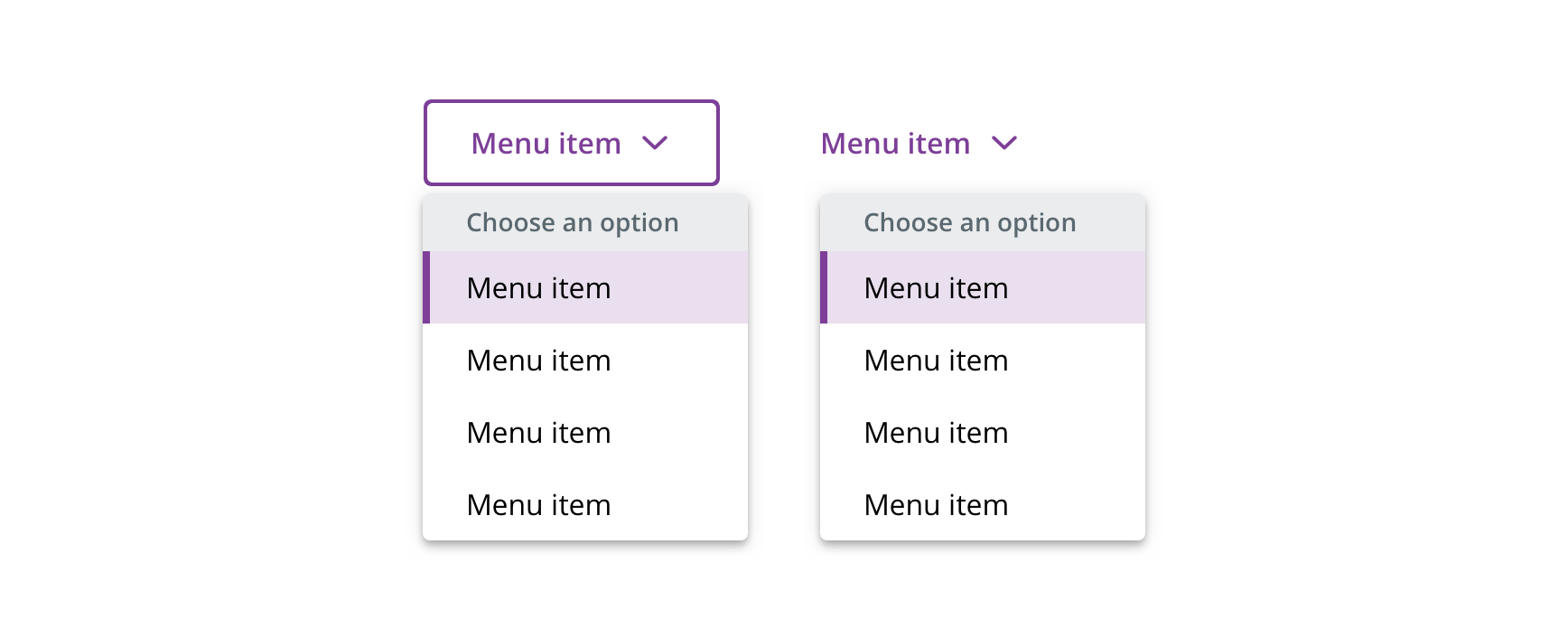
 Use for displaying a menu that changes the page
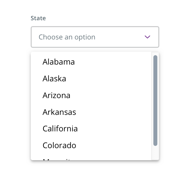
 Don't use for providing a list of options, especially within a form context. Use Select instead.
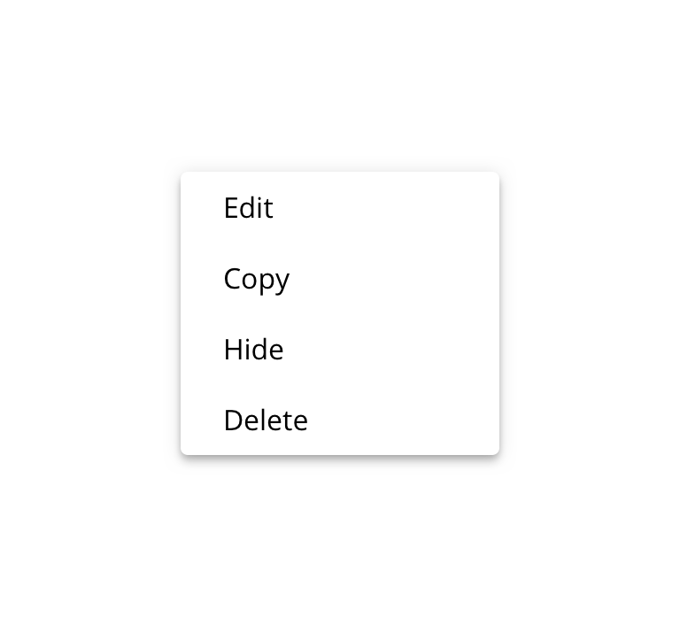
 Don't use for a menu of links or actions. Use Dropdown Menu instead.
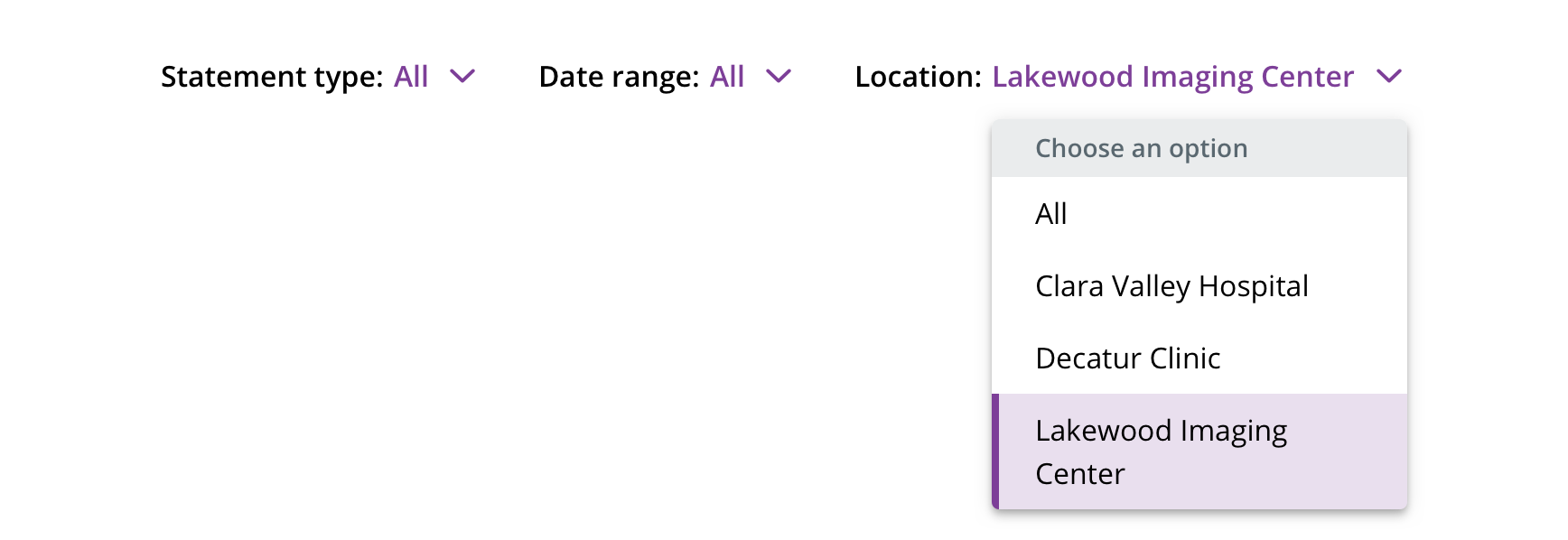
 Not intended to be used as filters
Menu trigger
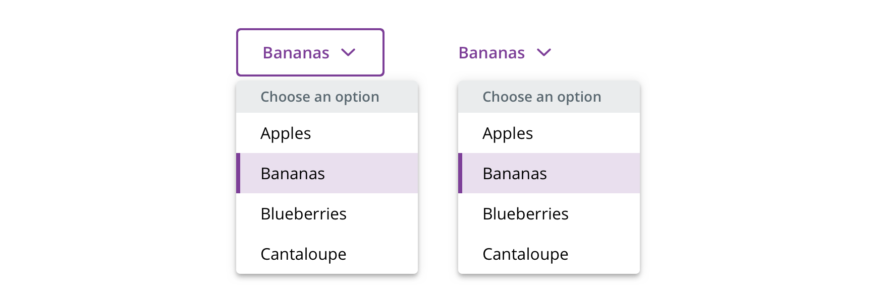
 Use the default or tertiary Button or a HTML button element to trigger the menu
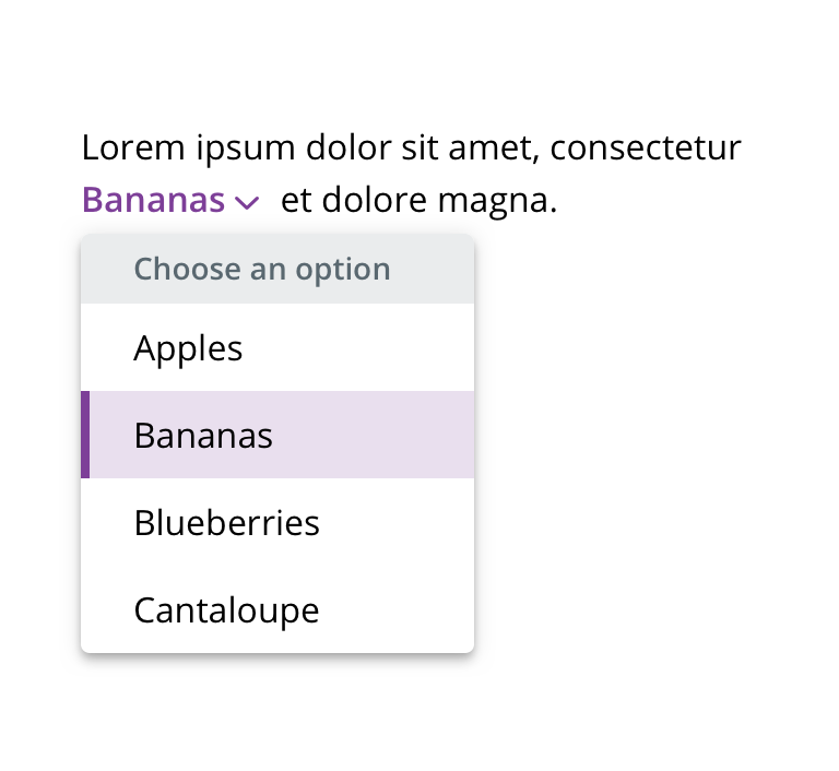
 Don't use other HTML elements as a trigger
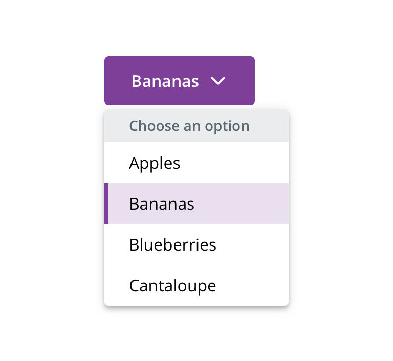
 Don't use with primary Button
Menu items

 Use for grouping related items
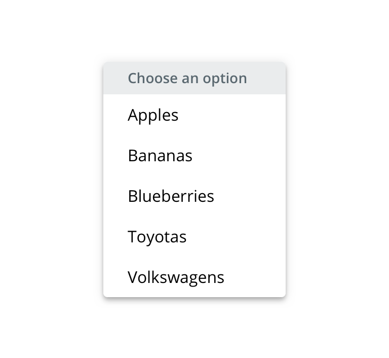
 Don't use for grouping unrelated items
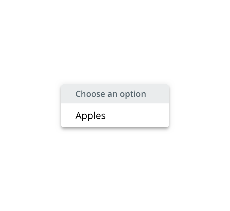
 Avoid using for single menu items
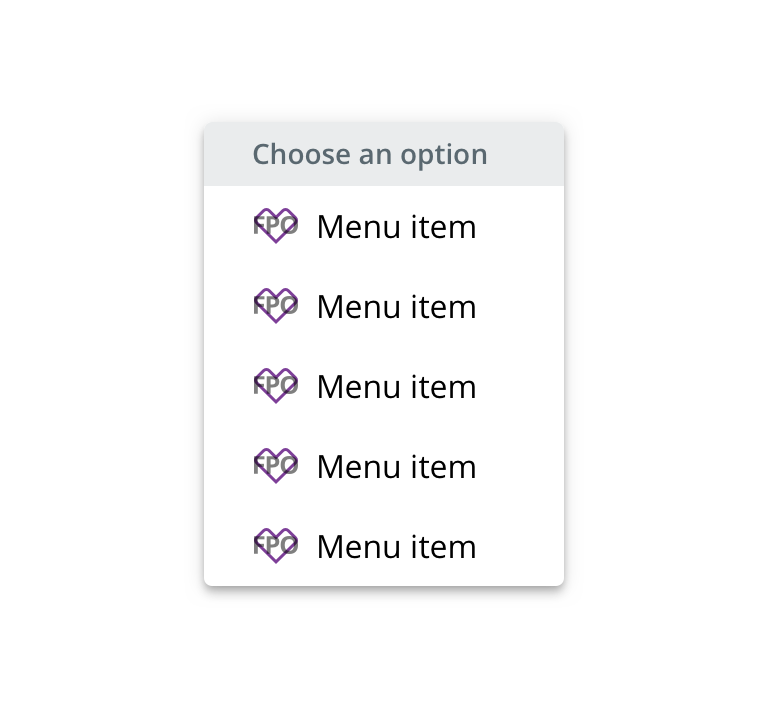
 Use icons consistently
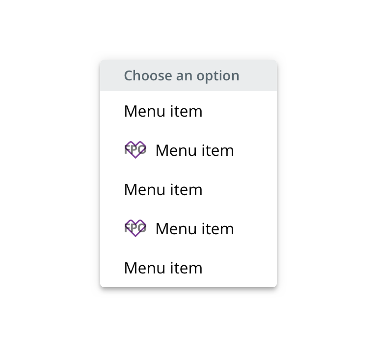
 Don't use icons inconsistently
Behavior
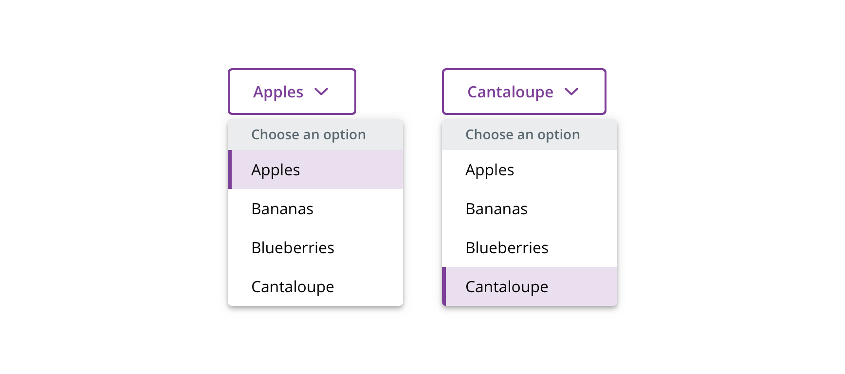
Trigger label
The trigger label will always reflect the selected menu item and will update when a new item is selected.
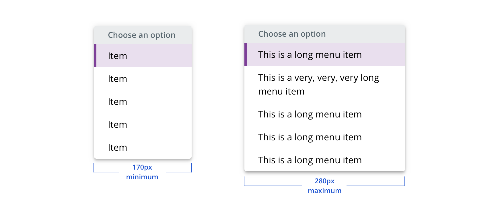
Width
Menu’s width grows based on the items within, but still adheres to minimum and maximum settings.
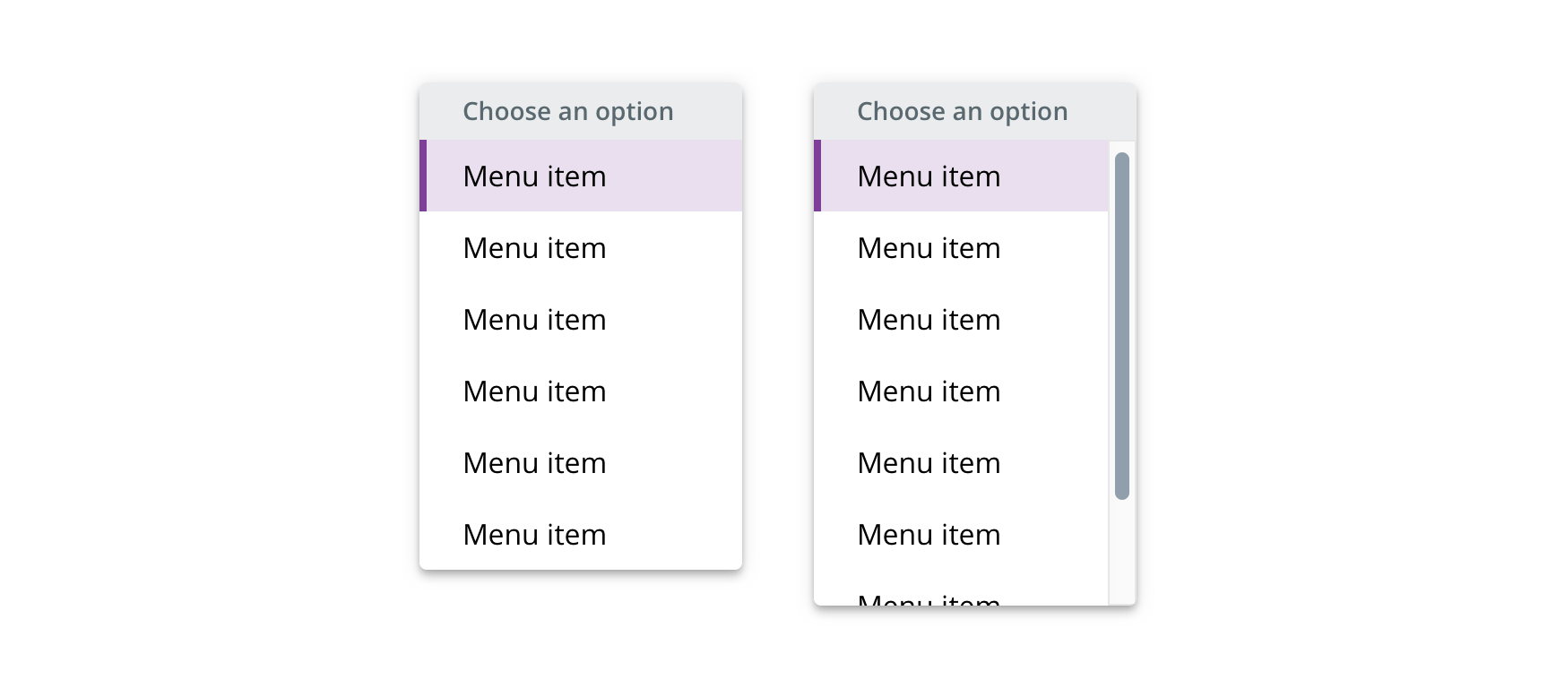
Scrolling
The menu will scroll after six items.
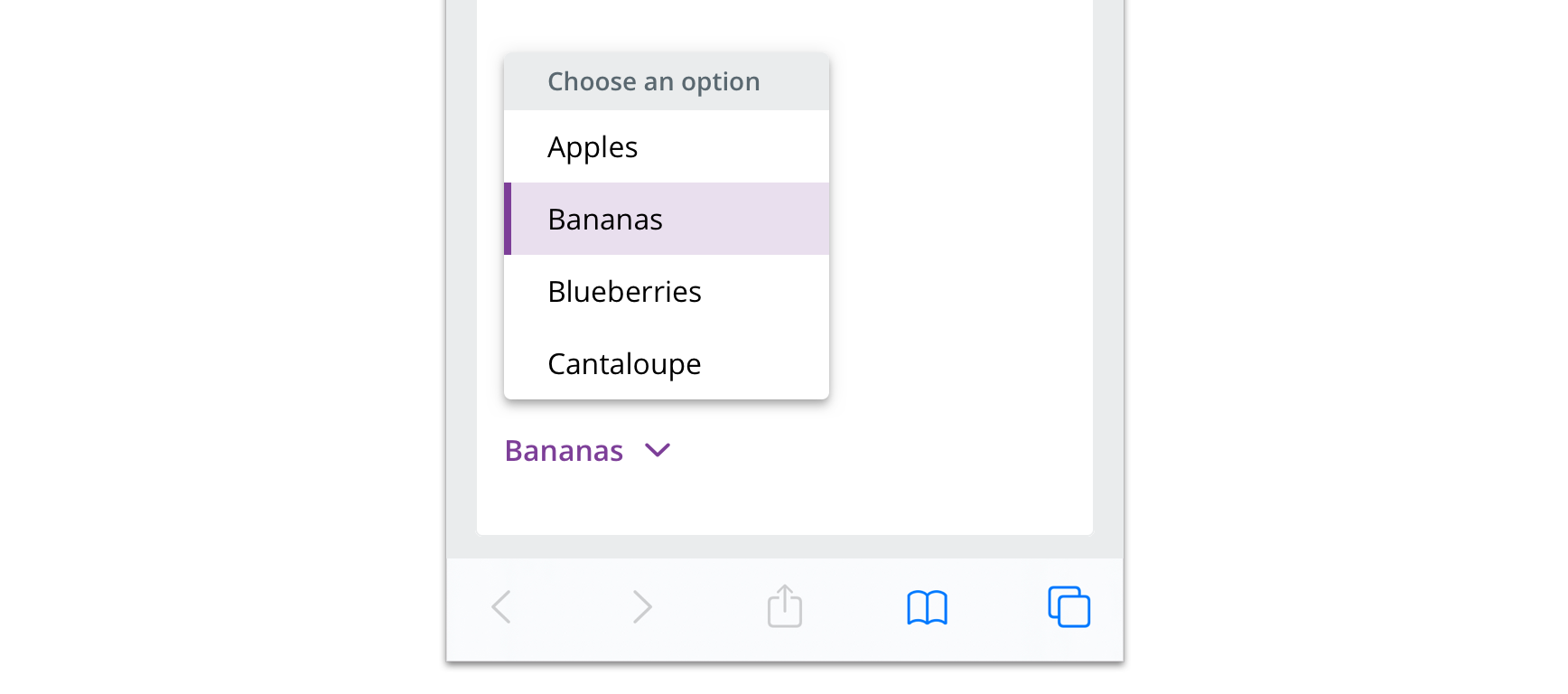
Avoiding viewport collisions
The menu will display above its trigger to avoid colliding with the viewport.
Visual style
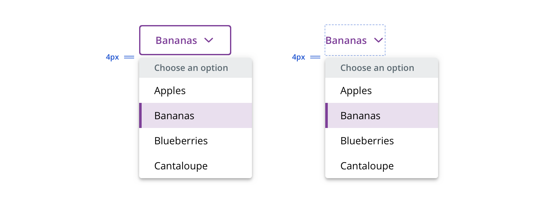
 Maintain 4px between Button and Dropdown Picker
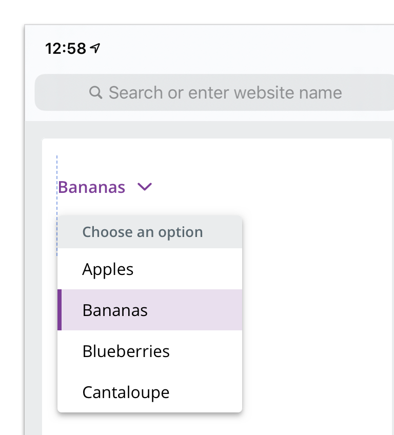
 Left-align with trigger when possible
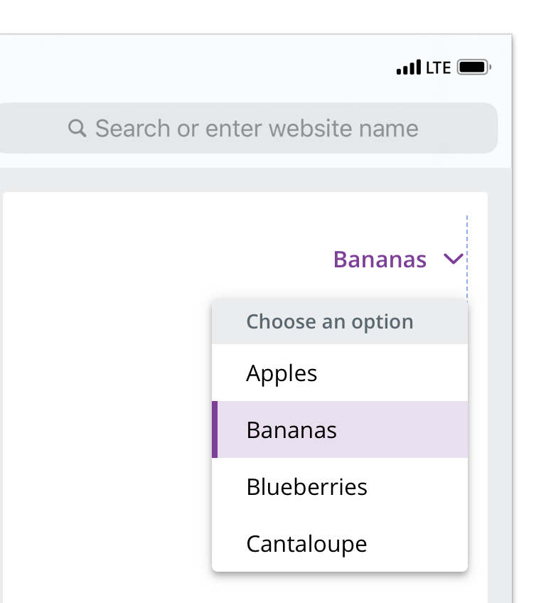
 Right-align with trigger to avoid viewport collision
Content strategy
The overall content goal of Dropdown Picker is to describe the user’s current view and surface options for other views. The copy, then, is “stateful.”
Casing
Dropdown Picker options should be styled according to their related content.

 This Dropdown Picker reflects the Title Casing of the headline displayed below
Implied action
Because Dropdown Picker describes and changes the view, actions are repetitive and confusing if included in the options.
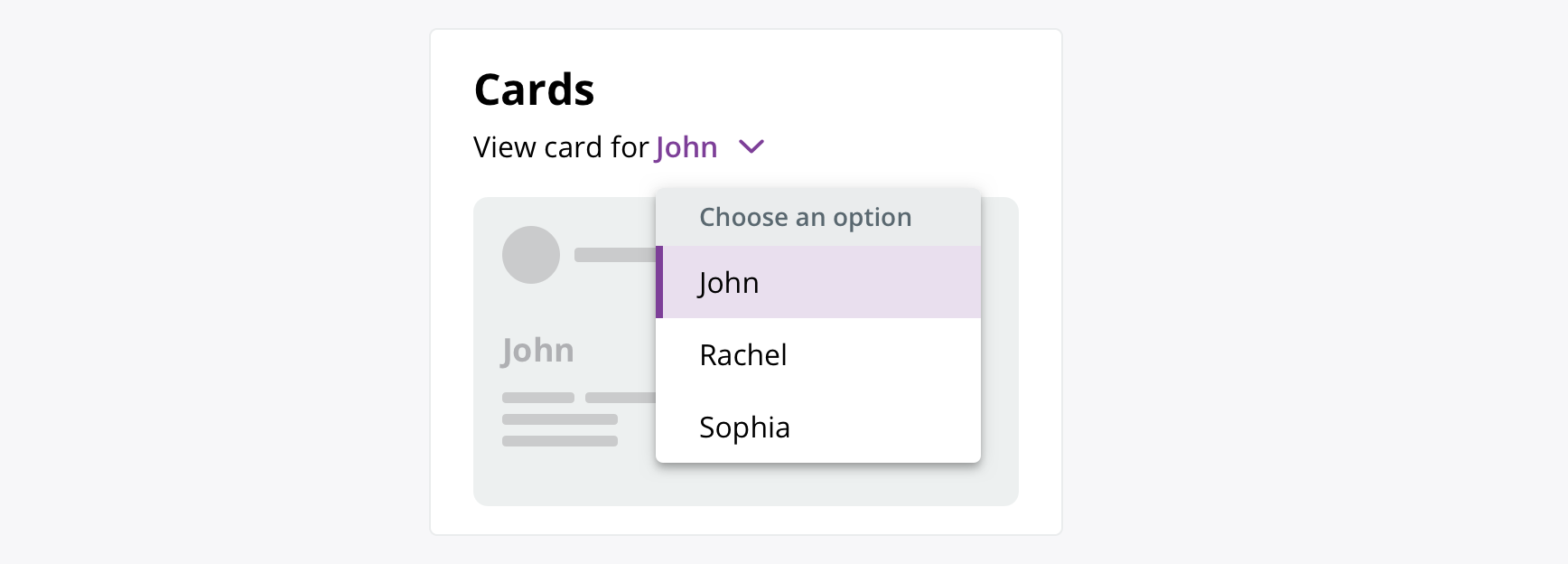
 Use supporting copy outside the options to highlight behavior, as needed
Character count
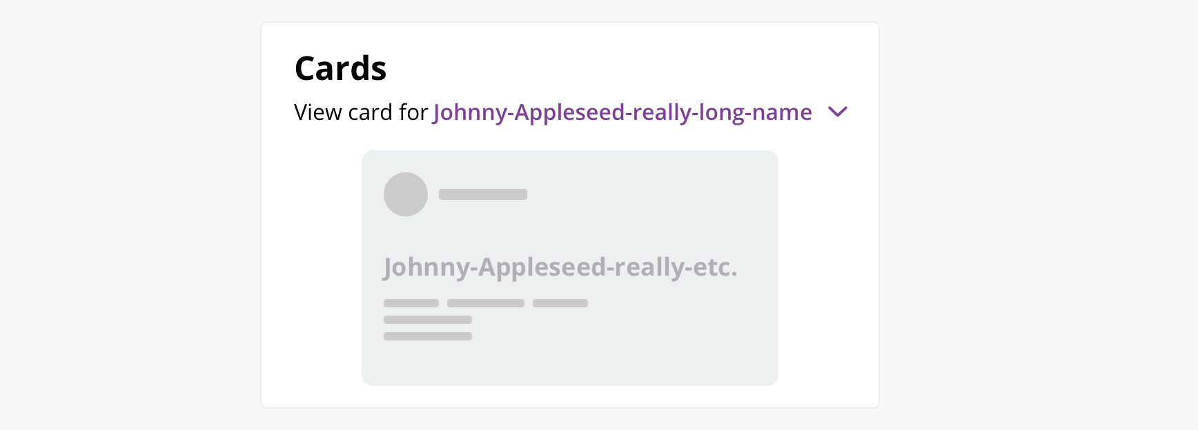
The Dropdown Picker is flexible for longer copy, but be sure to consider each option in the “selected” state — when it displays as the triggering button — to see how it plays with the rest of the page.
If you have options of unknown and/or potentially problematic length, work with design and a11y partners to determine the best solution for the context.
Accessibility
Characteristics
- Manually triggered stateful menu
- Page changes to selected state based on user selection
Keyboard/focus expectations
- Popup button receives focus
- Enter and Spacebar open/close the dropdown
- Arrow keys to move down the option list
- Enter or Spacebar to select an item
- Escape or tab to end of the list to exit the menu
- On escape, focus returns to button
Screen reader expectations*
- Focus on button trigger: “Choose an option, {Current Option}, collapsed, popup button”
- Picker opened: “Arrow key through indexed list of options * Item (1 of 5), Item (2 of 5), etc.”
- Selected option, dropdown closed: “Choose an option, {Current Option}, collapsed, popup button”
- Reopened: Focus returns to previously selected option within the list
*Note: This is a general experience expectation, but there are variations in how assistive technology responds on certain browser and screen readers.
