
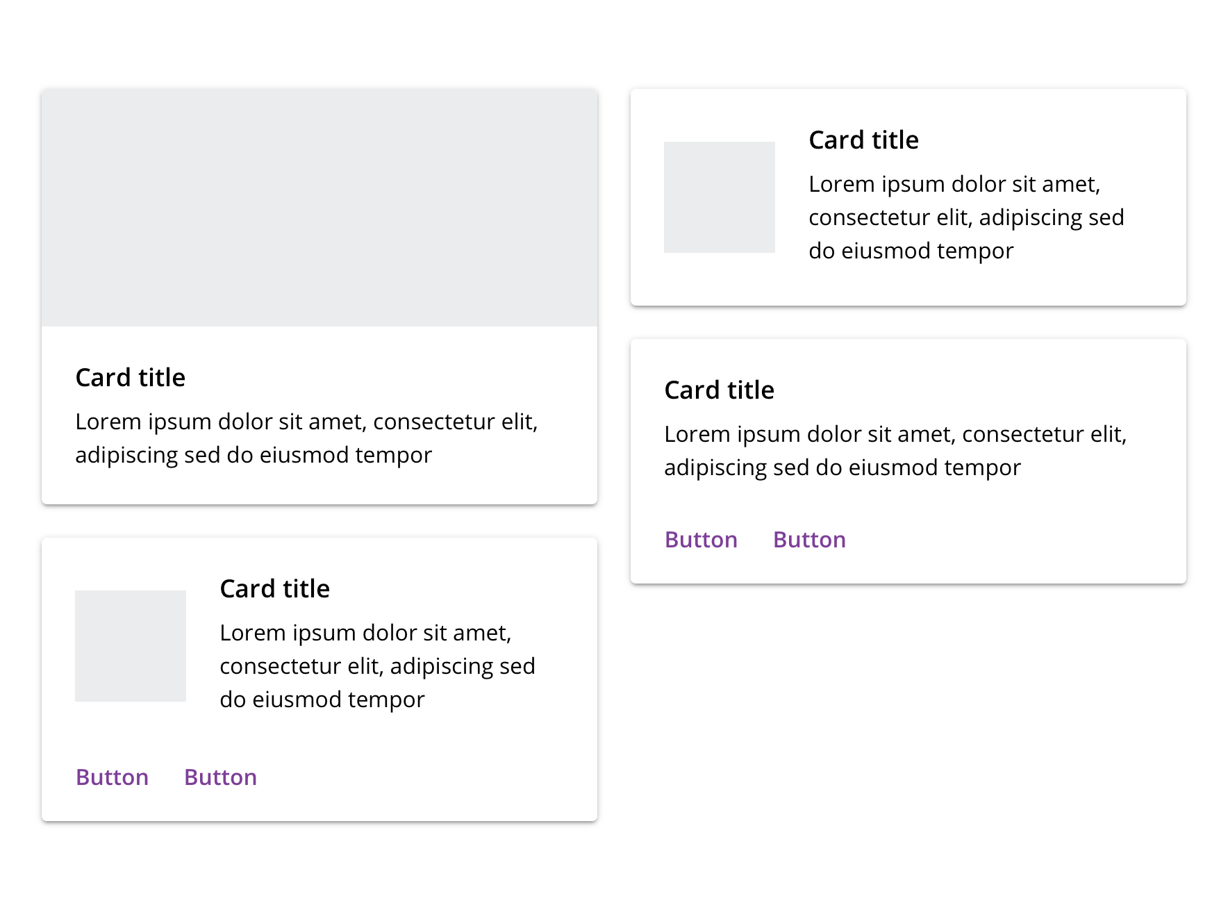
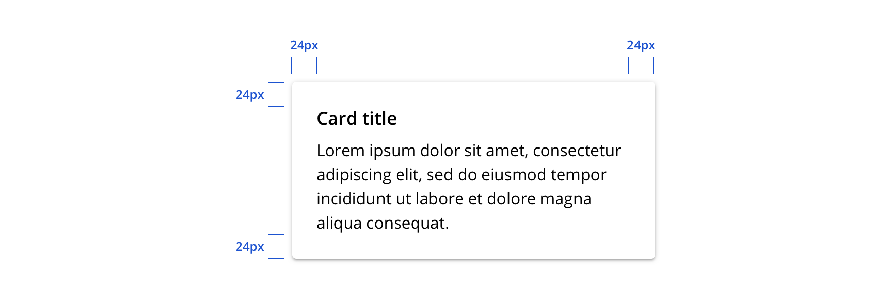
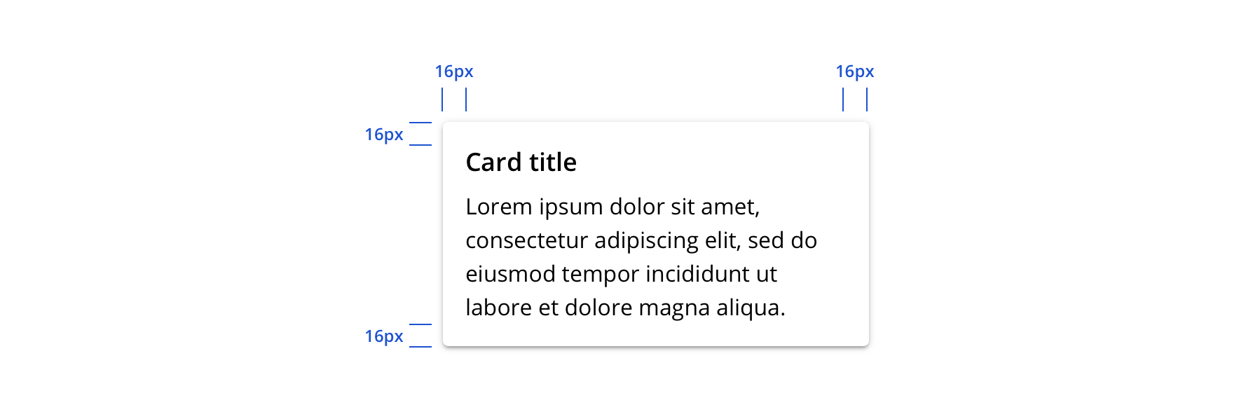
Card
Cards contain summary content and actions about a single subject. They can be used by themselves or within a list. Cards are interactive and aren’t meant to be used solely for style purposes.
Page sections
Type
Default

Though there is a single Card component, it is configurable to allow hero imagery, thumbnails, and additional actions.
Usage
Overview
 May work well when...
- User is browsing content items
- Presenting a concise summary of a single concept and linking to its details
- The entire container needs to be clickable/tappable
- Providing a very limited set of actions
 May NOT work well when...
- User is searching or comparing among content items (a structured, single-column list may be more efficient)
- Presenting detailed information or multiple concepts
- Providing a variety of inline actions or links
- Presenting wide content items
- Needing a generic visual container
Primary action region
Card’s primary action region is usually the card itself and should be one touch or tap to greater detail.
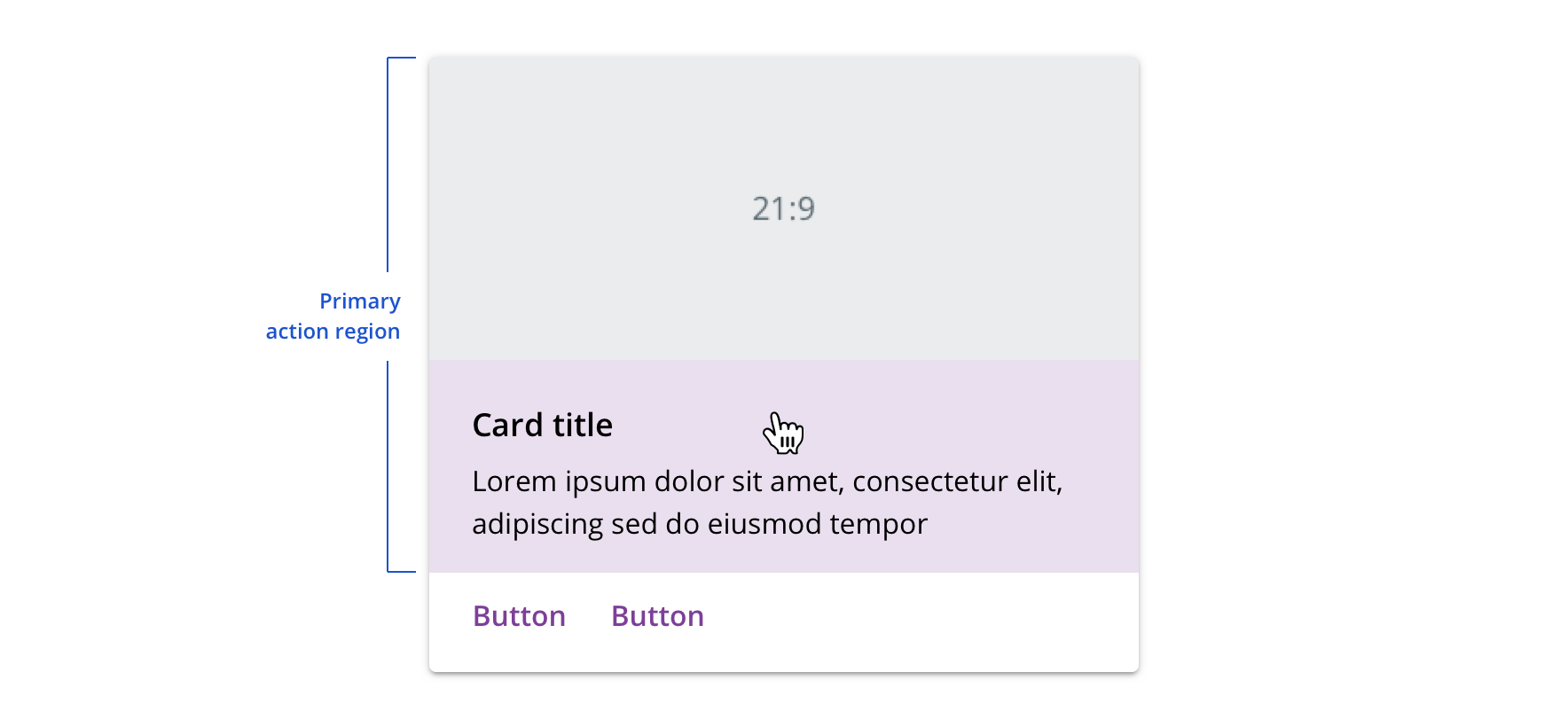
 Keep the primary action area clear of additional interactive elements
 Don't nest additional interactive elements within the primary action region
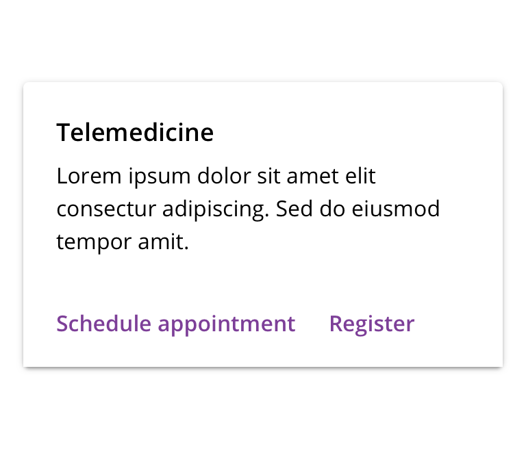
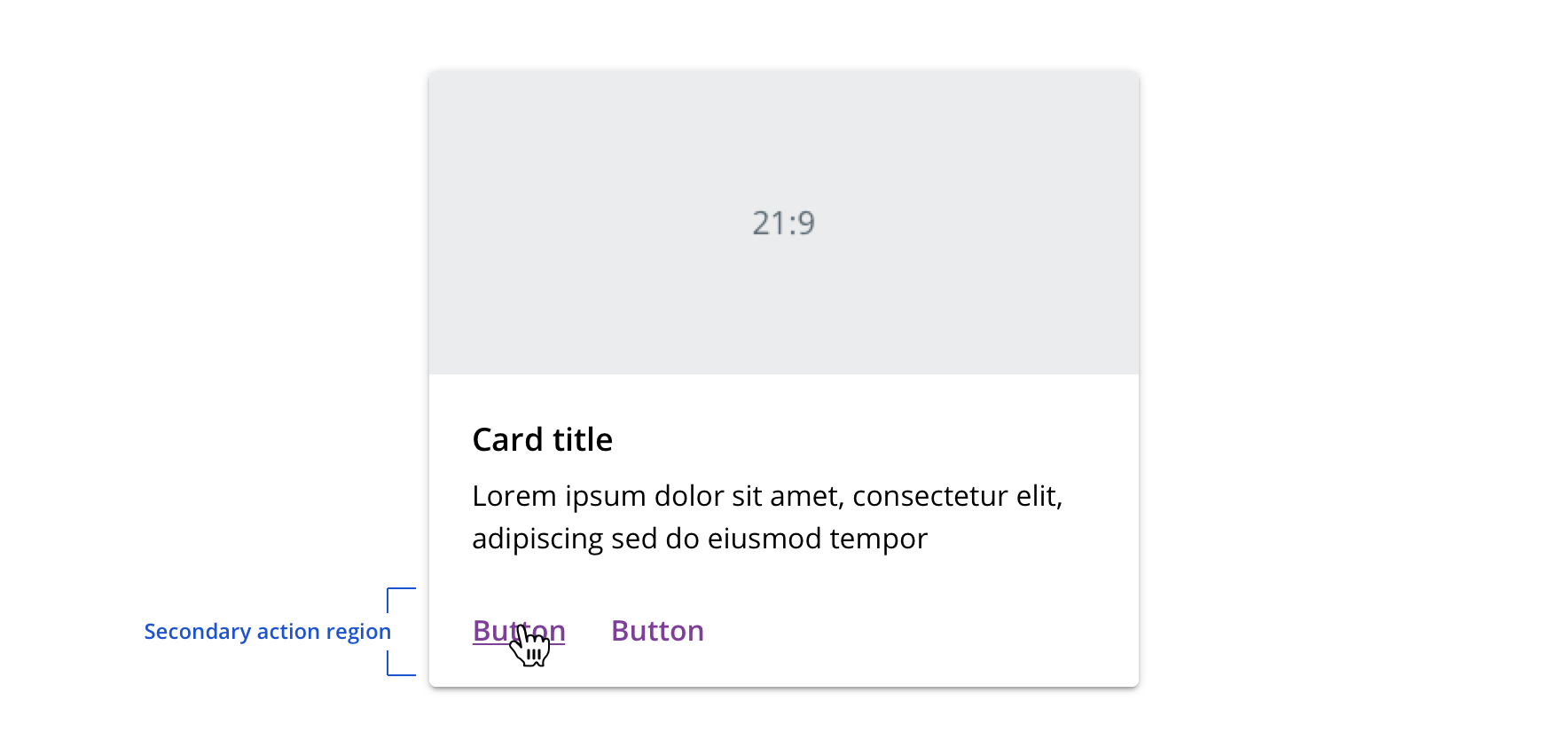
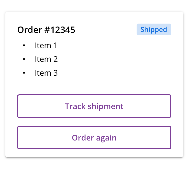
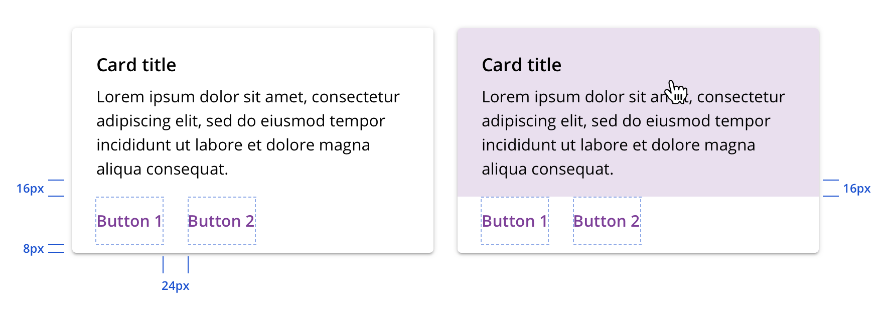
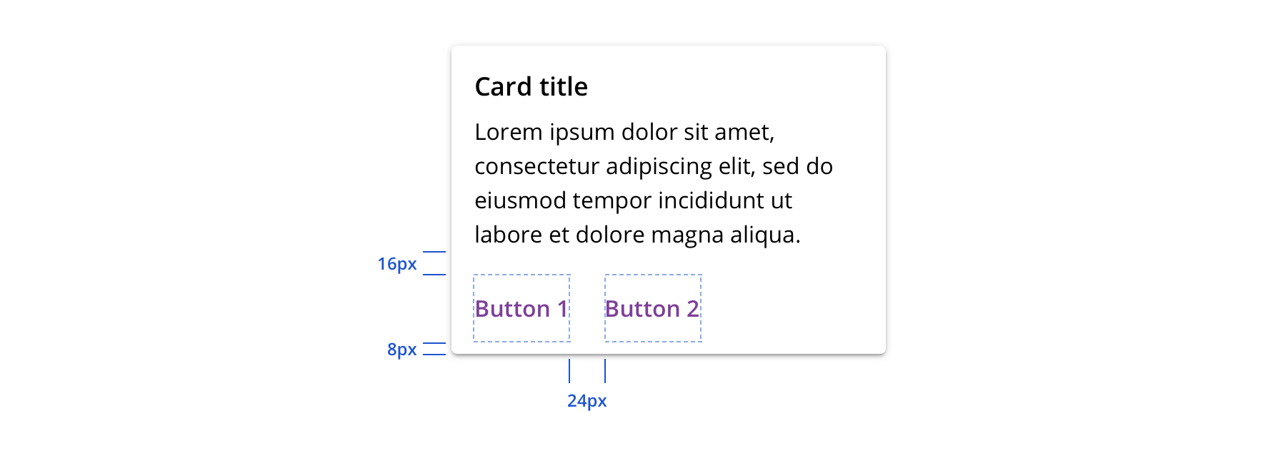
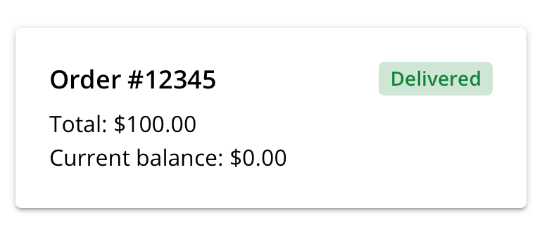
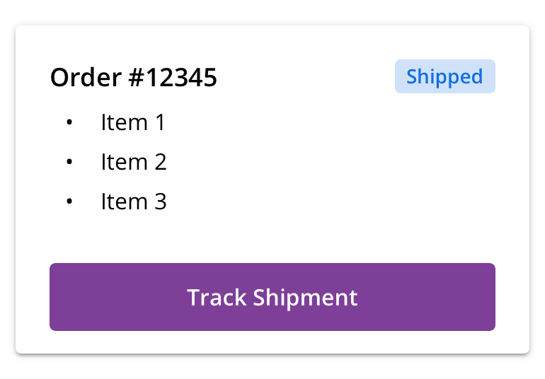
Secondary action region
Card’s secondary action region is for actions supplemental to each card’s subject. Each additional action added to a Card can detract from the main content so add them with great discretion.
In keeping with the name “secondary action region,” we generally recommend using Tertiary Buttons. However, there may be instances in which Primary or Default buttons are necessary. Refer to Button guidelines.
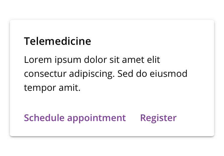 Use Tertiary Buttons for supplemental actions
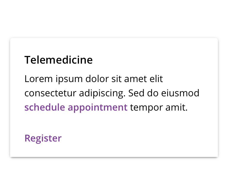
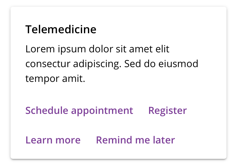 Don't include too many actions
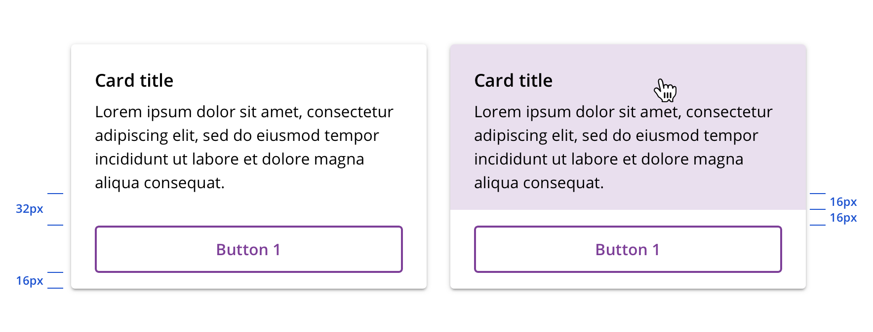
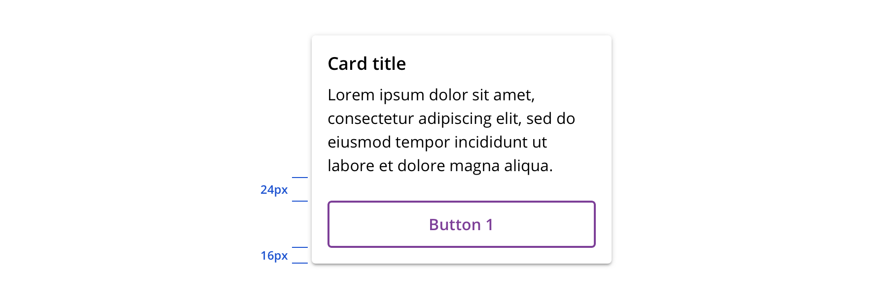
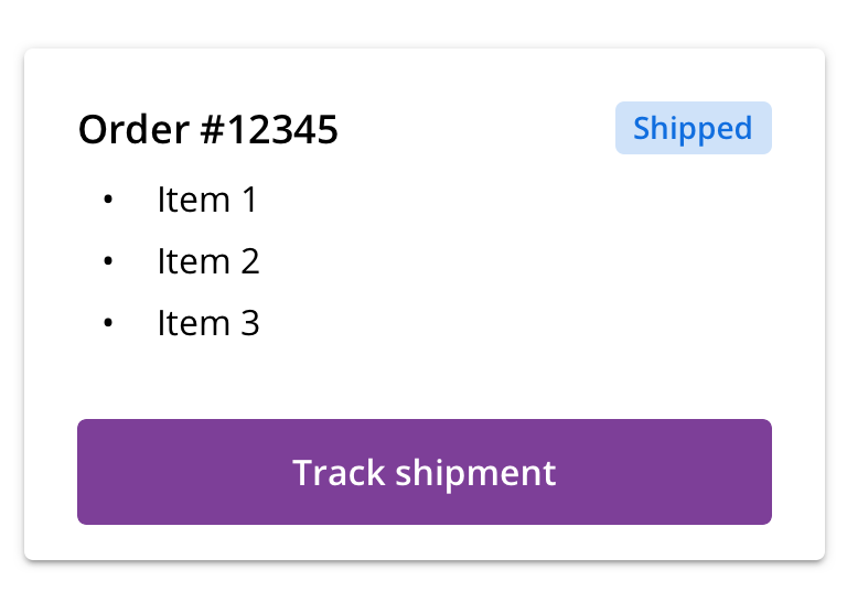 If using a Default or Primary Button to surface a top action, use a single button to maintain content clarity and focus
 Avoid multiple Default or Primary buttons
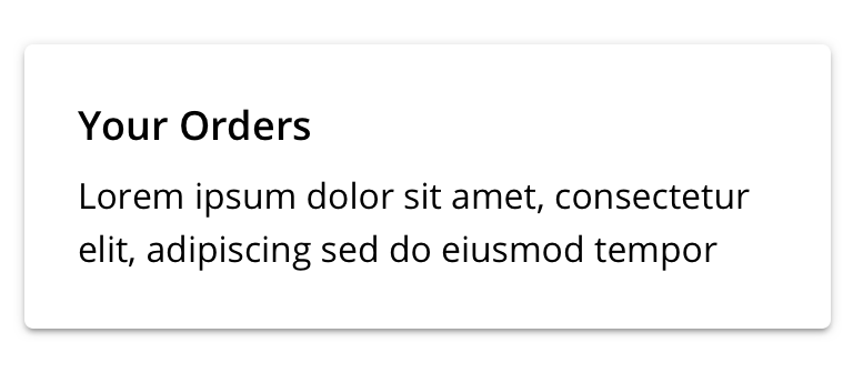
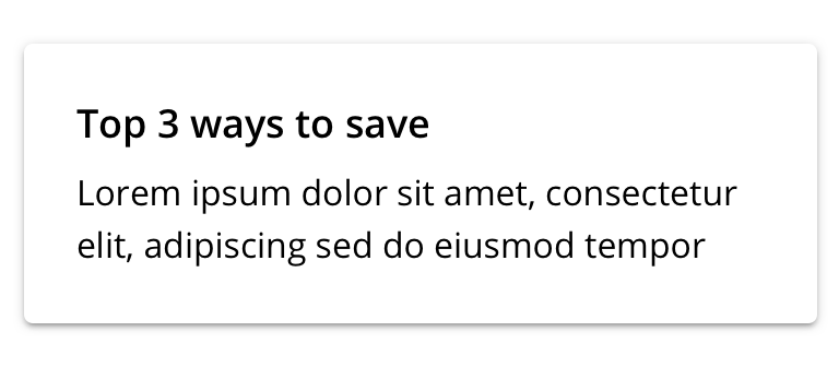
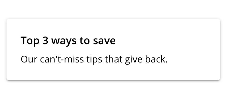
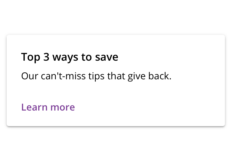
Title
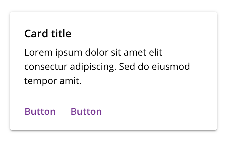 Card title is required to enhance usability and accessibility
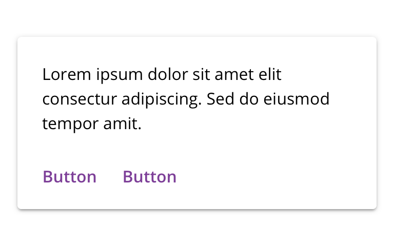 Don't omit the Card title
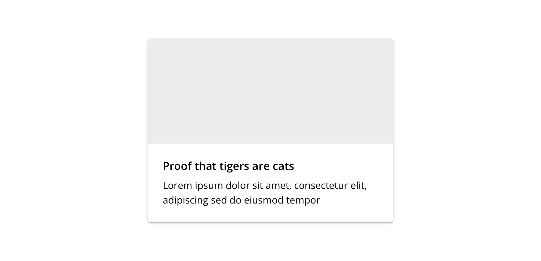
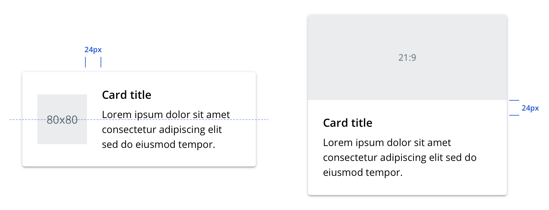
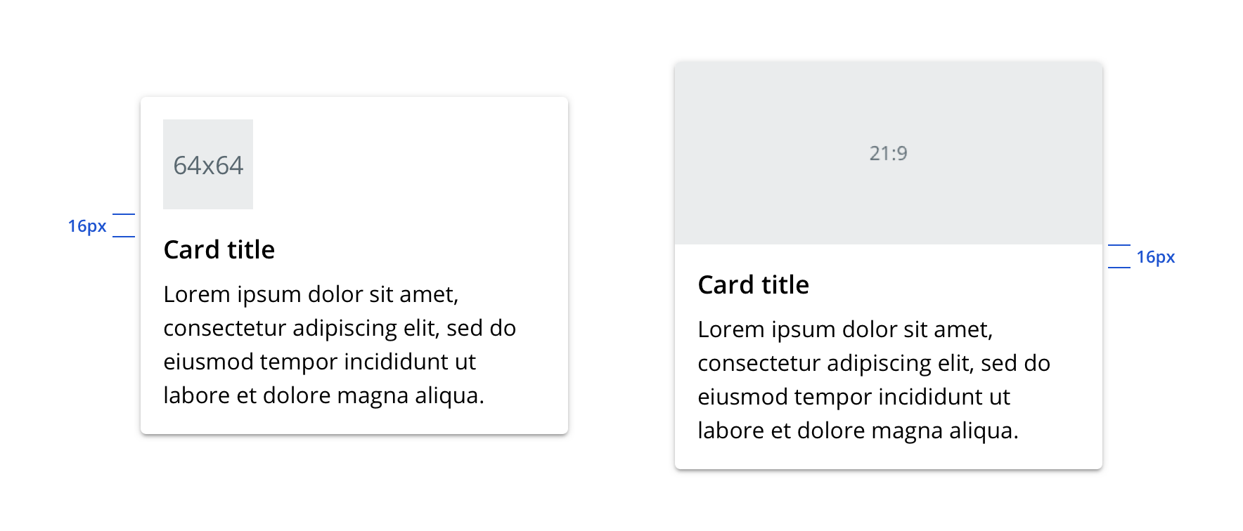
Media
Cards can contain rich media like hero images and thumbnails.
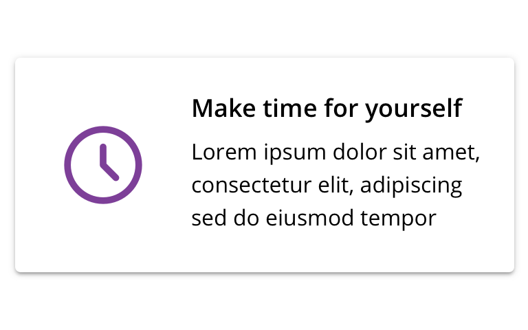
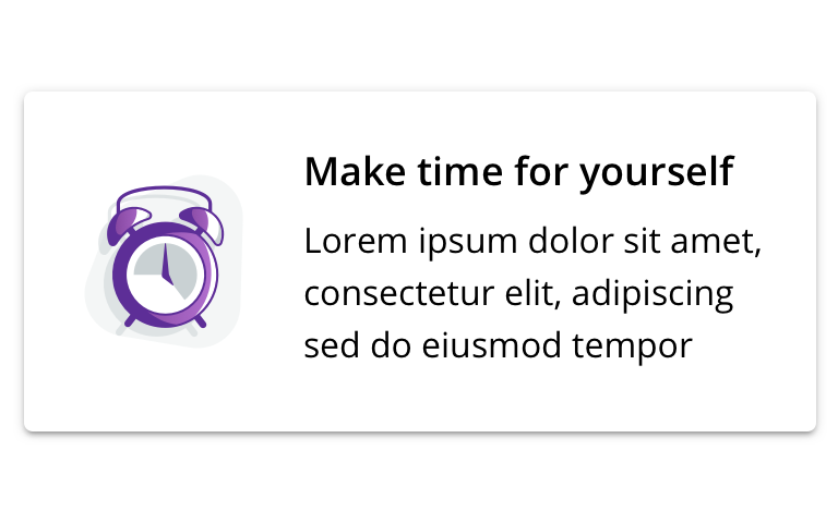 Use illustrations or pictograms for thumbnails
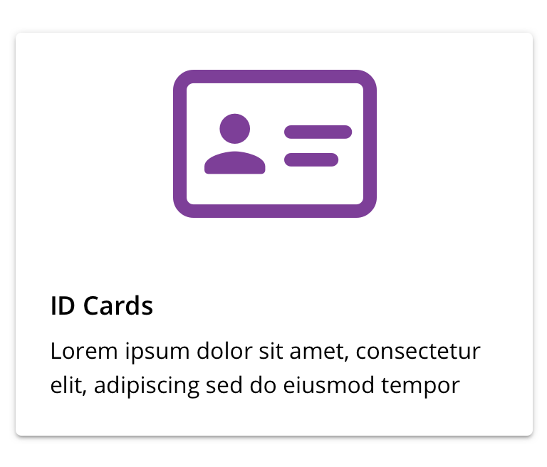
 Don't use icons for thumbnails
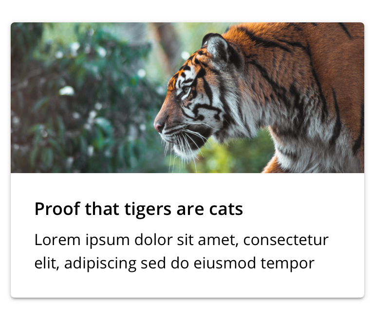 Use photography for hero images
 Don't use icons, illustrations, or pictograms for hero images
Use within a list
If Card is used within a list, be mindful of content quantity and how much scrolling may be required.
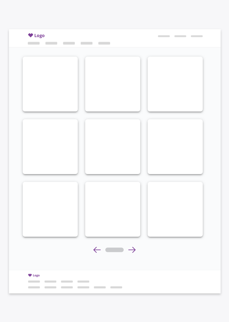 Use pagination patterns to avoid excessive scrolling
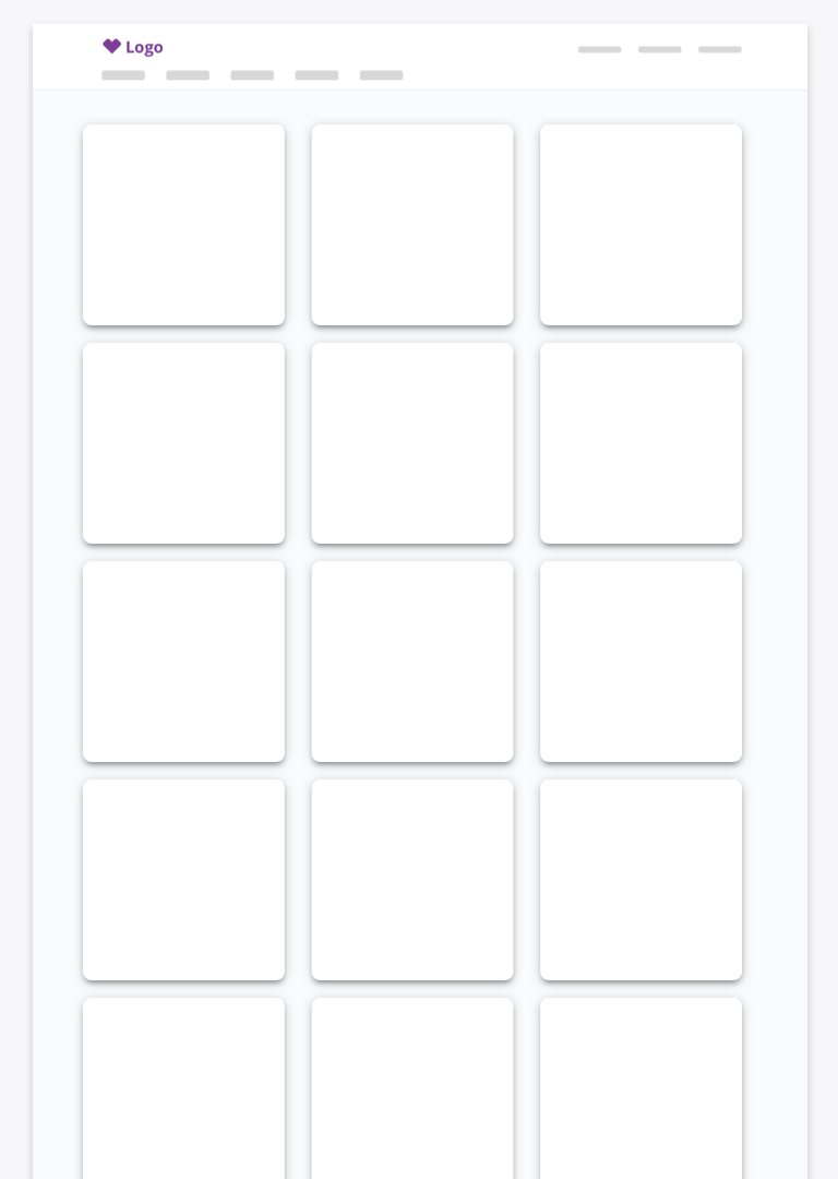 Avoid infinity scrolling
Behavior
Cropping
Hero images will fill a card’s width and, if necessary, crop evenly from top and bottom while maintaining their proportions.
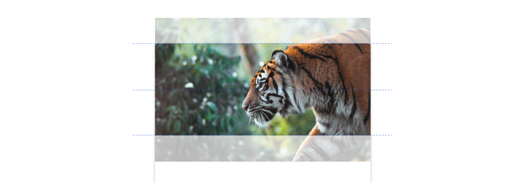
Graceful fallback
Hero images will gracefully fall back to a gray fill if asset is unavailable.
Visual style
Desktop
Mobile
Content strategy
The overall content goal of Card is to summarize a single subject, providing just enough information or motivation to take action.
Casing
Cards take style cues from the content they link to.
Context setting
Summary-level information on Cards should directly relate to the desired interactions.
Actions
Because the entire Card is clickable/tappable, no CTA is required to highlight that behavior. Instead, CTAs should present top supplemental actions that users can confidently take based on the summarized information.
 Surface top actions if a quick, clear next step is possible without clicking in
 Avoid actions that call out the inherent clickability of the card
Accessibility
Characteristics
- Content container holding single heading with linked content
- Utilizes link and/or buttons for action
- Completes an action based on a user’s selection
Keyboard/focus expectations
Card is a containing element and does not affect how content is consumed by assistive technologies.
- Main section of card receives focus
- Linked heading and content are read together
- Enter and spacebar click the main section link
- Tab to move focus to action buttons
- Focus navigates to each element within a card before moving to the next card
- Establish expected reading order within a card and among cards, must be maintained for various break points
- Visit https://cvsdigital.atlassian.net/wiki/spaces/A11Y/pages/51020729/Content+Order within the Digital Accessibility Wiki for more information
Screen reader expectations*
- “Link, {Card Title}, {Card Content}”
- Link clicked: “Press link, {Card Title}, {Card Content}”
- Tab forward to action buttons: “{Button Name}, button”
- Image don’t receive focus since they are always decorative
- For card group, index cards per page, user should hear “list, 8 items” when group is focused, each card will read “1 of 8, 2 of 8, etc.”
*Note: This is a general experience expectation, but there are variations in how assistive technology responds on certain browser and screen readers.