Alert
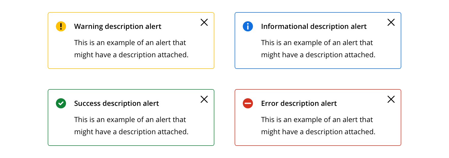
Alerts are descriptive dialogs to clearly and concisely communicate success, informational, warning, and error content.
Page sections
Types
Basic alert

Description alert

Dismissible description alert
Usage
Alerts can be used to bring attention to important changes, persistent conditions, unexpected failures or other relevant statuses.
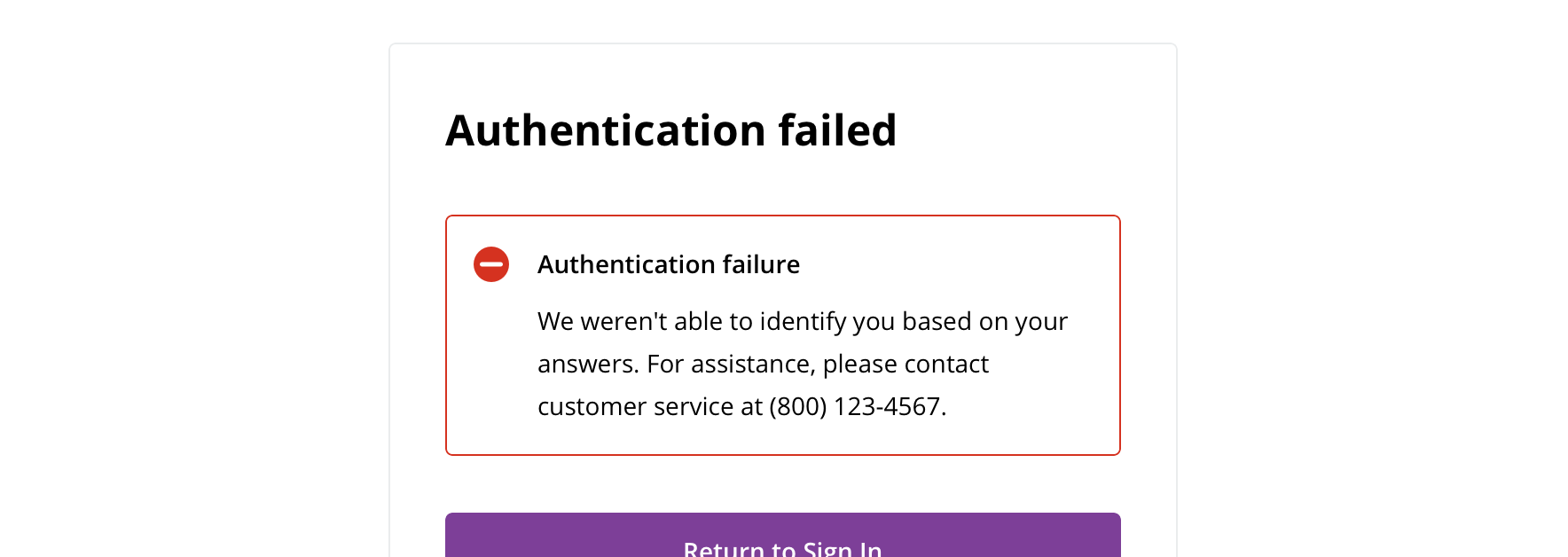
 Description alerts are generally used at a page or section level

 Basic alerts are generally used inline and are more specific to the item with which it's associated

 Use informational alerts to provide additional information that may help in a task or provide context, but won’t hinder completion or usability
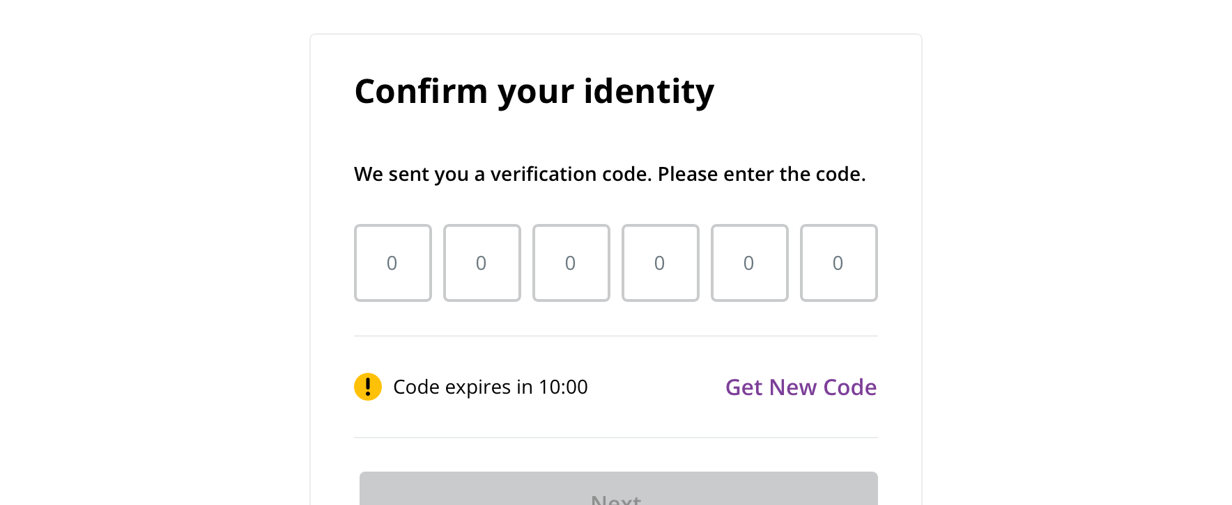
 Use warning alerts to notify the user about information that deserves caution or might hinder completing a task

 Use error alerts for critical messages that communicate site status or that users need to deal with immediately in order to proceed with their task

 Use success alerts to communicate completion of a task
Behavior
Alerts should be displayed within the appropriate context: at the top of the page or within the section to which they apply.

 A description alert can be dismissible if the alert isn’t critical

 Never make a basic alert dismissible
Visual style
Basic alert

 Keep margins between adjacent basic alerts to 8px

 Avoid margins less than 24px from adjacent, non-alert content

 Always left align wrapped text

 Never wrap text under an alert icon

 Avoid changing the icon or text style
Description alert

 Avoid margins less than 24px from adjacent, non-alert content
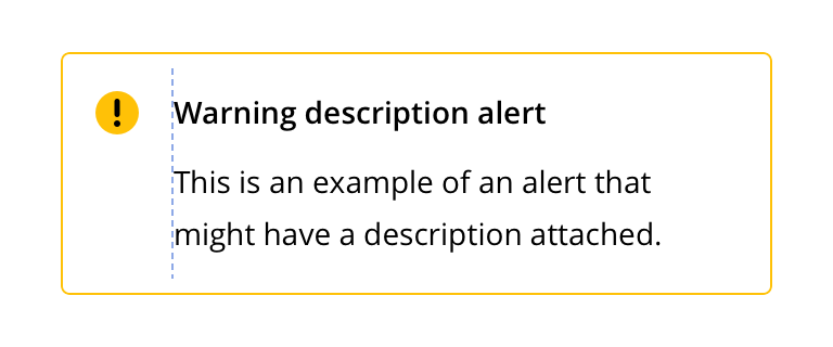
 Always left align wrapped text
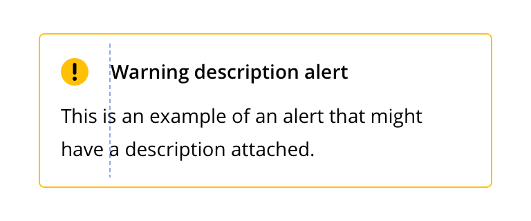
 Never wrap text under an alert icon

 Avoid changing the icon or text style
Content strategy
- Use Title Case for short (~1 – 3 word) headlines
- Use Sentence case for longer headlines written as sentences (e.g. Claims are currently unavailable)
- Provide a CTA in the form of an in-line text link when necessary
Accessibility
Characteristics
- Static Text with potential for custom content
- Rendered on page load
- Types:
- Warning – System caution indicator
- Error – System error user needs to be aware of
- Information – General information alert
- Success – Data changes saved successfully
Keyboard/focus expectations
- Typically do not receive keyboard focus
- Typically not designed to interrupt workflow
- Exception: Alert Dialog, is designed to interrupt workflow requiring user response
Screen reader expectations
- Alert type is announced. Ex. “Warning! Claims made within the past 48 hours may not be visible at this time.”
- Alert message must be announced. Ex. “Error! Network cannot be reached.”
