Dropdown Menu
A menu that allows users to choose an action from a list. It's always paired with a button to trigger the menu.
Page sections
Type
Default

Usage
Overview
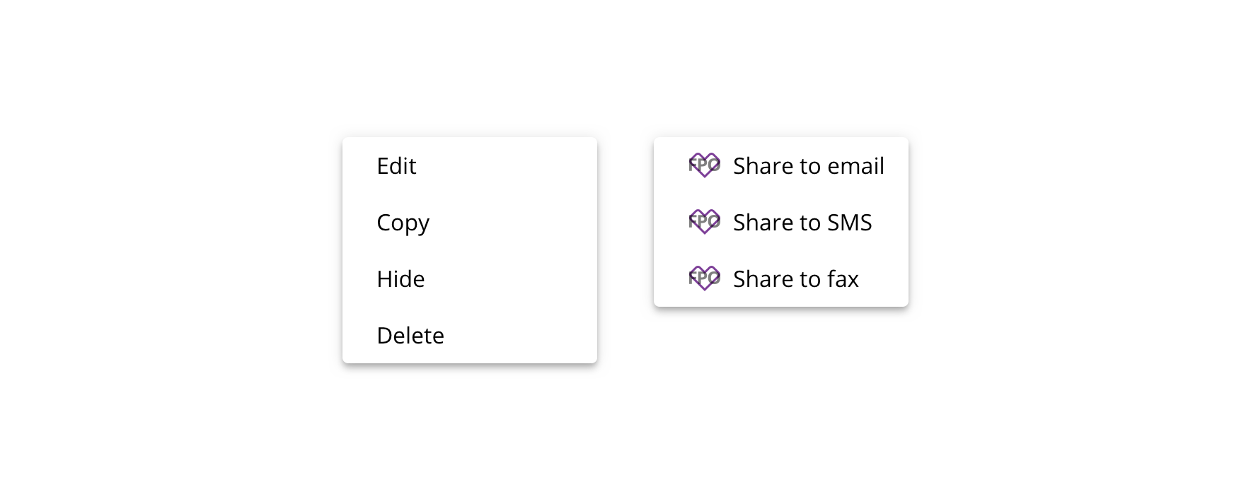
 Use for providing a menu of links or actions
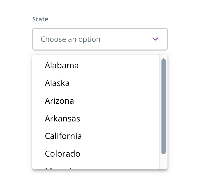
 Don't use for providing a list of options, especially within a form context. Use Select instead.
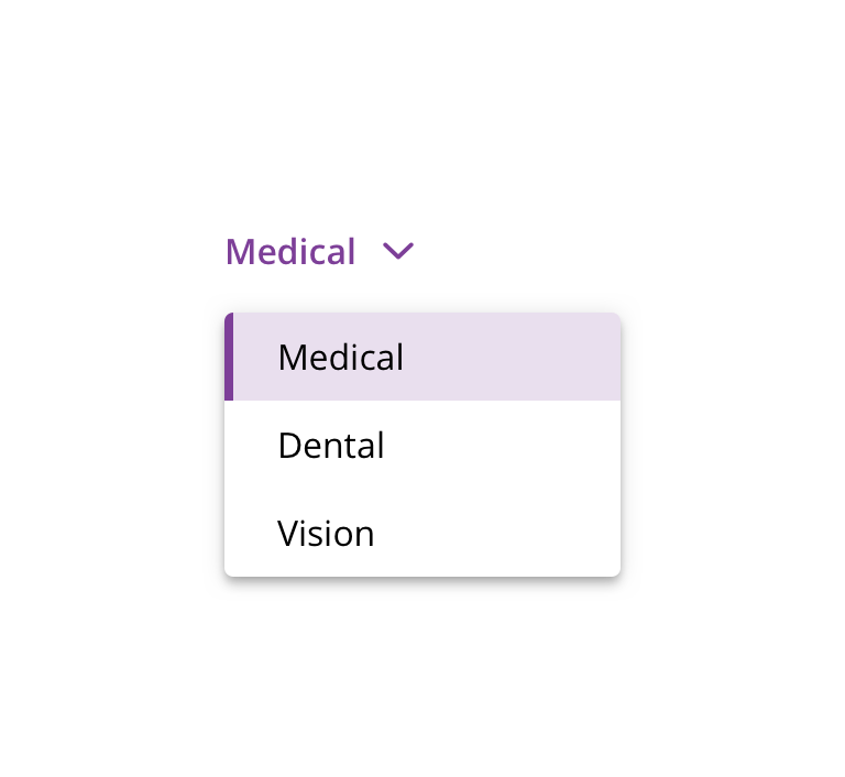
 Don't use for a menu whose content will change some or all of a page. Use Dropdown Picker instead.
Menu trigger
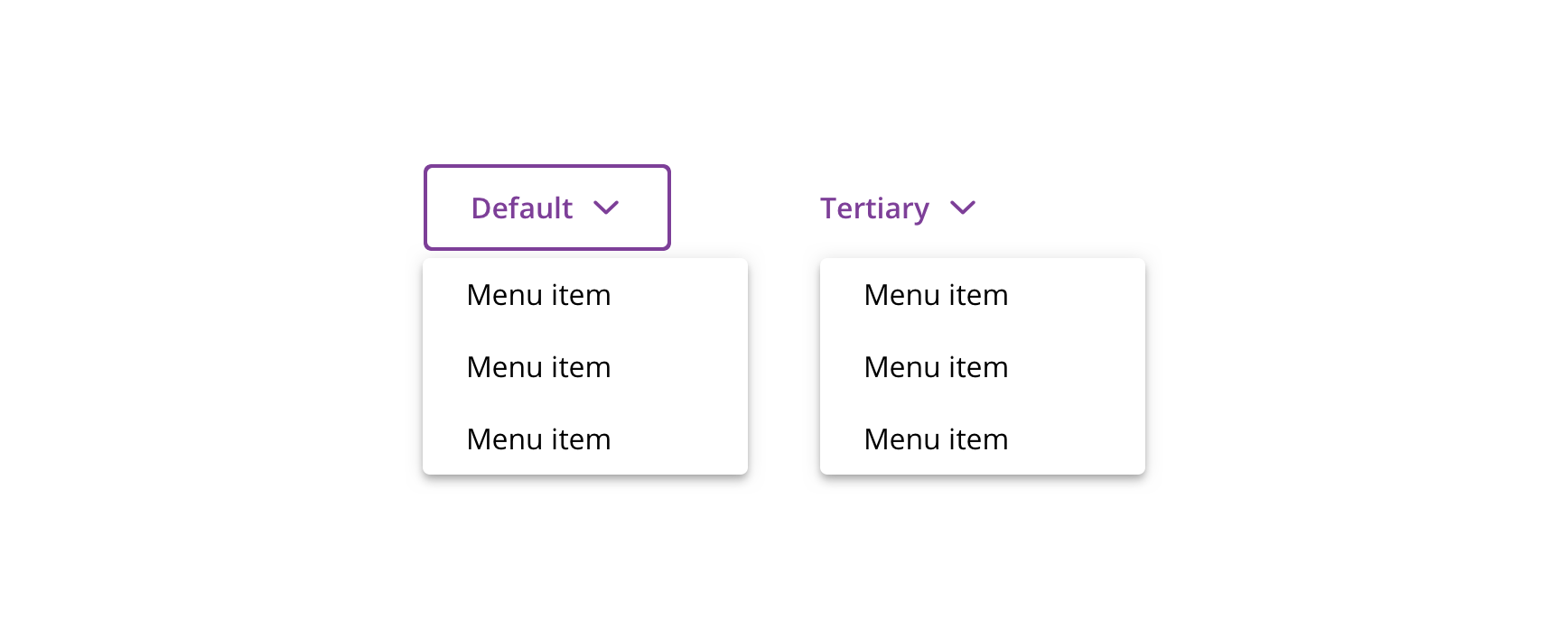
 Use the default or tertiary Button or a HTML button element to trigger the menu
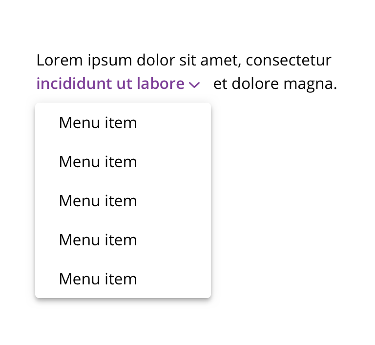
 Don't use other HTML elements as a trigger
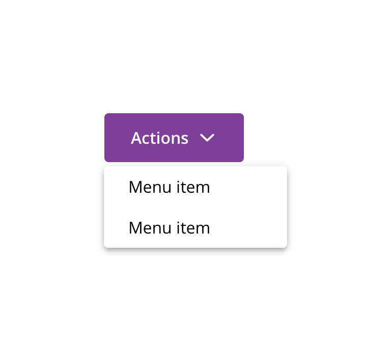
 Don't use with primary Button
Menu items

 Use for grouping related actions or links
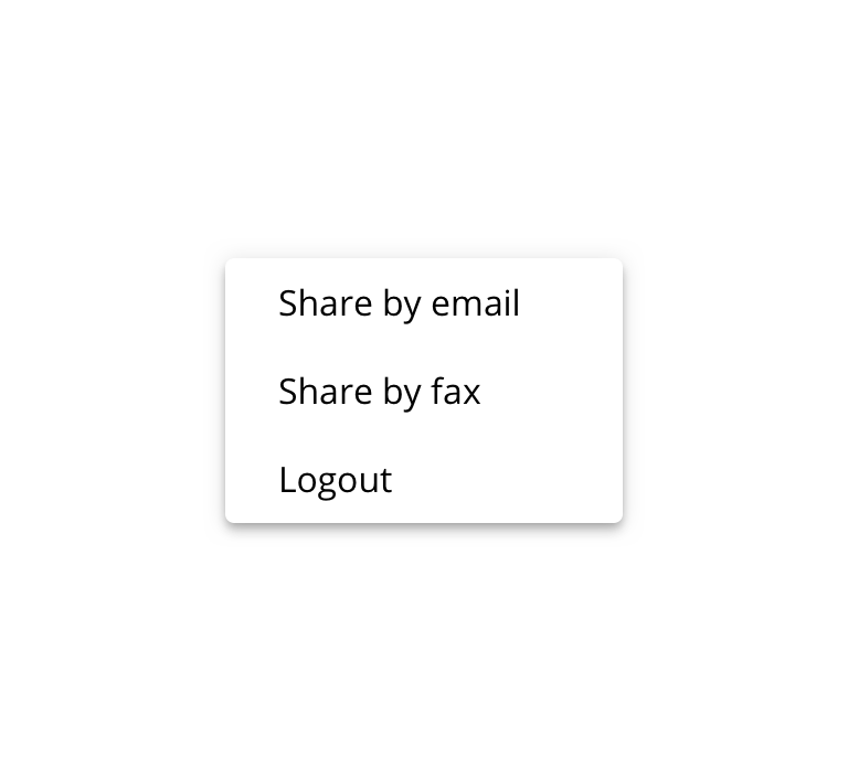
 Don't use for grouping unrelated items
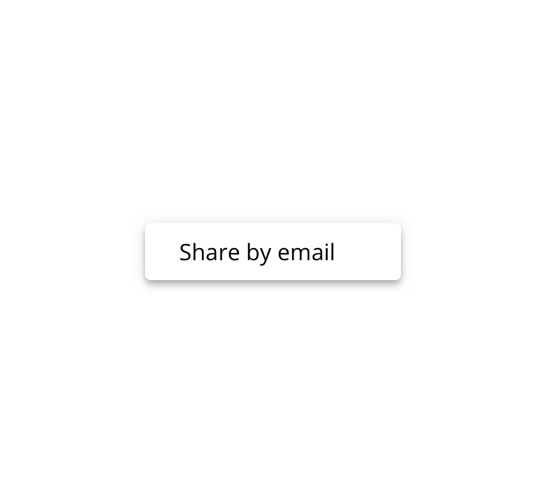
 Avoid using for single menu items
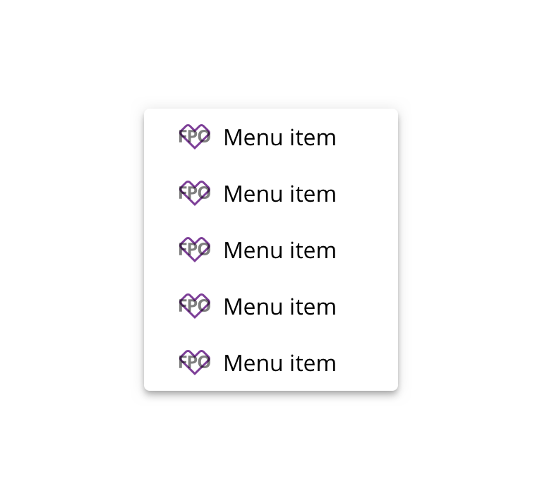
 Use icons consistently
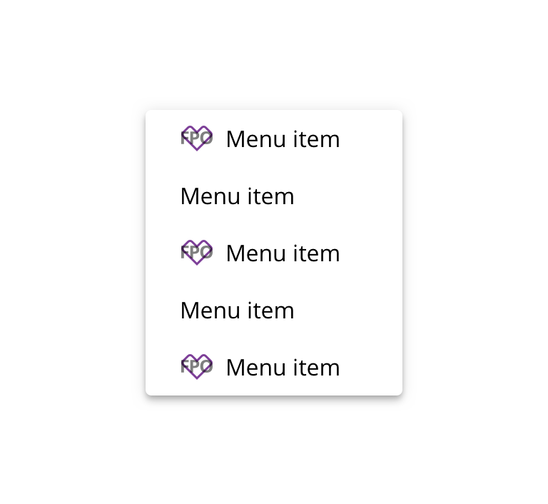
 Don't use icons inconsistently
Behavior
Width
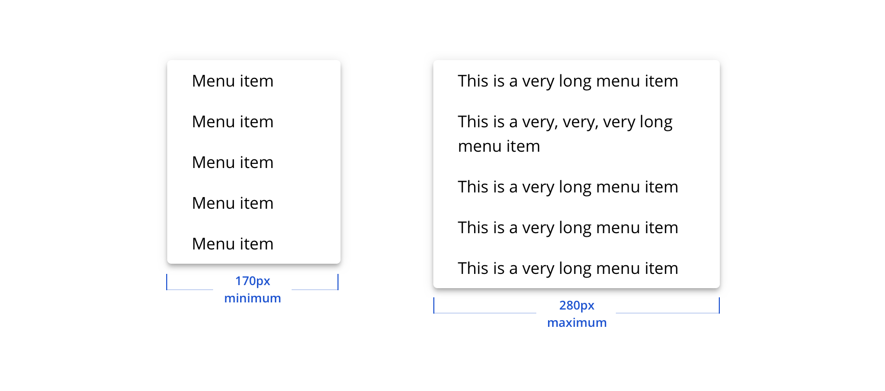
Menu’s width is based on its content, but still adheres to a minimum and maximum width.
Scrolling
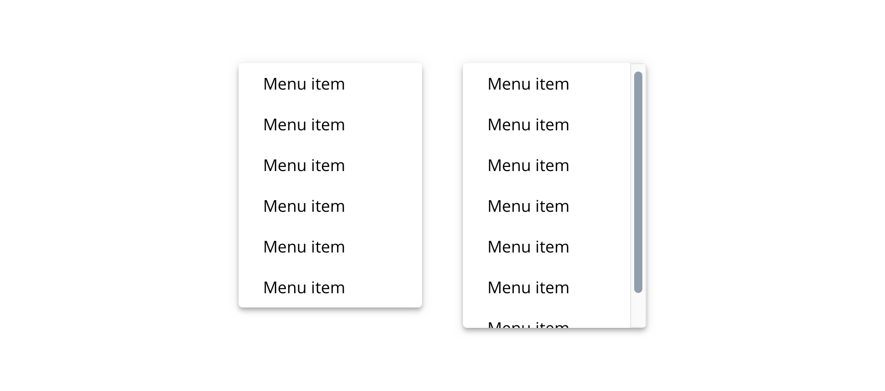
The menu will scroll after six items.
Avoiding viewport collisions
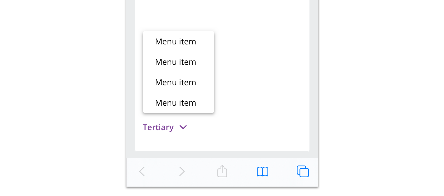
The menu will display above its trigger to avoid colliding with the viewport.
Visual style
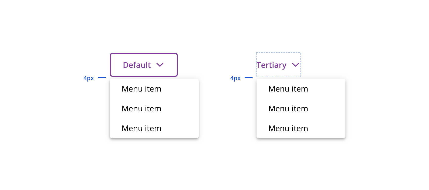
 Maintain 4px between Button and Dropdown Menu
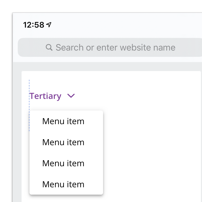
 Left-align with trigger when possible
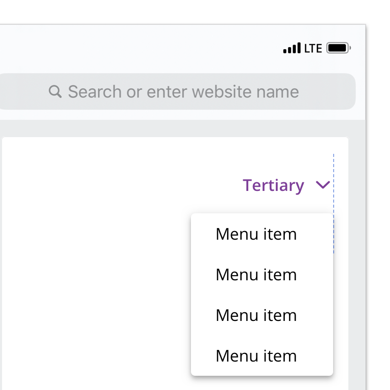
 Right-align with trigger to avoid viewport collision
Content strategy
The overall content goal of Dropdown Menu is to surface a menu of actions that users can choose from quickly and confidently. Context and clarity are key factors in helping set expectations for the chosen action.
Casing
Because Dropdown Menu options are actions, apply the same style you’d use for Button or links.

 Use Title Case for short, button-like actions

 Use Sentence case for longer, link-like copy. End punctuation is not necessary.
Character count
The surrounding page sets the stage, so Dropdown Menu options can be short and sweet. If a longer option is necessary, the component can accommodate multiple lines.

 Focus the user with succinct, direct actions

 Avoid extraneous content that's implied by the menu's context
Consistency
The surrounding page sets the stage, so Dropdown Menu options can be short and sweet. If a longer option is necessary, the component can accommodate multiple lines.

 Start all Dropdown Menu options with verbs

 Stick to a common grammatical structure within each menu
Accessibility
Characteristics
- Manually triggered stateless menu
- Utilizing links or buttons for action
- Completes an action based on a user’s selection
Keyboard/focus expectations
- Popup button receives focus
- Enter and Spacebar open/close the menu
- Tab or arrow keys to move down the menu list
- Enter to select a menu item
- Escape or tab to end of the list to exit the menu
Screen reader expectations*
- “{Button Name}, collapsed, popup button”
- Once opened: “{Button Name}, expanded, popup button”
- Menu opened: “Menu, choose an item, {Total Number of Items}”
- Each item within the menu: “{Label Name}, menu item, index #”
- For menus using links: “Link, Menu Item, {Label Name}”
*Note: This is a general experience expectation, but there are variations in how assistive technology responds on certain browser and screen readers.
