Select
An input element that lets users choose one option from an options menu.
Page sections
Type
Default

Usage
While Select and Dropdown appear similar, they have different usages. Select is used in scenarios where users are selecting an option and submitting data (such as a form). Dropdown is used in scenarios where users are choosing an action that changes the view of the page or navigates elsewhere.

 Use for displaying multiple options from which a user can select only one

 Avoid using if the options are too wordy or long in content. Use Radio Buttons instead.
Behavior
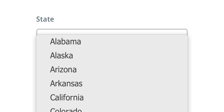
Select relies on the browser default options menu for built-in accessibility benefits and mobile-friendly functionality. This is a Picker on iOS and a Dialog on Android.
Visual style
Select can be variable width and should align to the content they’re paired with when appropriate.

 Never make a full page width Select on desktop

 Never rely on the placeholder text to explain the type of information intended for the Select. Always include a label.

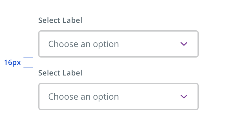
 Vertically stack multiple Selects when possible

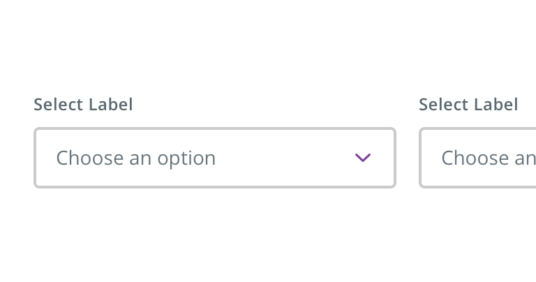
 Avoid multiple Selects that horizontally align
Content strategy
- Use Title Case for Select labels
- Keep labels short (~1 – 2 words)
- Omit CTAs from labels (e.g. “State” not “Select a State”)
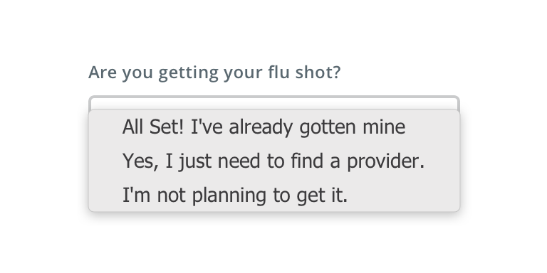
- Exceptions to label length include necessary differentiation (e.g. Confirm New Password) and more editorial approaches (e.g. Where are you getting your flu shot?). When possible, avoid editorial labels by using headlines, body copy, etc to inject voice and context.
- Do not punctuate Select menu options
- Generally, use Title Case for short (~1 – 3 word) Select menu options. Sentence case is acceptable for more editorial phrasings, but opt for shorter options when possible (e.g. Mail Order vs Receive prescription by mail)
Accessibility
Keyboard/focus expectations
- Enter/Spacebar opens select element and activates selected option
- Tab/Shift+Tab shifts focus to/away from select element
- Up/down arrows move between selectable options
Screen reader expectations
- Element is announced as a select element. Ex. “Select” / “Picker” (Voice Over iOS)
- Required/optional is announced
- Options are read as user arrows through. Ex. “Option 1…”
- Selected option is announced. Ex. “Option 3, selected”
