Modal
A dialog overlay often used to communicate information requiring immediate user attention or action.
Page sections
Type
Default
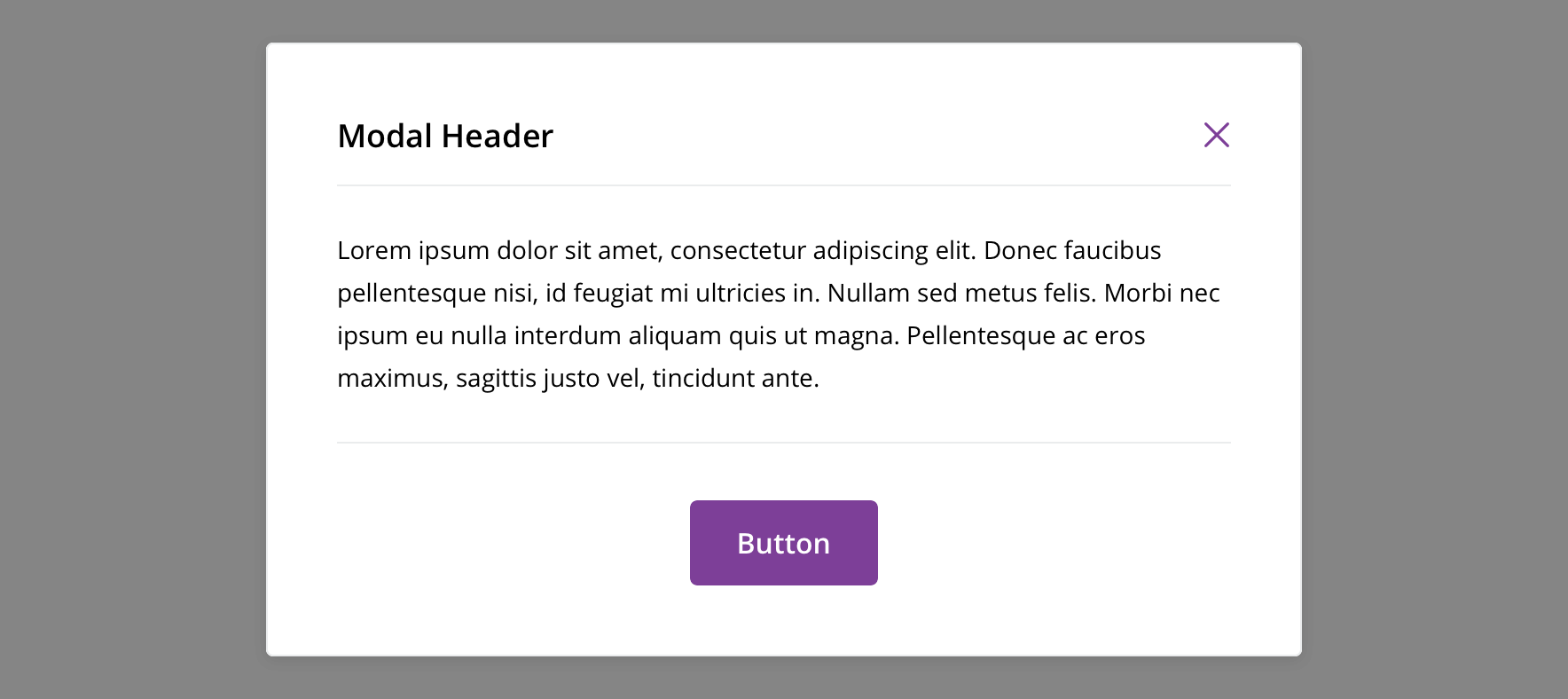
Usage
A modal can be useful for microinteractions that require the user to maintain their context. However, because a modal is also highly disruptive, it should be used sparingly, like when relaying critical information upon which a user needs to act in order to proceed with their workflow.
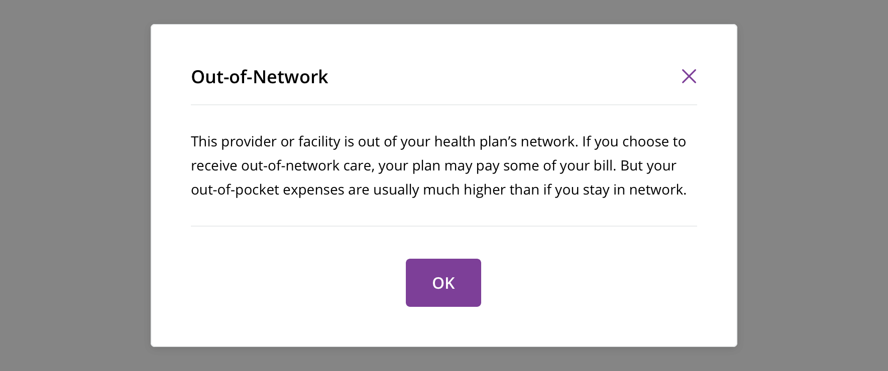
 Use for displaying critical information
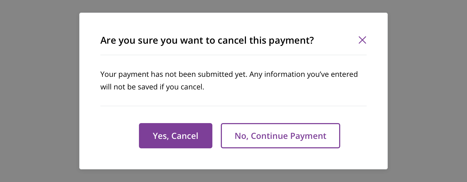
 Use for requesting information from a user in order to move forward
Behavior
Avoid showing modals without the user taking action to prompt them.
Always allow the modal to be dismissible, by:
- Clicking/tapping the close icon
- Pressing the escape key
- Clicking outside the modal area
Always block content under the overlay. Users must either complete the task in the modal or close the modal to return to the main content.
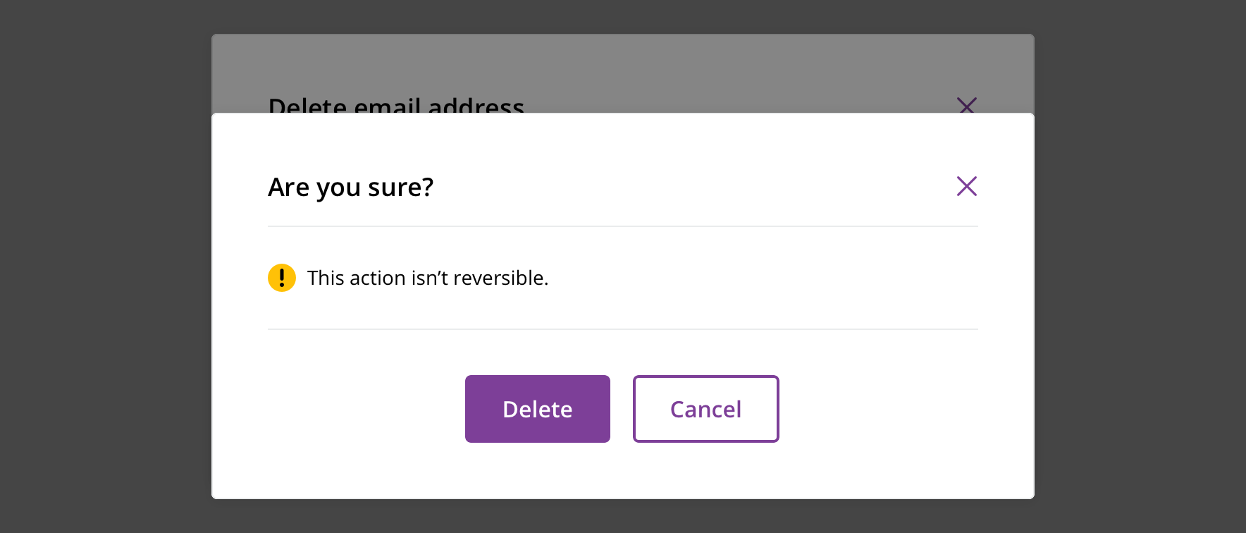
 Never display more than one modal at once
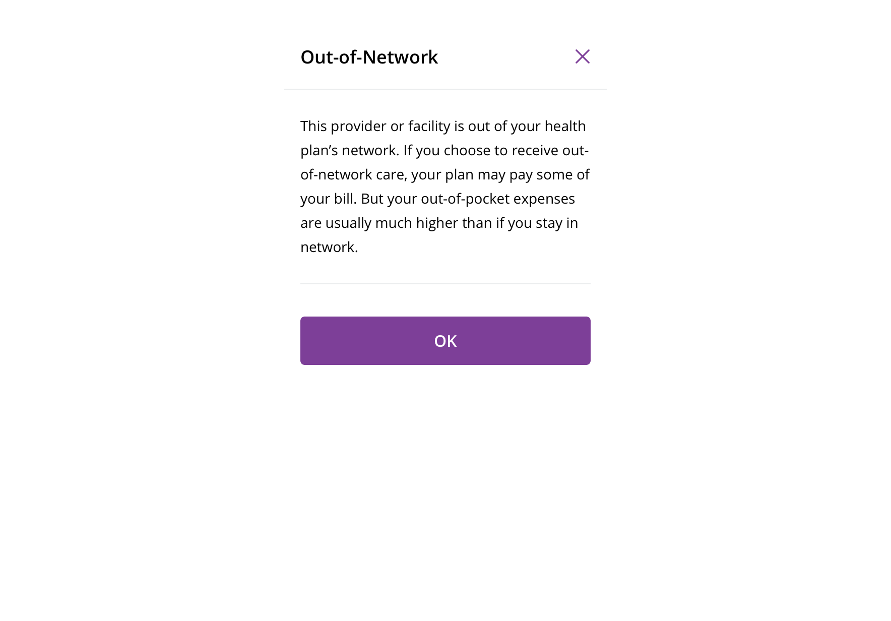
 On mobile, all modals become full-screen modals
Visual style
Display modals in the center of the viewport on desktop and tablet.
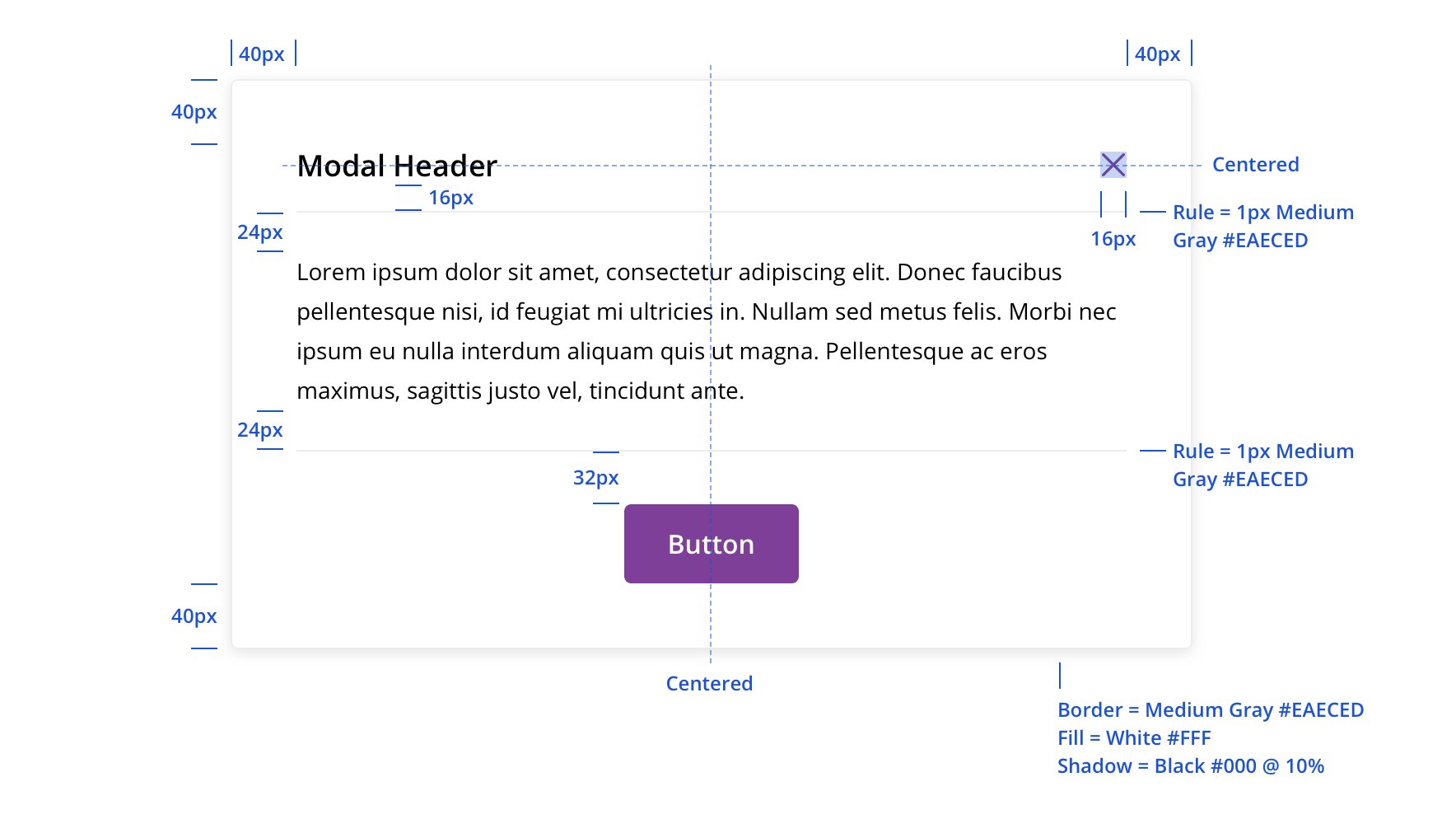

 Always use an overlay between the page content and a modal

 Long modal titles wrap, pushing down the rest of the content
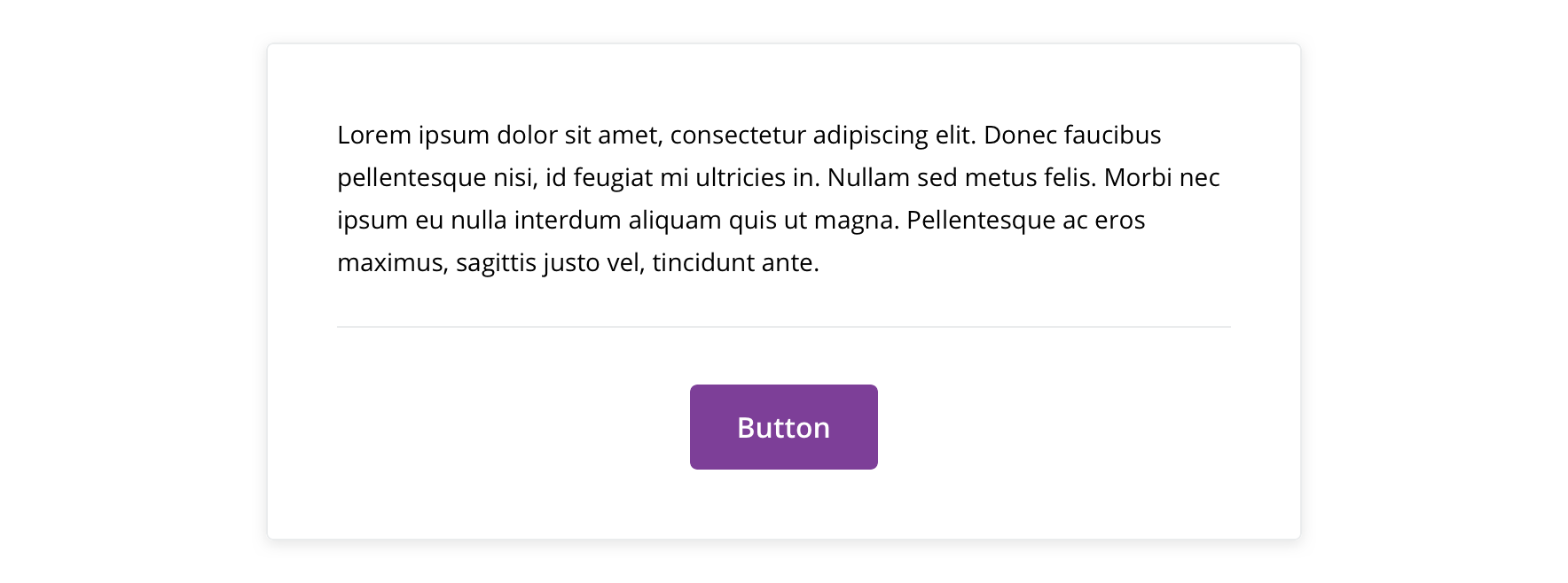
 Never remove the header or close icon
CTA buttons should be in the footer section of the modal.

 Horizontally center a single CTA

 Multiple CTAs follow button group guidelines, with the group horizontally centered in the modal
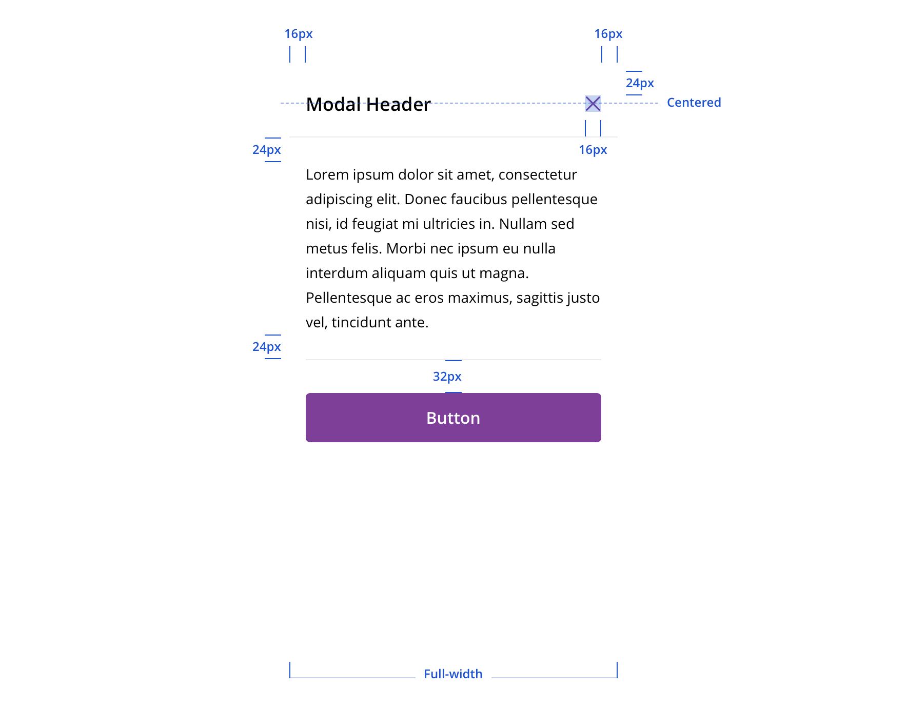
 Mobile modals are always full-screen
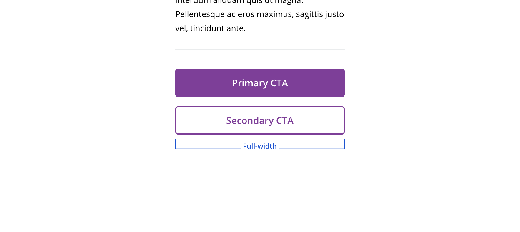
 Buttons on mobile modals should be full-width and stack

 There should be at least 32px bottom margin on mobile modals
Content strategy
- Use Title Case for short (~1 – 3 word) headlines
- Use Sentence case for longer headlines written as sentences (e.g. Claims are currently unavailable)
- Typically include 1 – 2 buttons, primary and secondary
Accessibility
Characteristics
- Manually triggered by user
- Display additional information and may include a call to action
Keyboard/focus expectations
- Enter/Spacebar activates trigger on manually activated modals
- Focus is trapped within modal until it is closed
- All buttons in modal receive keyboard focus and operable with a keyboard alone
- Tab/Shift + Tab move focus to the next/previous focusable element
- Escape closes the dialog
- When the dialog is closed, focus returns to the trigger element
Screen reader expectations
- Announces dialog when it appears. Ex. “Web Dialog…”
- “X” close button, upper right corner, is identified as a “Close” button. Ex. “…Close Button”
- For dynamic content (e.g. Price a service) errors will be read in order of appearance within the content.
