
Sheet modal
Interstitial for viewing large content that cannot fit inside of a modal.
Page sections
Types
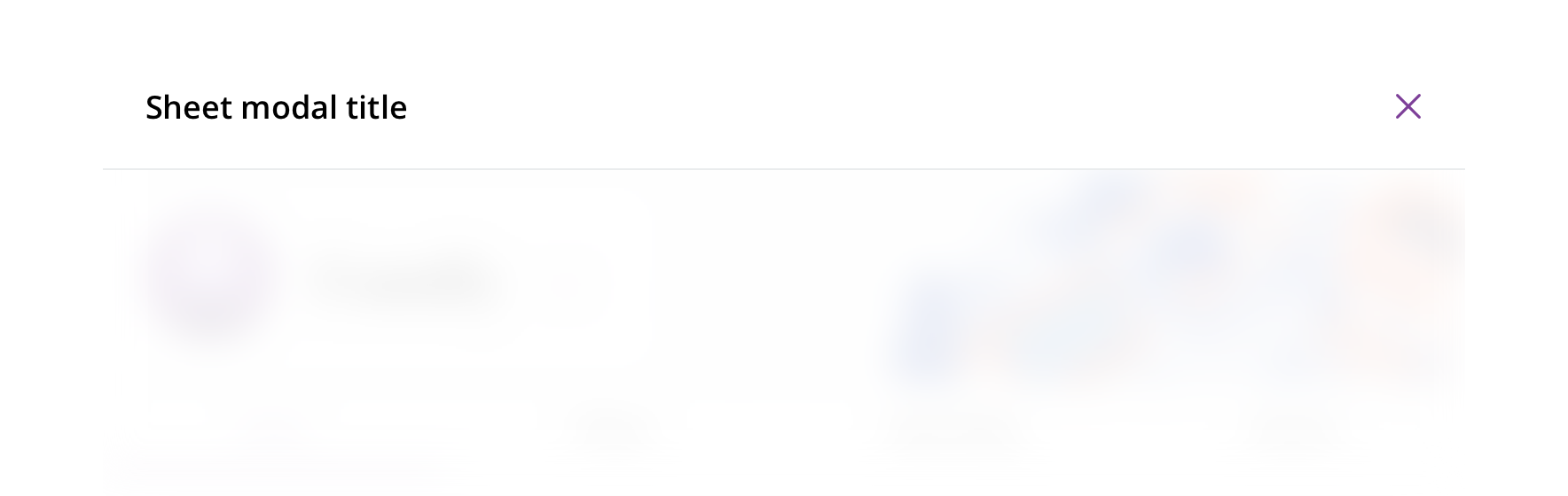
Default
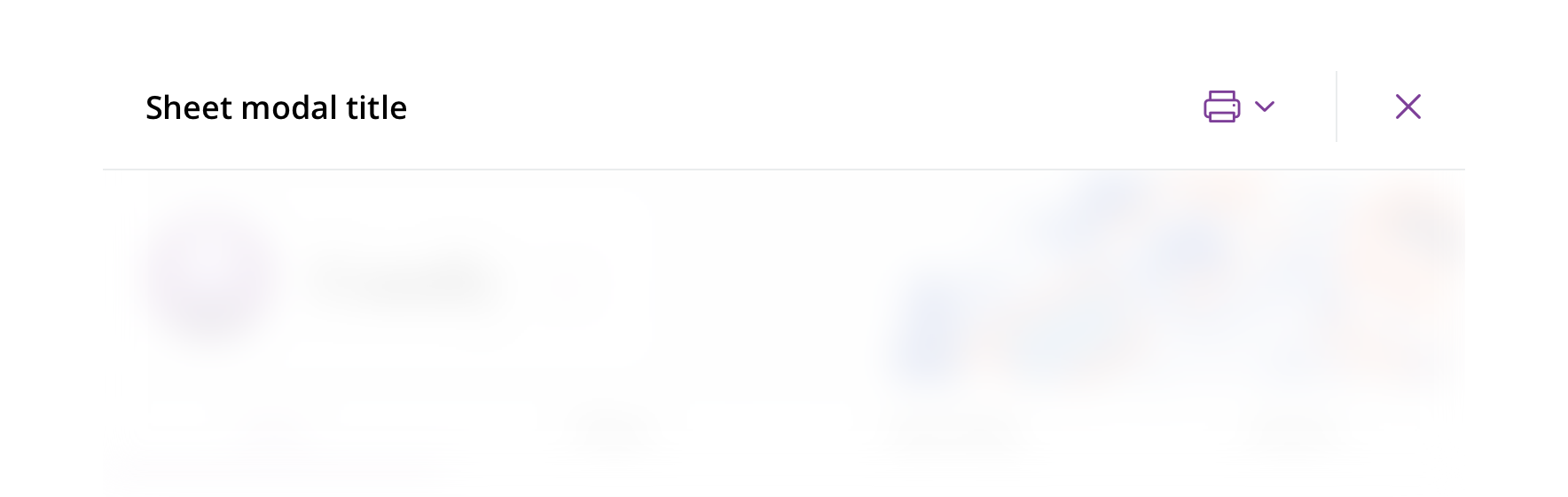
With utility items
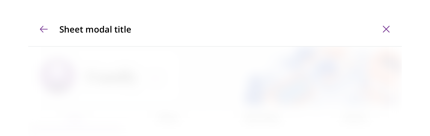
With back arrow
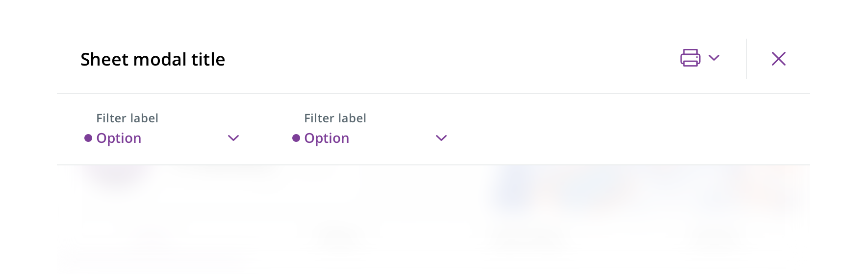
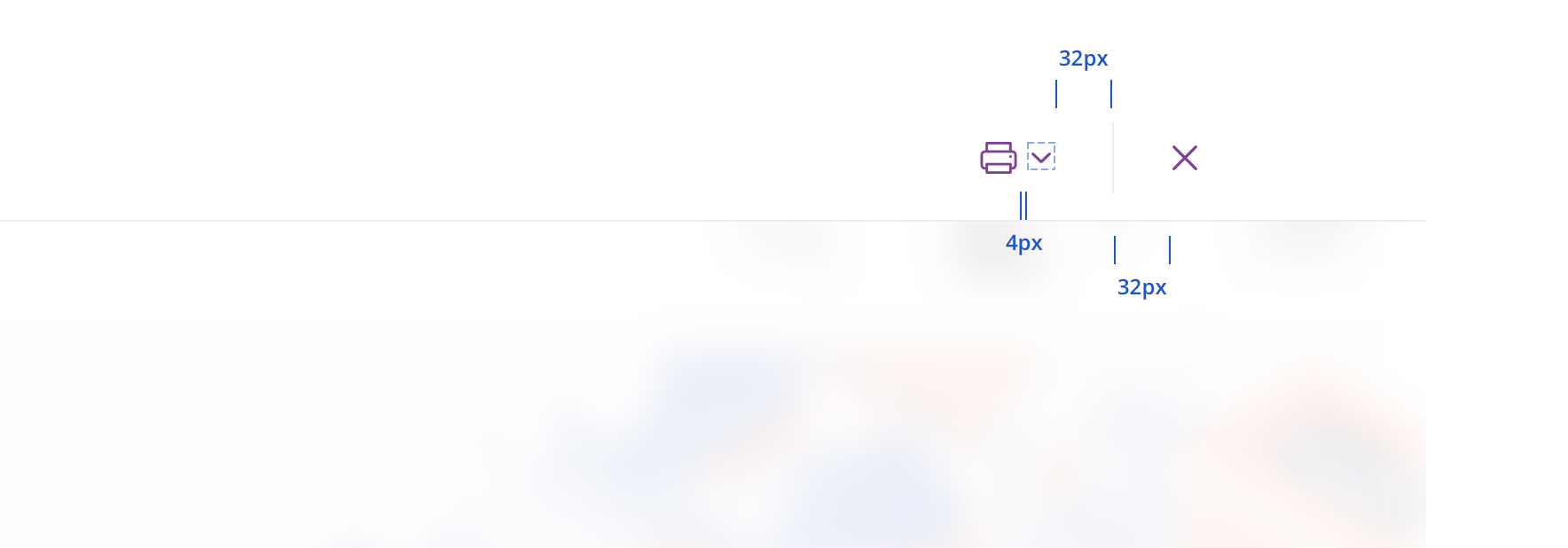
With control bar
Without header

Usage
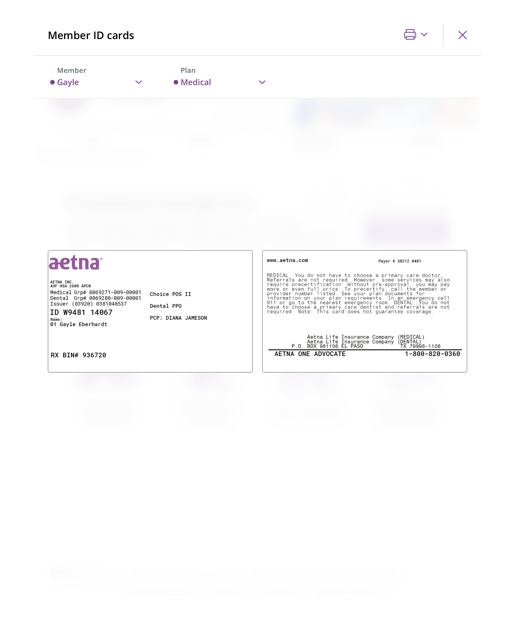
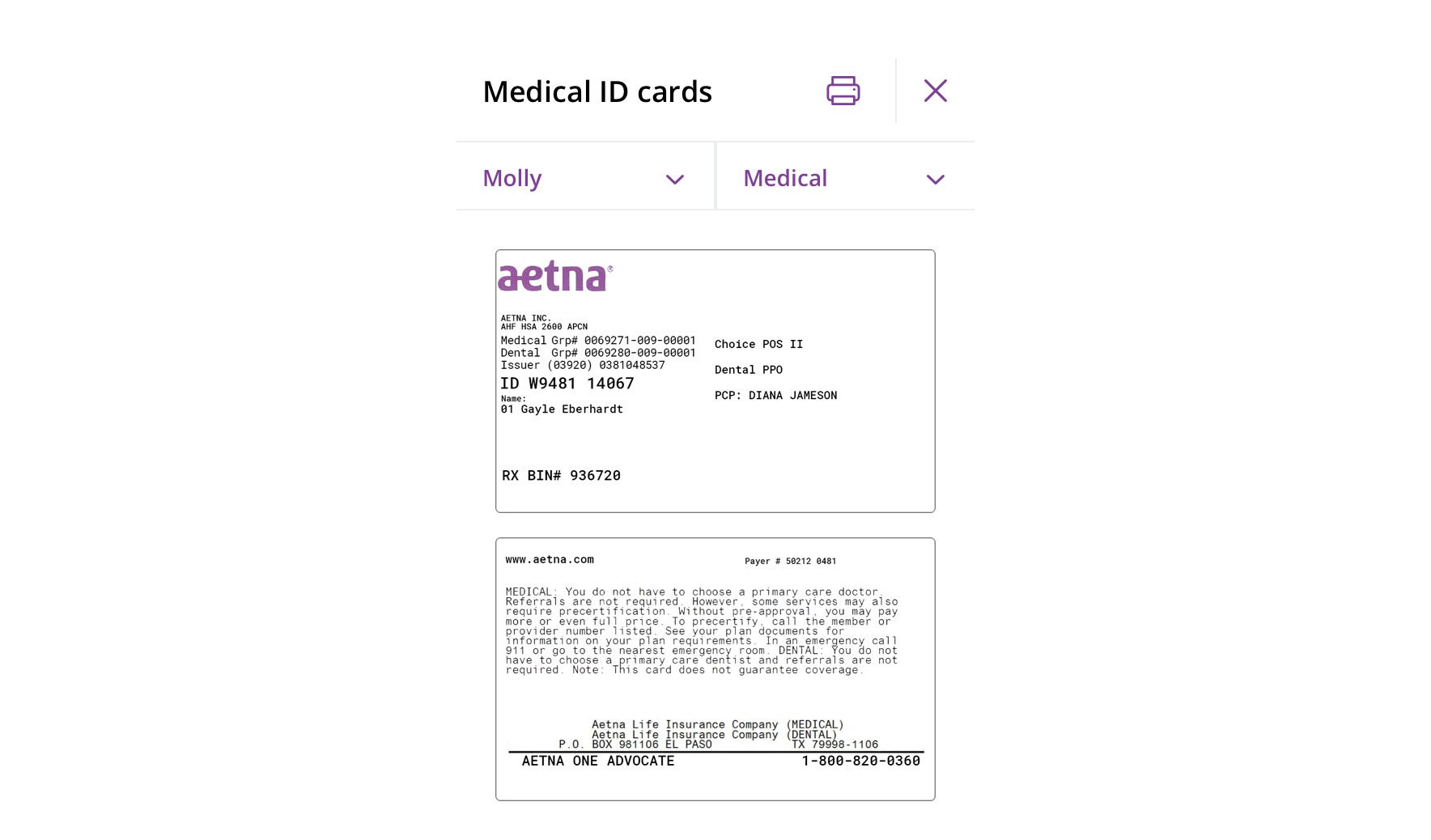
 Use when presenting display-focused content within the context of a page, such as Member ID cards
 Avoid using for small amounts of content. Use a modal instead.
Behavior
The sheet modal overlays the entire screen. It should fade in smoothly with the header sliding down from the top.
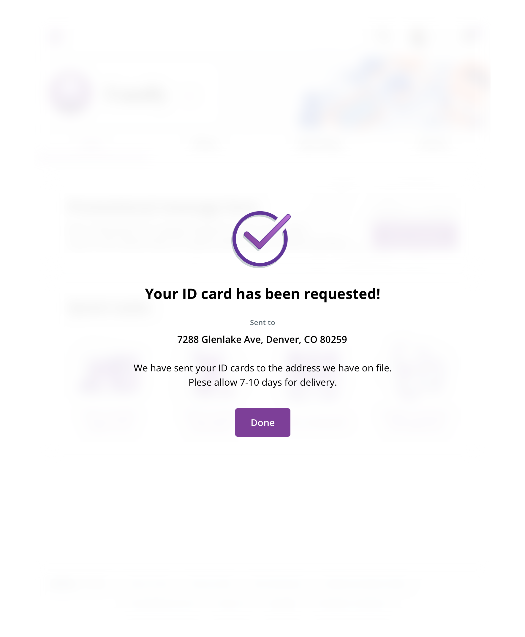 Always remove the header section for a success, confirmation, or error message to provide the user with one clear way to exit in the form of a CTA
Avoid content that scrolls.
Never close the modal by clicking on the background.
 On mobile, sheet modals become full-page modals and follow mobile modal guidelines
Visual style
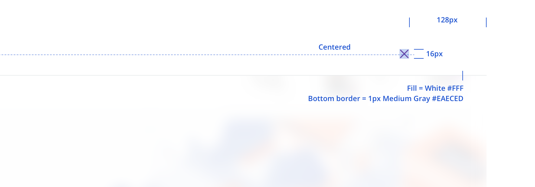
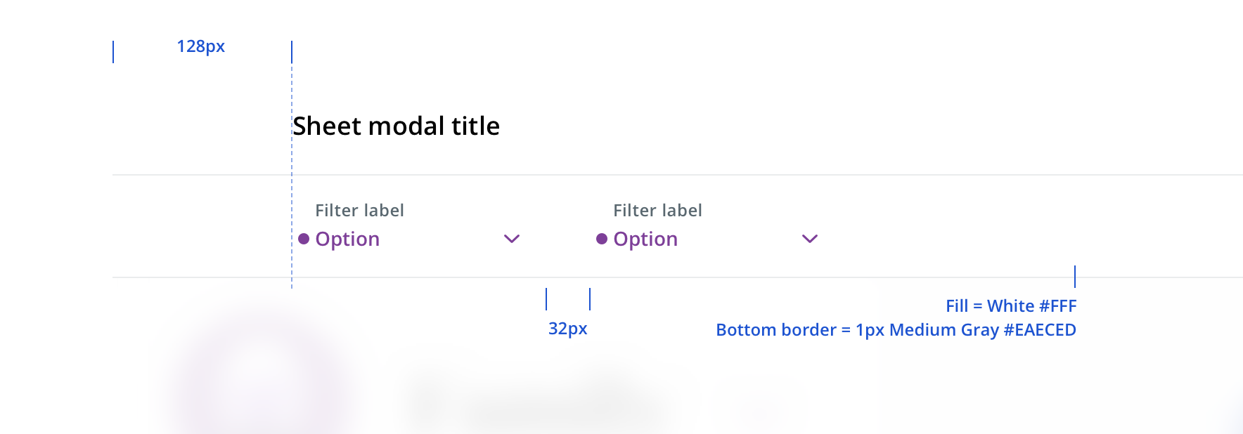
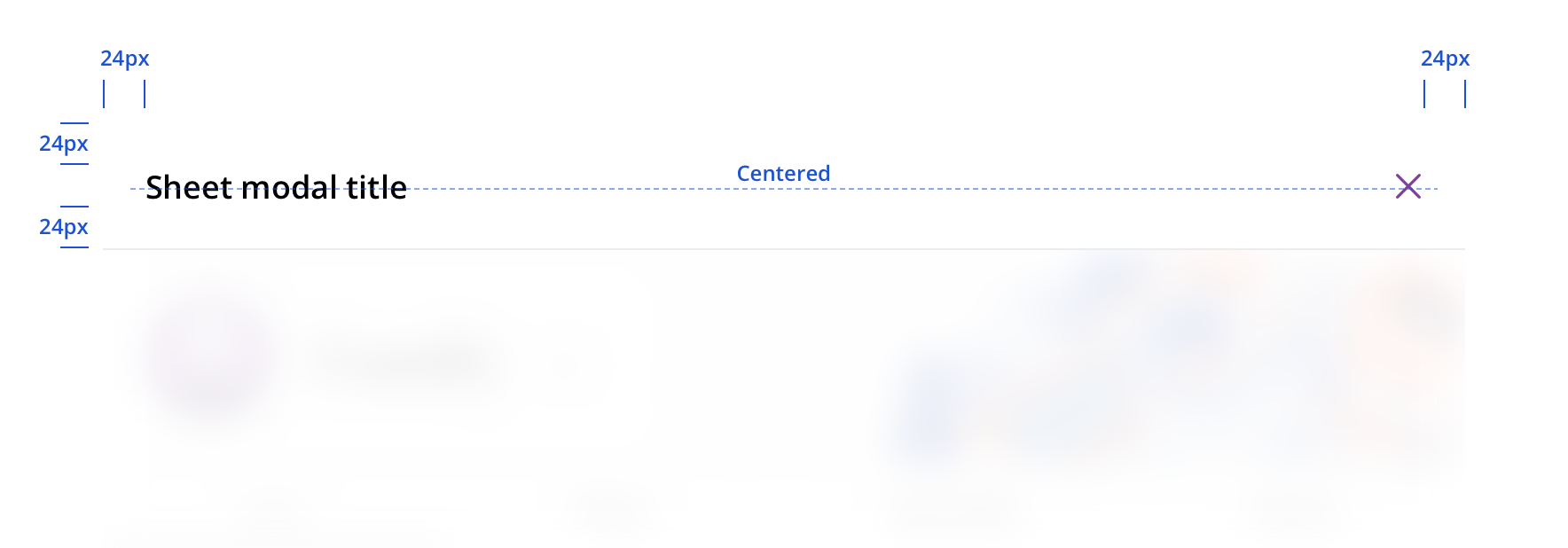
Both desktop and tablet header elements follow the same spacing rules, other than adhering to breakpoint margins. Apply a gaussian blur to the background content the sheet modal sits on top of for these two breakpoints.
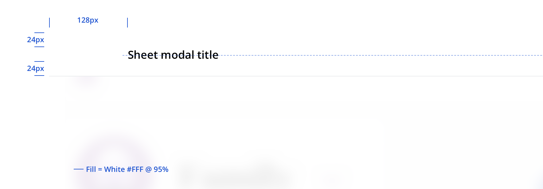
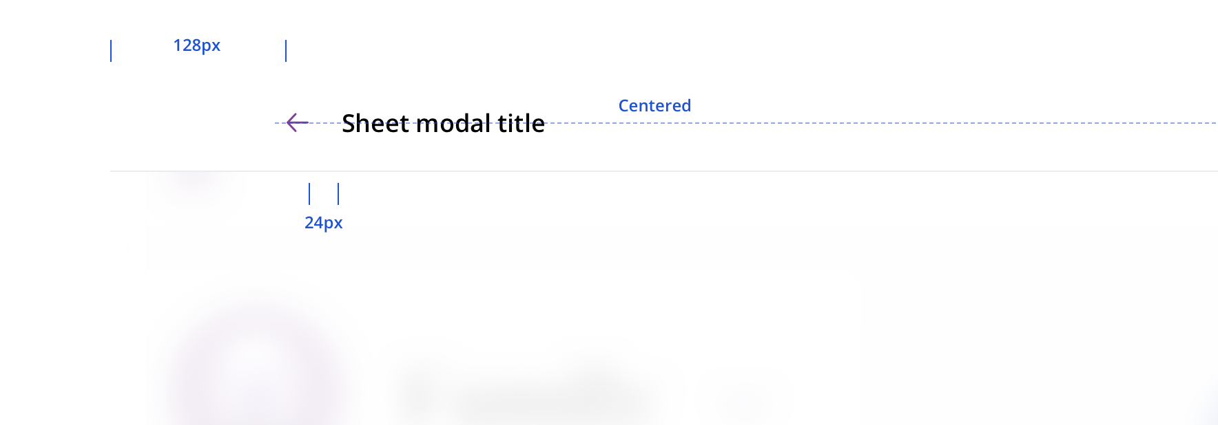
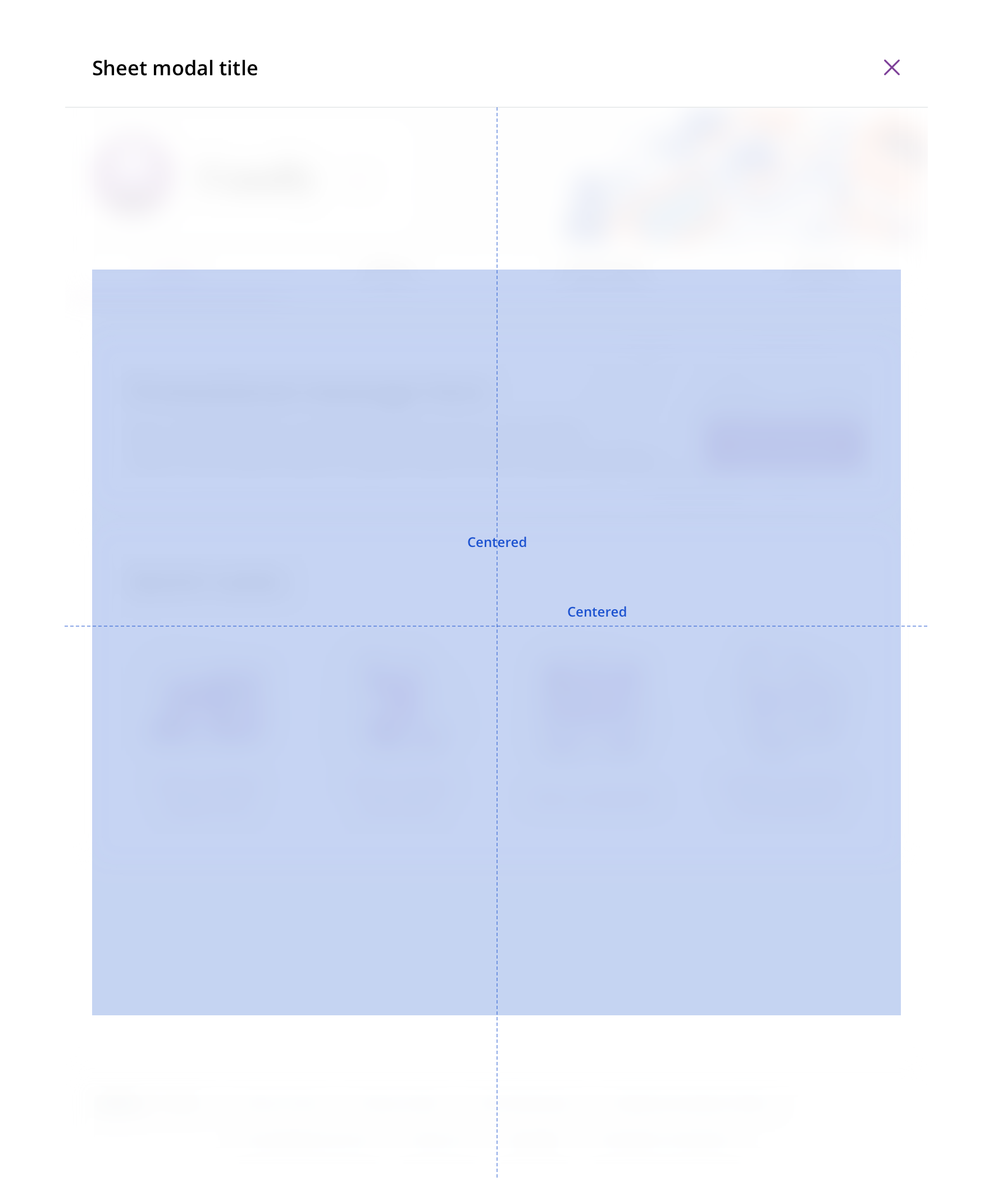 Horizontally center content. Vertically center un-scrollable content within the viewport.

 Avoid using different background colors other than the 95% white
Accessibility
Characteristics
- Manually triggered by user
- Display additional information and may include a call to action
Keyboard/focus expectations
- Enter/Spacebar activates trigger on manually activated modals
- Focus is trapped within modal until it is closed
- All buttons in modal receive keyboard focus and operable with a keyboard alone
- Tab/Shift + Tab move focus to the next/previous focusable element
- Escape closes the dialog
- When the dialog is closed, focus returns to the trigger element
Screen reader expectations
- Announces dialog when it appears. Ex. “Web Dialog…”
- “X” close button, upper right corner, is identified as a “Close” button. Ex. “…Close Button”
- For dynamic content (e.g. Price a service) errors will be read in order of appearance within the content