
Tooltip
A container to show brief explanation of a term.
Page sections
Types
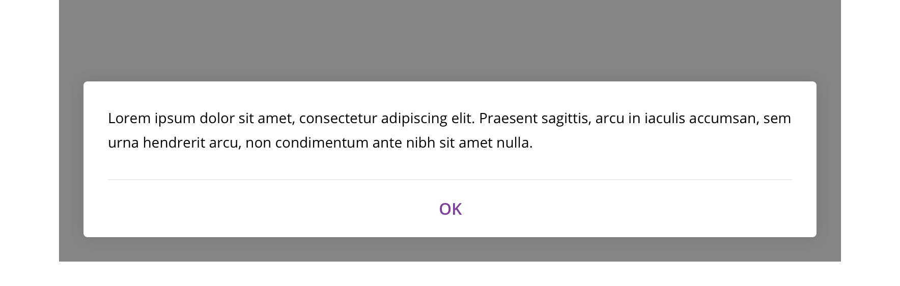
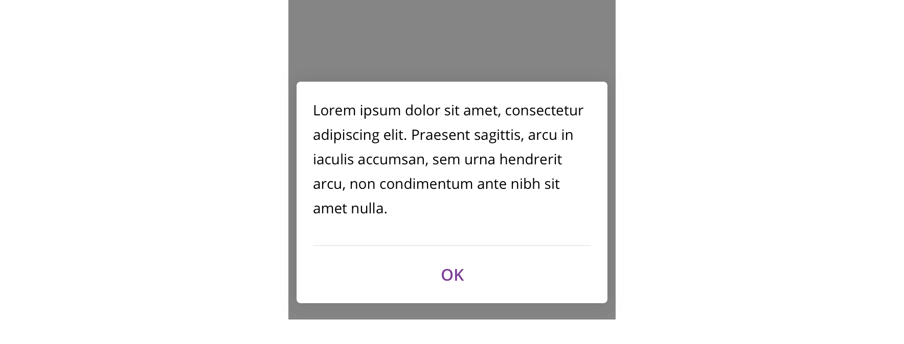
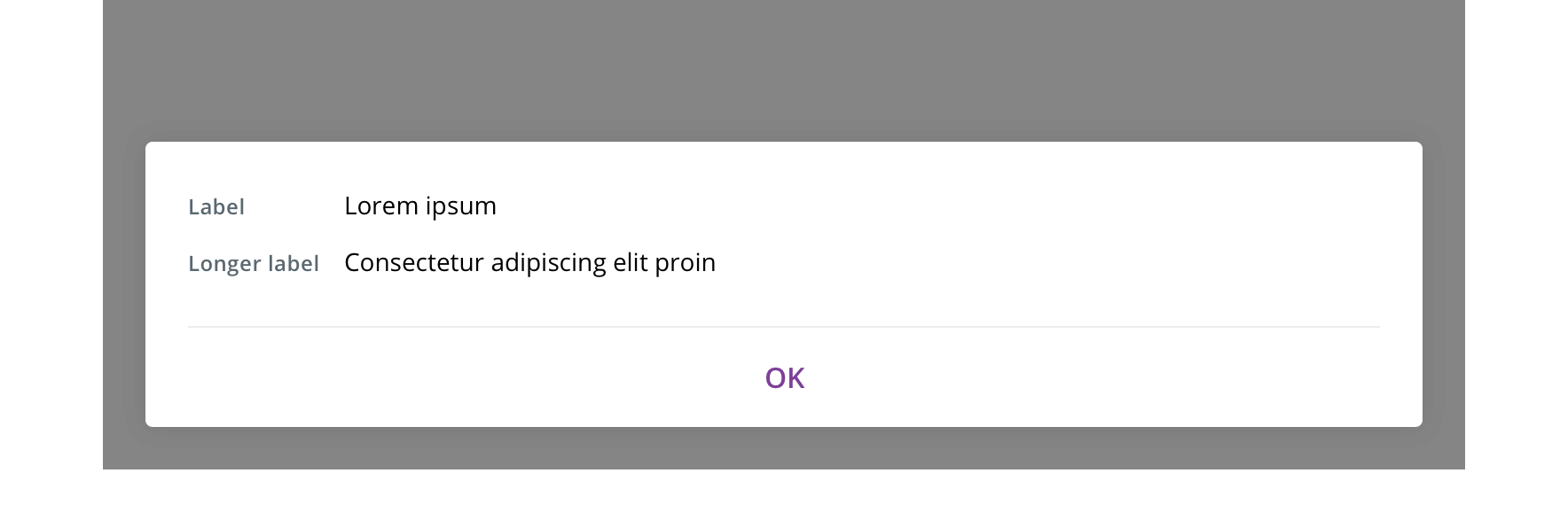
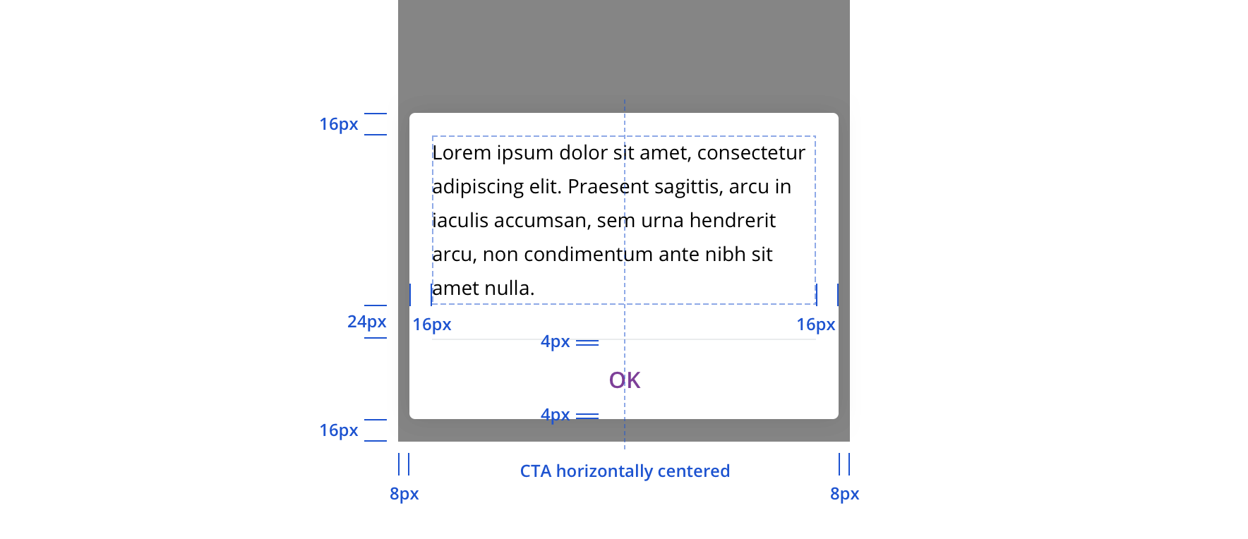
Default

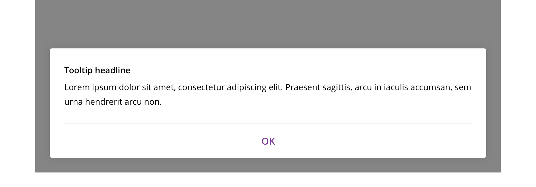
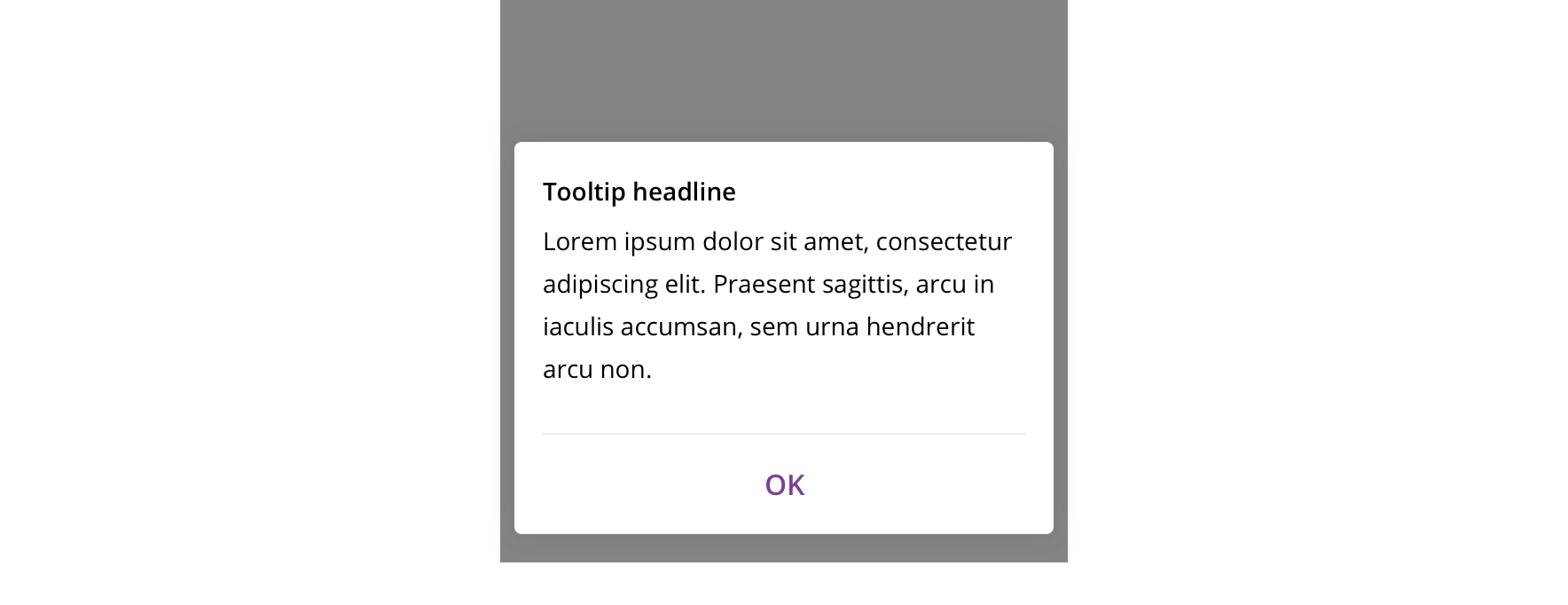
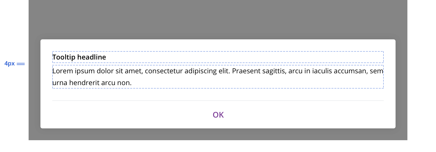
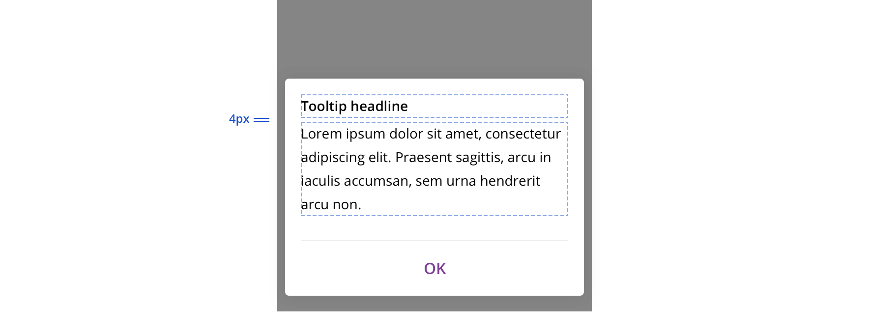
With headline

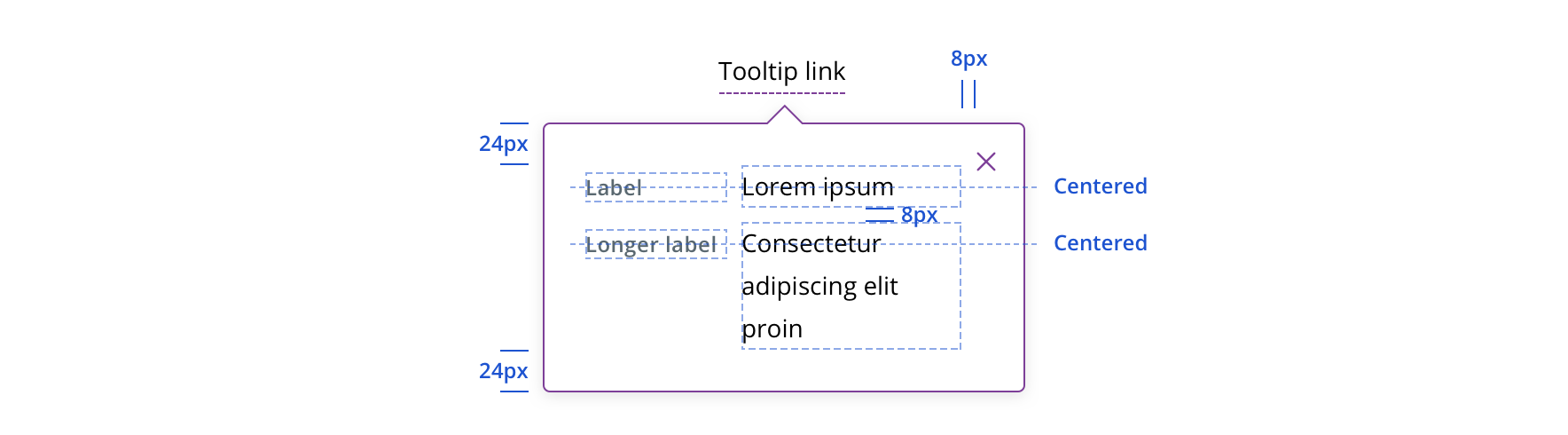
With labeled categories

Usage
Displaying content that explains a term that the user needs for more clarity in the context of a page.
Behavior
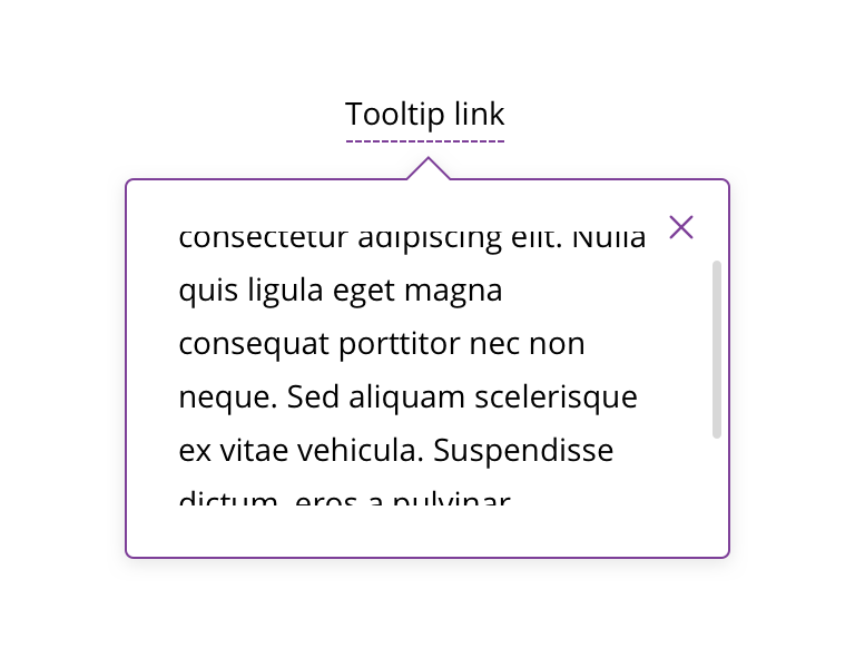
Tooltips always appear on-click /-tap.
Always close by refreshing the page, clicking the close icon/CTA, hitting escape, or clicking outside the tooltip.

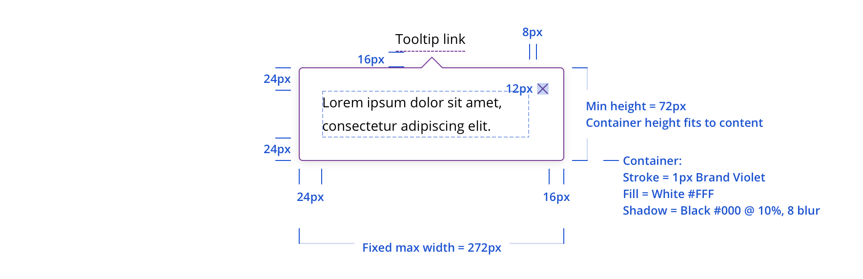
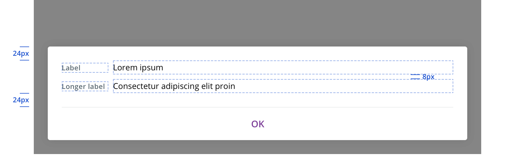
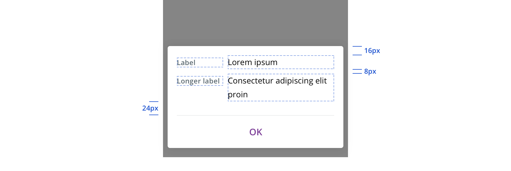
 Always fit the container to the content when the content doesn't fill the full fixed width
 On desktop, always default to show tooltip below what was clicked on if there is room
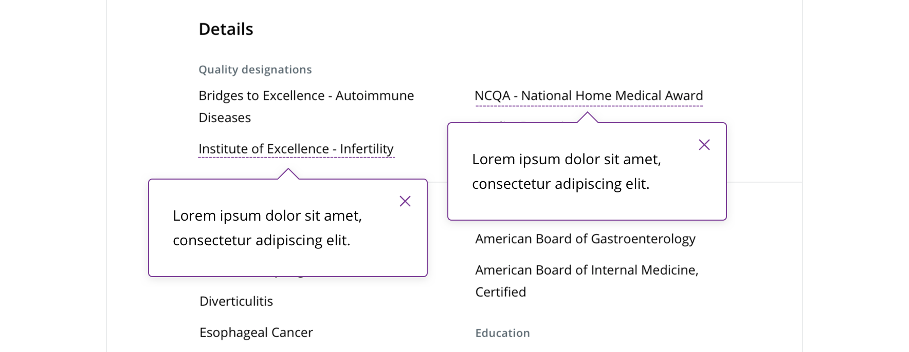
 Never have more than one tooltip open at once
 Never scroll on desktop or tablet
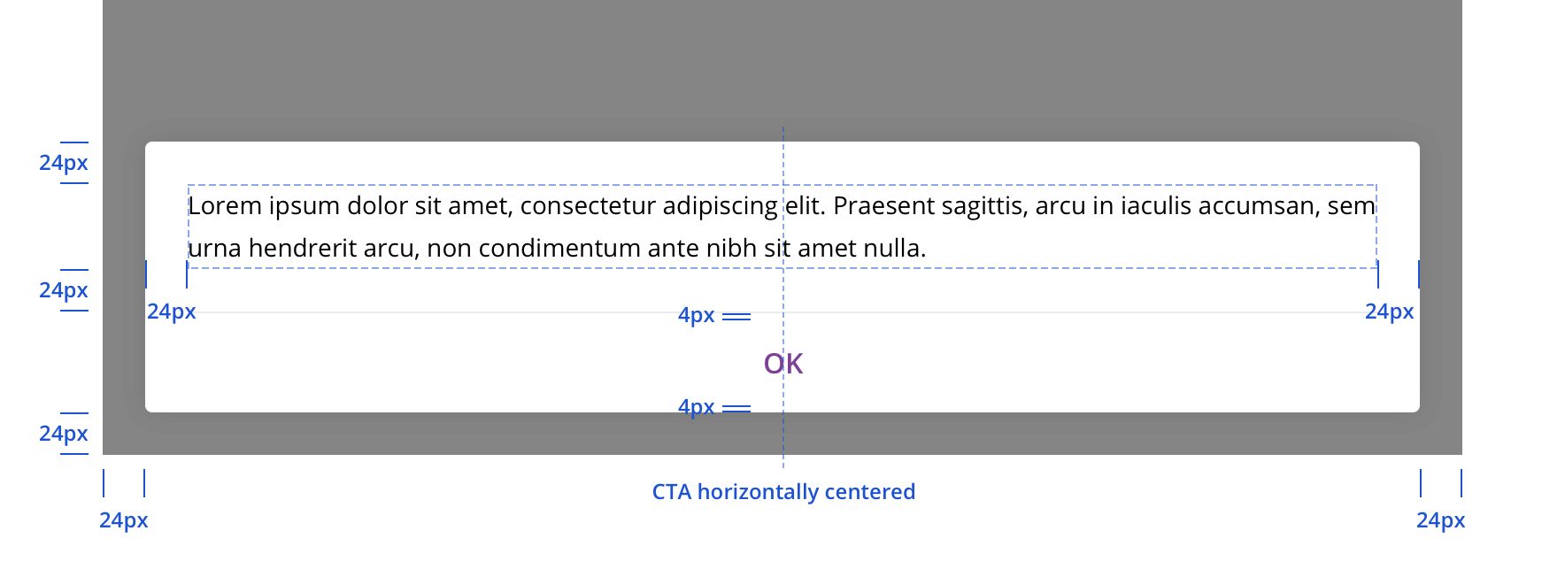
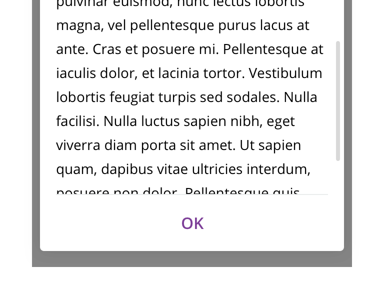 Mobile can scroll if the height of the tooltip is larger than the screen. In this instance, the "OK" CTA should stay pinned to the bottom of the viewport.
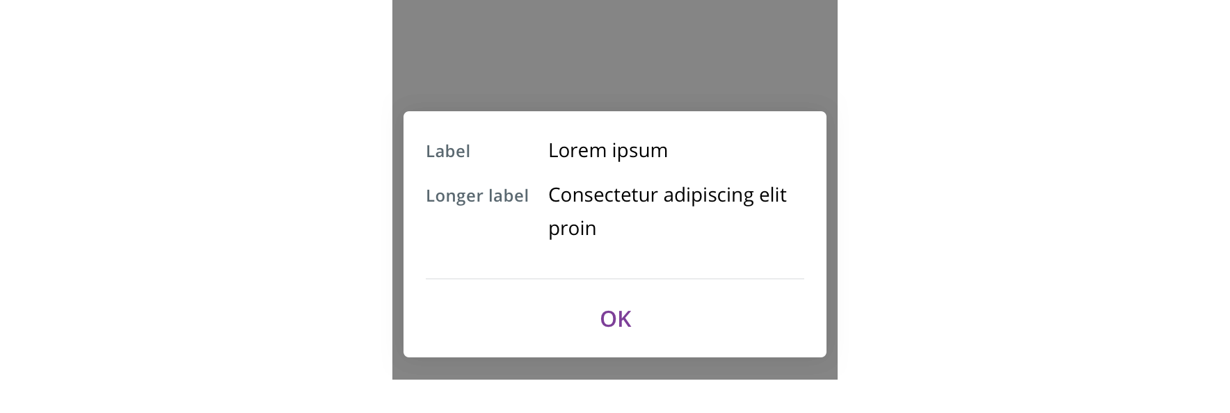
On tablet/mobile, always slide in from the bottom and vertically fit the container to the content.
Visual style
Default
With headline

With labeled categories
States
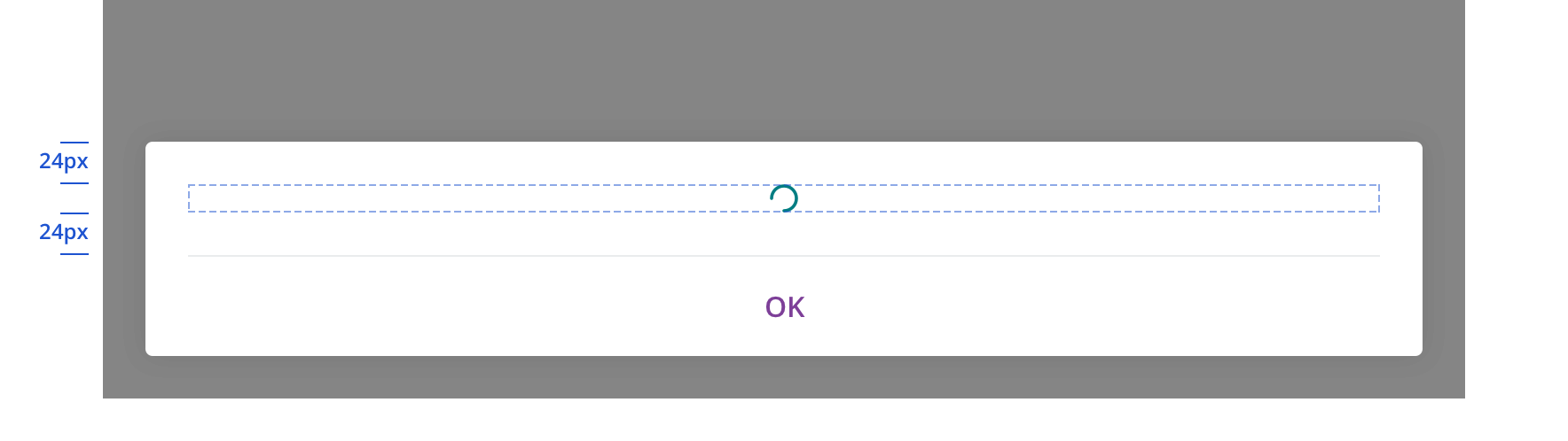
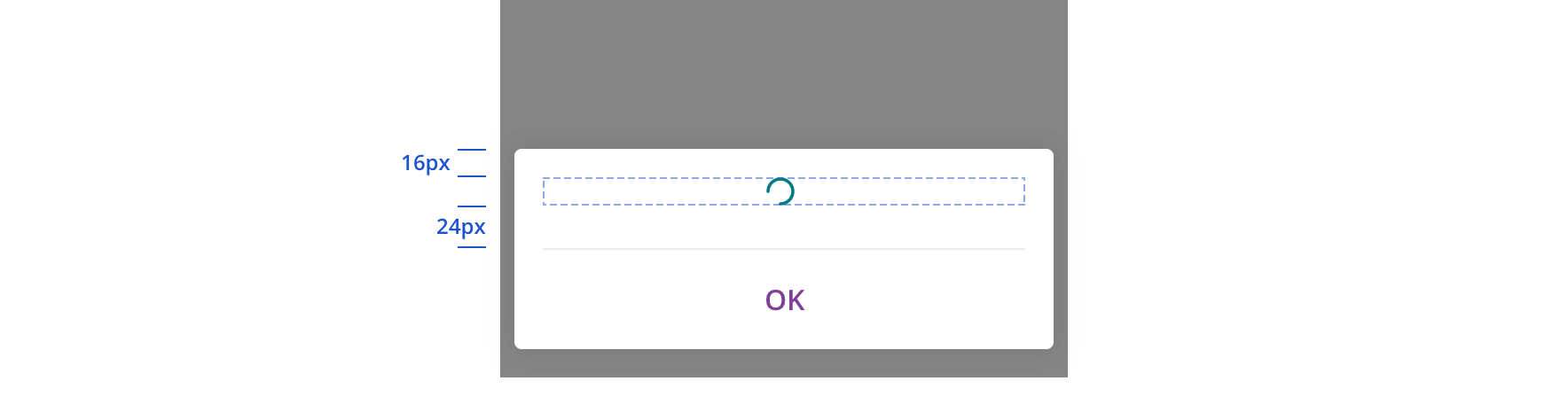
Spinner is used for a tooltip’s loading state.
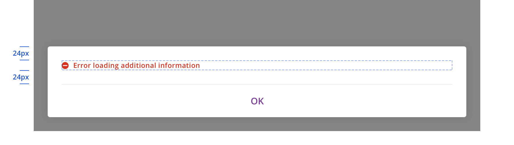
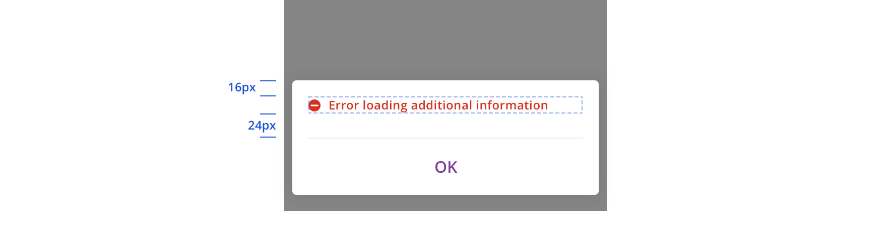
Tooltip error state always includes an error icon.

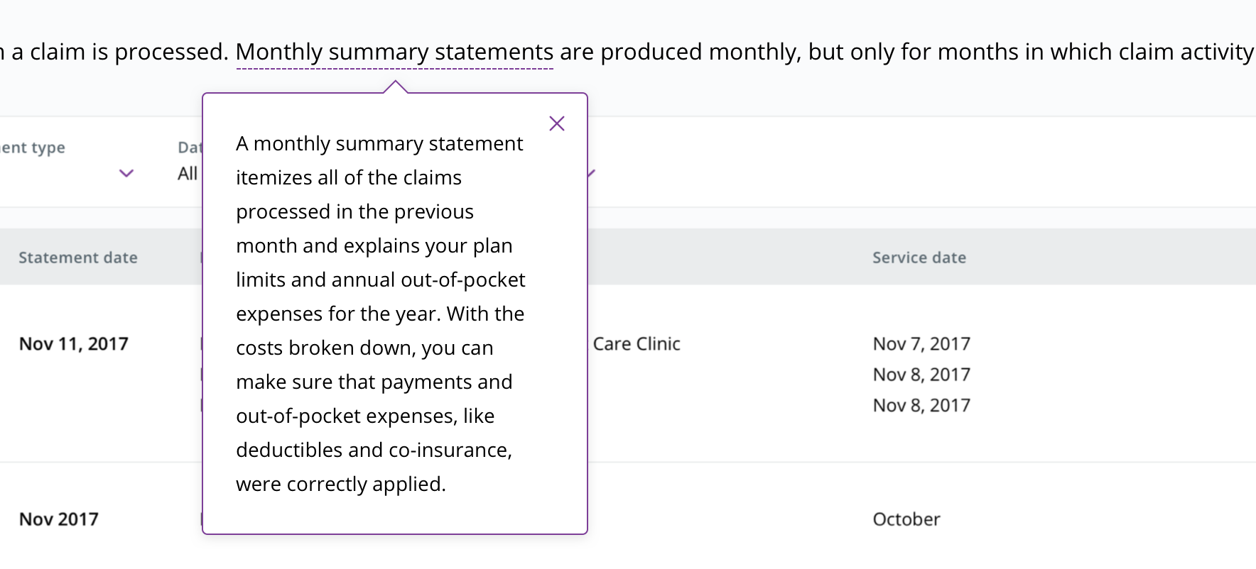
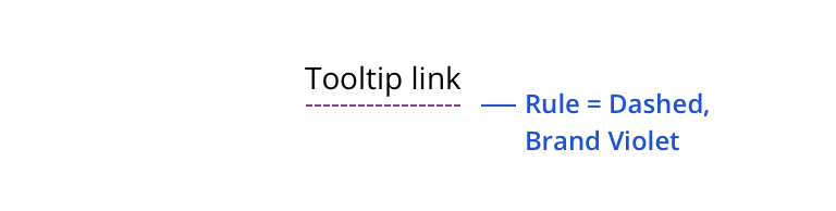 Always use the purple dashed line underneath text that requires a tooltip
 An info icon can also be used to trigger a tooltip
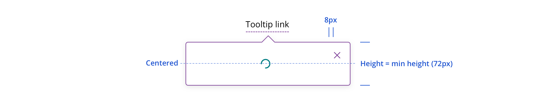
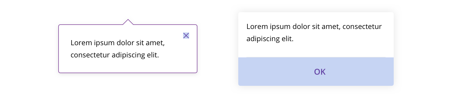 Always include a close option (12px close icon on desktop, "OK" text link on tablet/mobile)
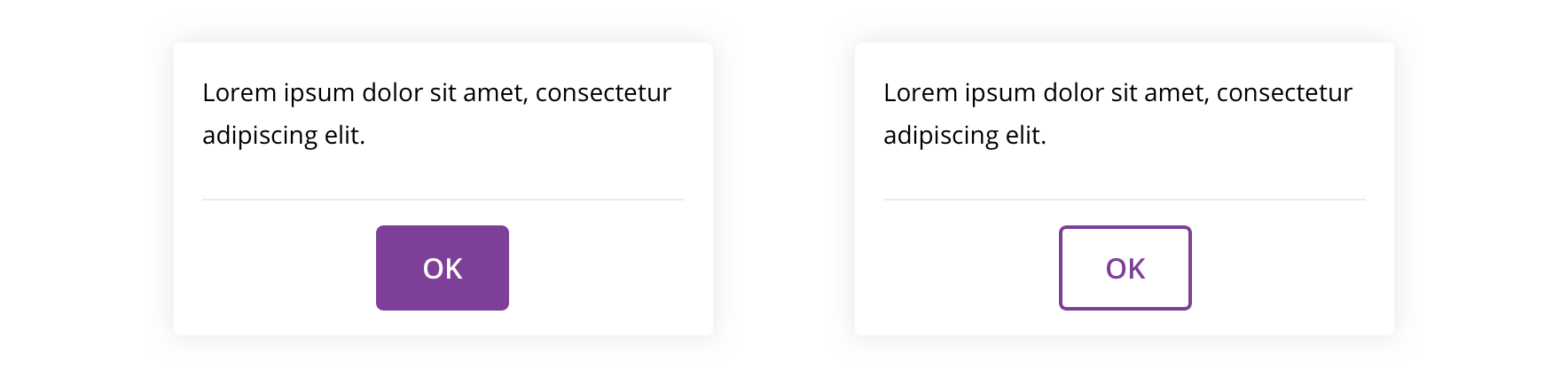 Never use a primary or secondary button as the CTA
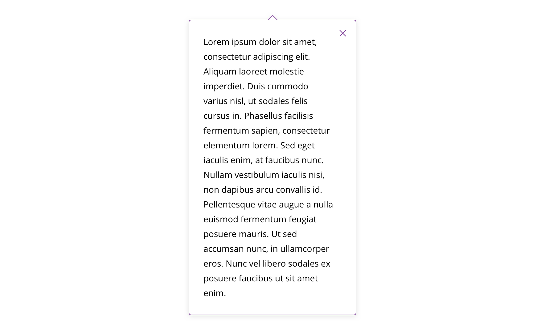 Avoid using large amounts of text. Ideal tooltip content length is 3 sentences or fewer (around 220 English characters).
 Avoid using text colors other than black
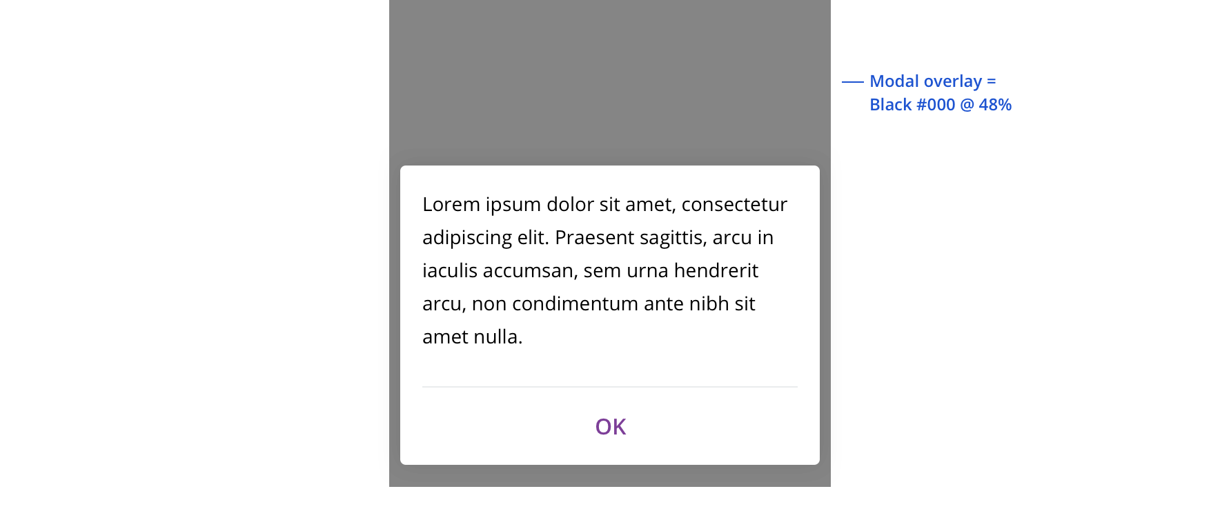 On tablet/mobile, always use a modal overlay
Content strategy
- Typically only requires body text, but headlines are acceptable when necessary
- Align on character counts, particularly with attention to mobile displays
- Avoid character counts over 220 English characters
Accessibility
Characteristics
- Popovers are made up of two parts
- Trigger =
Link/Button/ Image - Popover container
Keyboard/focus expectations
- Trigger element receives keyboard focus.
- Pressing Enter / Spacebar (varies by screen reader) to activate trigger (do not use a hover event).
- Users can move on from trigger without triggering the popover.
- Focus must be trapped within popover container.
- Focus is placed on the popover’s close button. (In the future if we add another action in the popover we will need to revisit this rule.)
- Pressing ESC or activating the close button dismisses the popover.
- Focus must return to the popovers trigger element.
Screen reader expectations
- Screen Reader must announce presence of the popover. (how it announces will be determined as component is being made.)
- Close button must be identified to user as a close button.
- User must be notified the popover has been closed / dismissed (done by placing focus back on trigger).