Datepicker
Lets users choose a single date from a visual calendar.
Not yet developed
Because this component hasn't been developed, its documentation is incomplete. If you need to use this in a feature, it will need to be developed as a component first. Work with system team if the component is needed.
Page sections
Type
Default
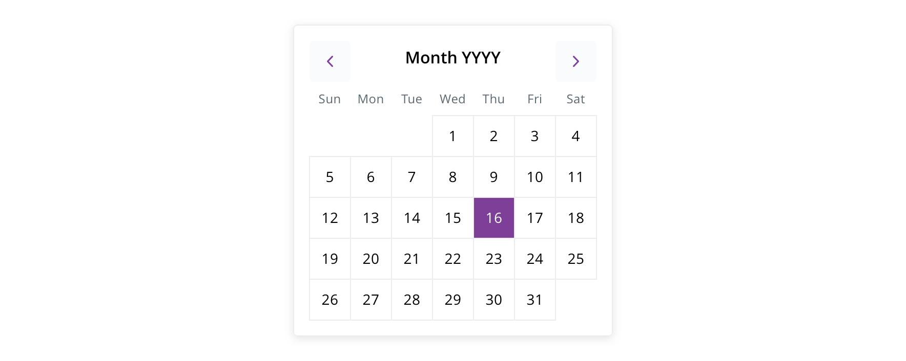
Usage
The datepicker is used for prompting users to visually select a single date within a form.
Never use the datepicker for:
- Any date that is many years in the past or future (i.e. Birth Date)
- Date ranges
Behavior

 The datepicker is triggered from a form select
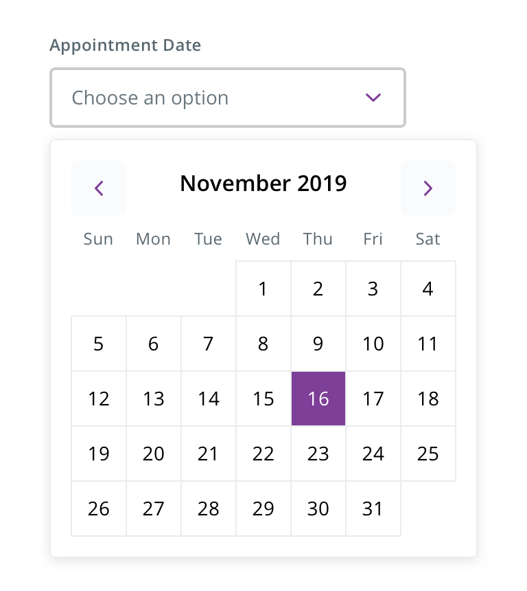
 Always drop datepicker down from a select on desktop and tablet
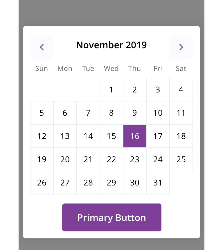
 Always pop up from the bottom as a full-width, half modal on mobile
Visual style
Always maintain the component width.
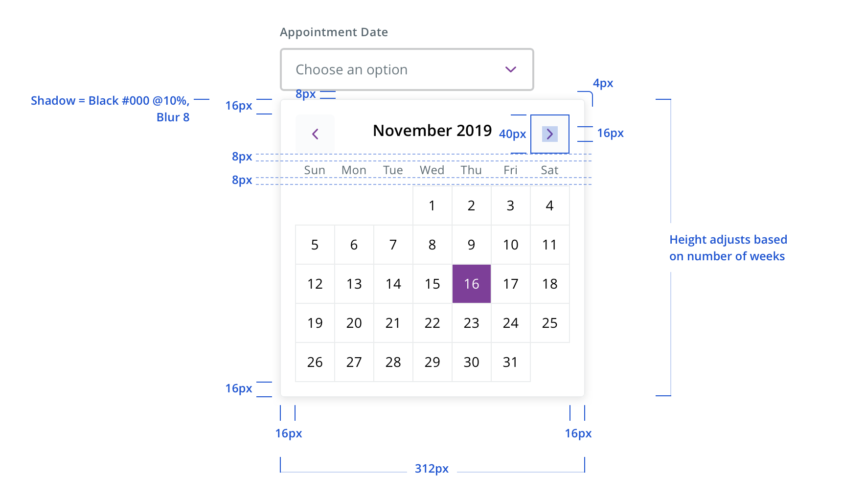
 On desktop and tablet, always keep datepicker left-aligned to its parent dropdown. It doesn’t have to right align with the dropdown
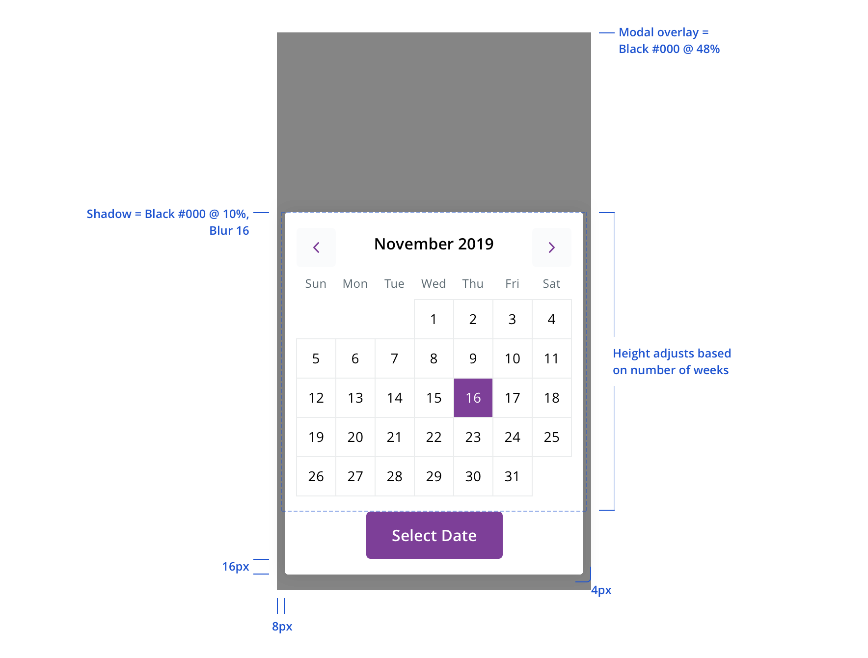
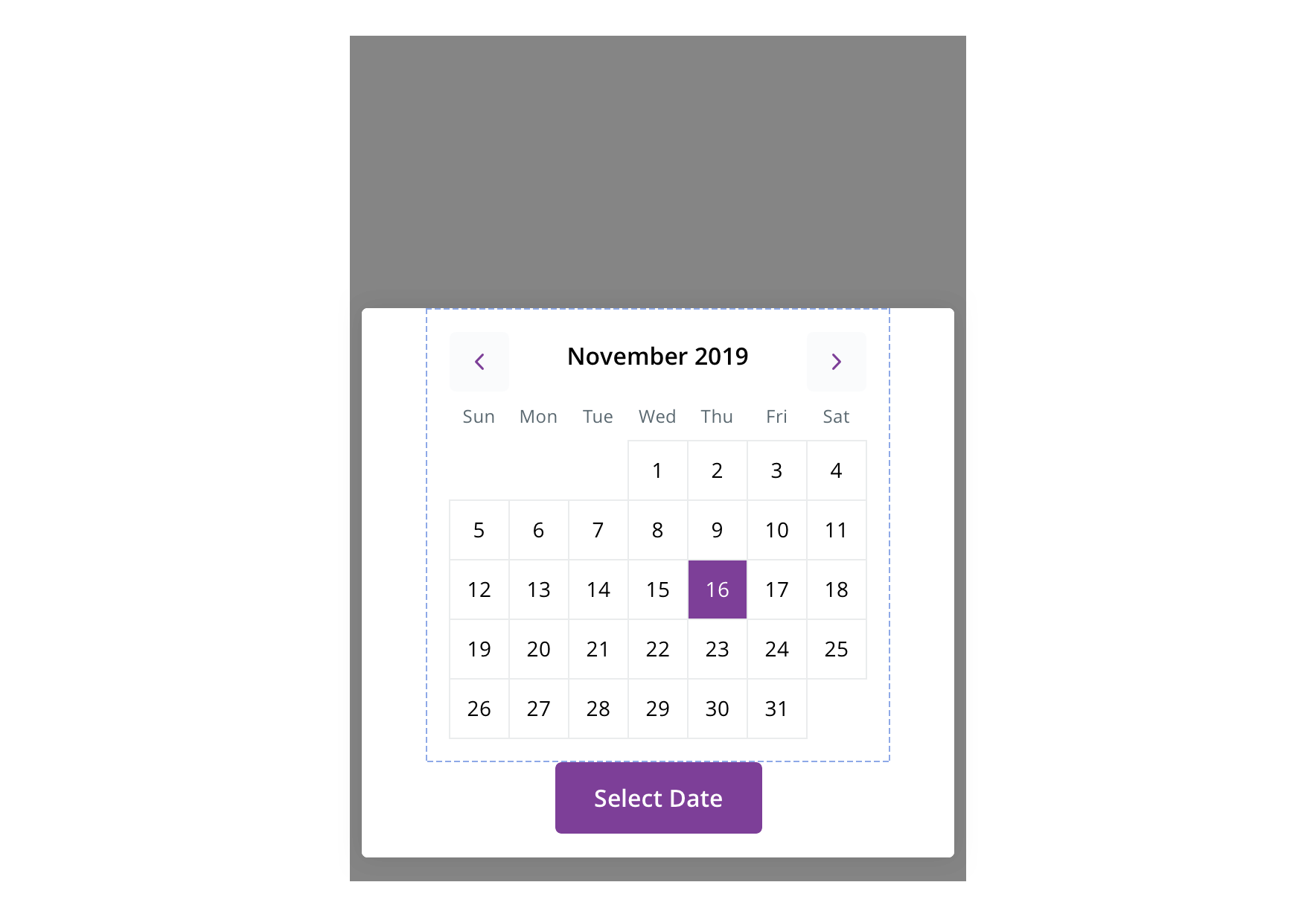
 On mobile, if it doesn’t fit the screen exactly, the modal background maintains the screen margins, but the picker states the same size
Accessibility
Characteristics
- Appears as a text input field with a calendar icon which triggers the Datepicker (calendar widget) that appears below the input field
- Alternatively appear as a dropdown which triggers the calendar widget that appears below the dropdown when activated
Keyboard/focus expectations
- Enter/Spacebar opens calendar widget
- Escape closes the calendar widget.Calendar widget receives keyboard focus when opened
- Keyboard focus is trapped within calendar widget until it is closed or dismissed
- Up/down arrow keys move to the same day in the next/previous week
- Left/right arrow keys move to the next/previous day
- Alt + Page Up/Page Dn switches to next/previous year
- Page Up/Page Dn switches between the next/previous months
- Date selected by pressing Enter
- Keyboard focus returns to field containing the trigger for the calendar widget
Screen reader expectations
- Date constraints are announced. Ex. “Dates prior to today’s date are unavailable.”
- Calendar controls are announced
- Date currently receiving focus is announced. Ex. “Tuesday, September 25, 2018.”
- Selected date is announced. Ex. “Tuesday, September 25, 2018, Selected.”
