Text input
A single-value text input control most commonly used for short text within a form.
Page sections
Type
Default

Usage
Text inputs can be used for prompting the user to enter short, text-based input values such as:
- Text
- Passwords
- Email addresses
- Phone numbers
Avoid using text input for potentially multi-line text, like ratings or messages to providers. Use textarea instead.

 Use text inputs for short text, like names

 Avoid using text inputs for longform text
Behavior
Text inputs can be developed to display an error on specific input conditions.

 Wrap error text if longer than text input width

 Avoid immediately erroring input
Visual style
Text inputs can be variable width and should align to the content they’re paired with when appropriate.

 Never make a full page width text input on desktop

 Never rely on the placeholder text to explain the type of information intended for the text input. Always include a label.

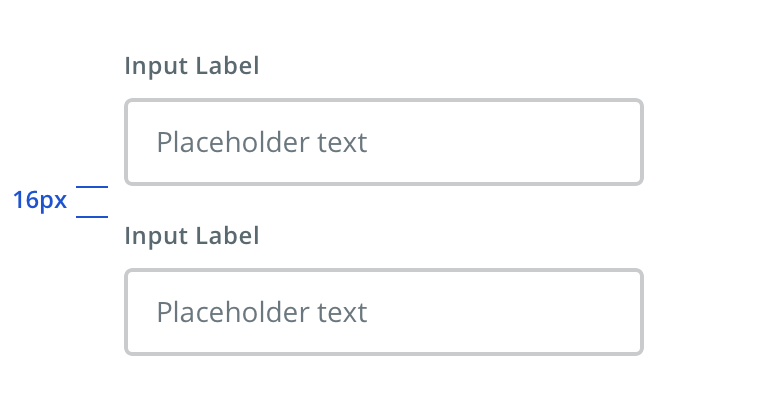
 Vertically stack inputs when possible

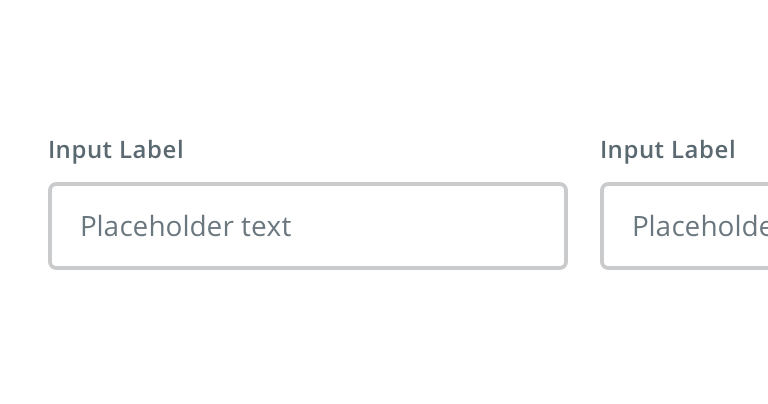
 Avoid inputs that horizontally align
Content strategy
- Use Title Case for labels
- Use Sentence case for more editorial, instructional placeholder
- Follow normal casing, grammar, and punctuation practices (e.g. use a period for full sentences)
- Adhere to parallel syntax when authoring multiple text fields on a single page / screen
Accessibility
Characteristics
- Edit state: Label must be programmatically connected to input field
- Completed: Valid data entered
Keyboard/focus expectations
- Pressing the tab key moves focus to the text input field
- Focus is received differentiating it from other fields in the form
Screen reader expectations
- Label is read and edit is announced indicating field is ready to receive data. Ex. “First Name, Required, Edit”
- For mobile, floating labels announced by screen reader
- Required field and constraints such as special formatting is announced Ex. “Phone Number, ##########, Edit”
