Textarea
A multiline text input control most commonly used within a form.
Page sections
Type
Default

Usage
Textareas are used for prompting the user to enter sizable amounts of free-form text such as:
- Ratings
- Messages to providers
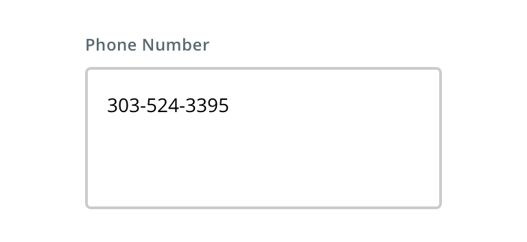
Avoid using text input for potentially single-value text, like phone numbers or email addresses. Use text input instead.

 Use textarea for longform text, like ratings

 Avoid using textarea for single-value text
Behavior

 Textarea should automatically overflow and scroll to accommodate text
Textarea can be developed to display an error on specific input conditions.

 Avoid immediately erroring textarea
Visual style
Textareas can be variable width and should align to the content they’re paired with when appropriate.

 Never make a full page width textarea on desktop

 Never rely on the placeholder text to explain the type of information intended for the textarea. Always include a label.

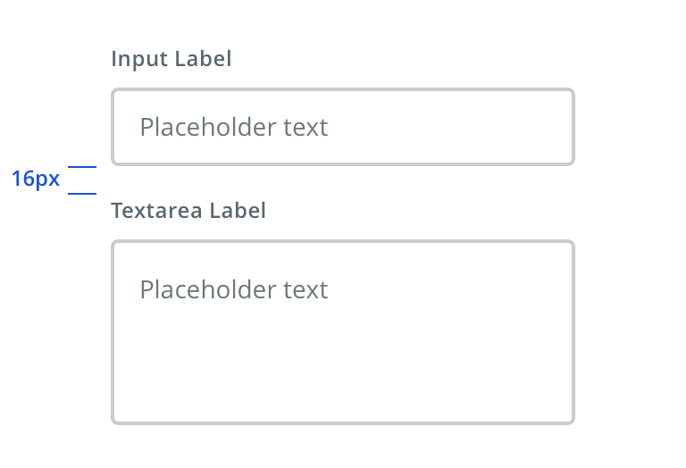
 Vertically stack textareas when possible, even when used with text inputs

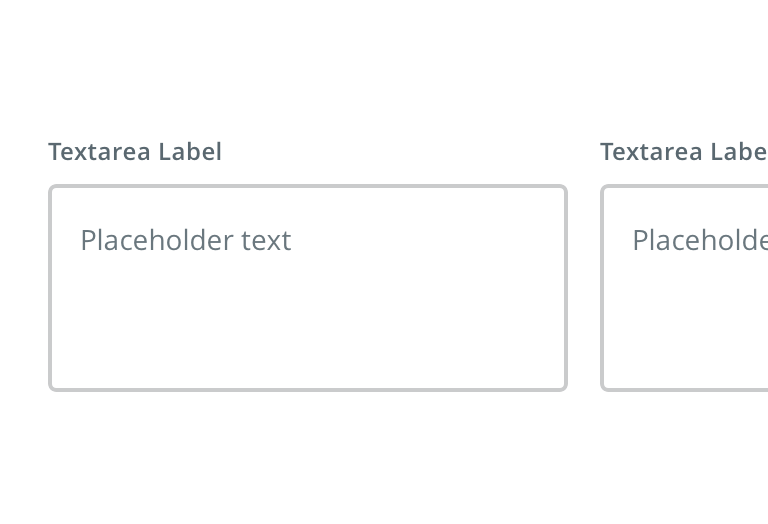
 Avoid inputs that horizontally align
Content strategy
- Use Title Case for labels
- Use Sentence case for more editorial, instructional placeholder
- Follow normal casing, grammar, and punctuation practices (e.g. use a period for full sentences)
- Adhere to parallel syntax when authoring multiple text fields on a single page / screen
Accessibility
Characteristics
- Label should be programmatically associated with the textarea
- Required or optional field in indicated
- Clicking on label shifts focus to the textarea
Keyboard/focus expectations
- Receives focus when tabbed to
Screen reader expectations
- Label is announced. Ex. “Comments…”
- Constraints; maximum number of characters, if field is required, Characters remaining etc. Ex. “…(Optional), textarea, maximum of 1000 characters, edit”
