
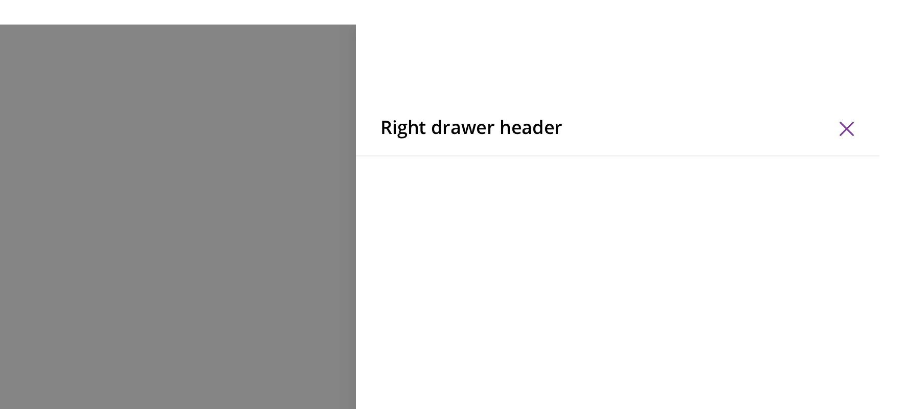
Right drawer
A dialog overlay used for a small user task that will alter the page behind.
Page sections
Type
Default
Usage
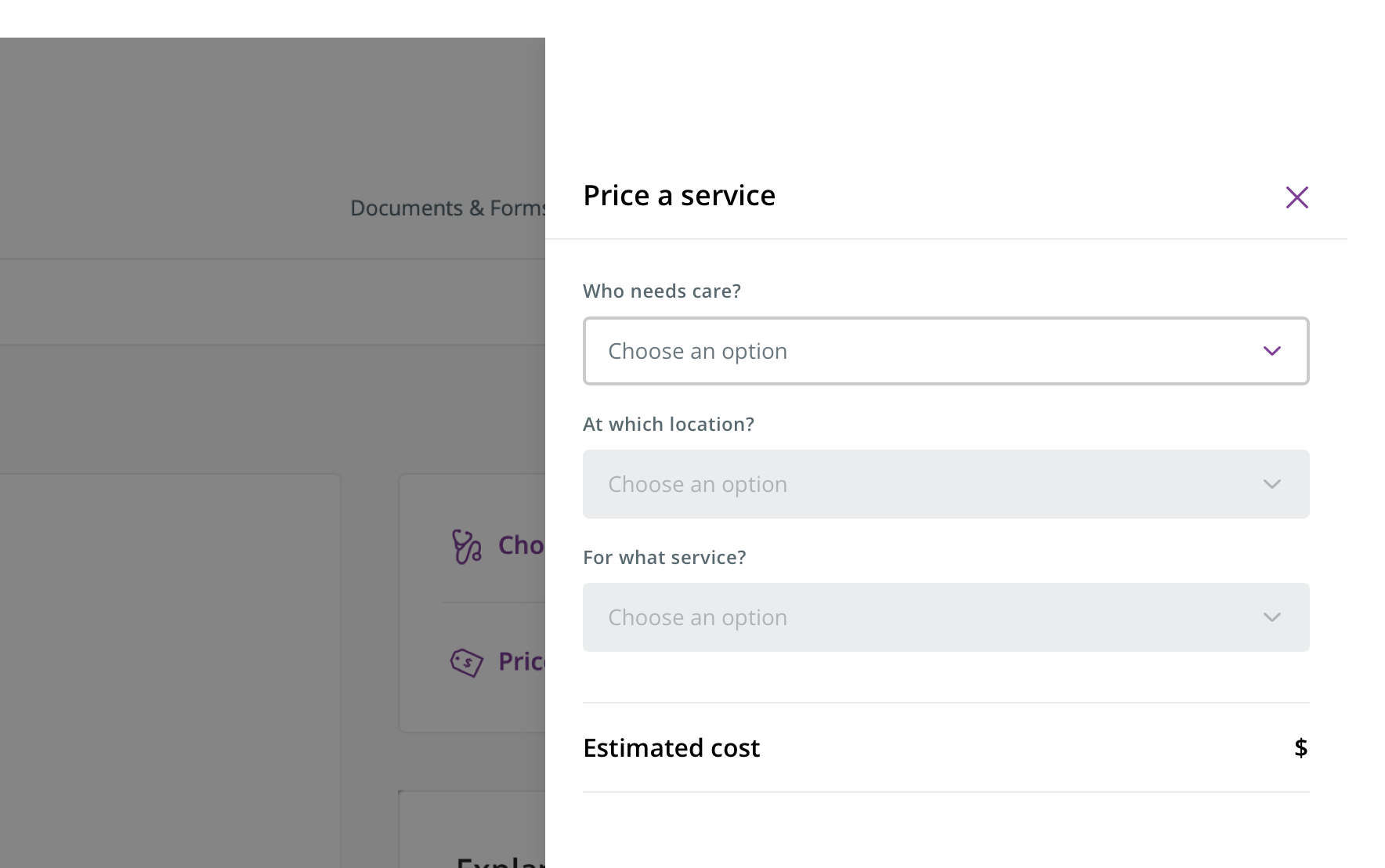
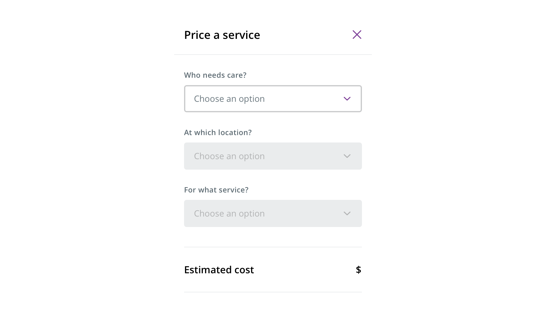
 Use for small tasks that change the page it overlays, such as pricing a procedure for a provider
Avoid using for lengthy flows or large amounts of content.
Avoid using as a substitute for a separate page, such as a list of PDFs to download.
Behavior
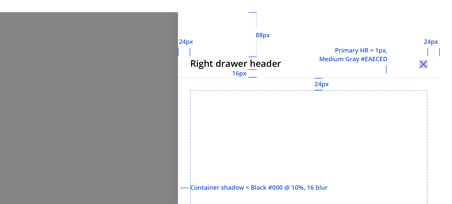
The right drawer slides in from the right as the overlay fades in. Closing the right drawer should reverse these actions.
Always allow the right drawer to be dismissible, by:
- Clicking/tapping the close icon
- Pressing the escape key
- Clicking outside the right drawer area
Avoid content that scrolls.
On tablet, the width stays the same as it is for desktop.
 On mobile, all drawers become full page modals and should follow modal rules
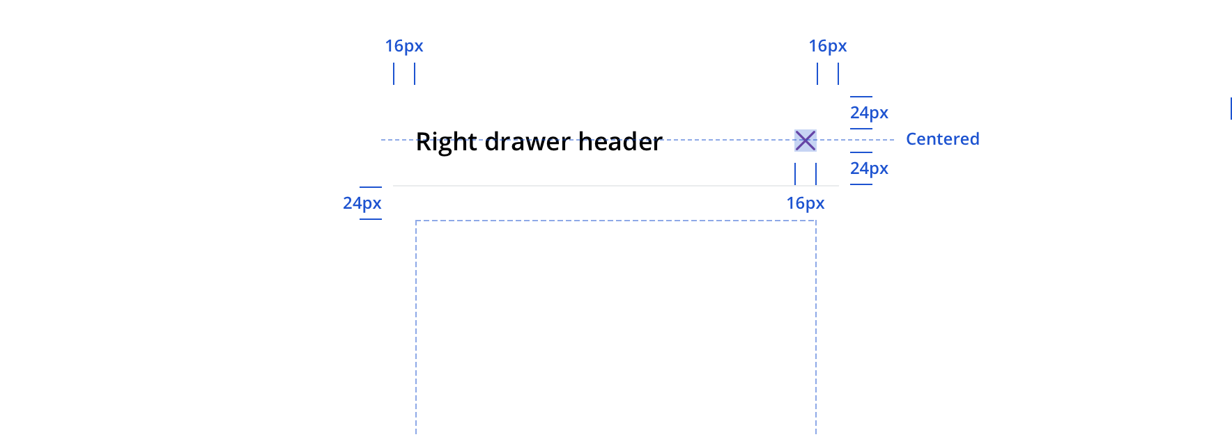
Visual style
Accessibility
Characteristics
- Manually triggered by user
- Display additional information and may include a call to action
Keyboard/focus expectations
- Enter/Spacebar activates trigger on manually activated right drawer
- Focus is trapped within right drawer until it is closed
- All buttons in right drawer receive keyboard focus and operable with a keyboard alone
- Tab/Shift + Tab move focus to the next/previous focusable element
- Escape closes the dialog
- When the dialog is closed, focus returns to the trigger element
Screen reader expectations
- Announces dialog when it appears. Ex. “Web Dialog…”
- “X” close button, upper right corner, is identified as a “Close” button. Ex. “…Close Button”
- For dynamic content (e.g. Price a service) errors will be read in order of appearance within the content