Expansion panel
Contains information that can be toggled to display or hide in order to save on vertical real estate.
Page sections
Types
Expansion panel

List item

Usage
Use expansion panels and list items when displaying lots of information that can be summarized in a single line, while still needing the full detail available.
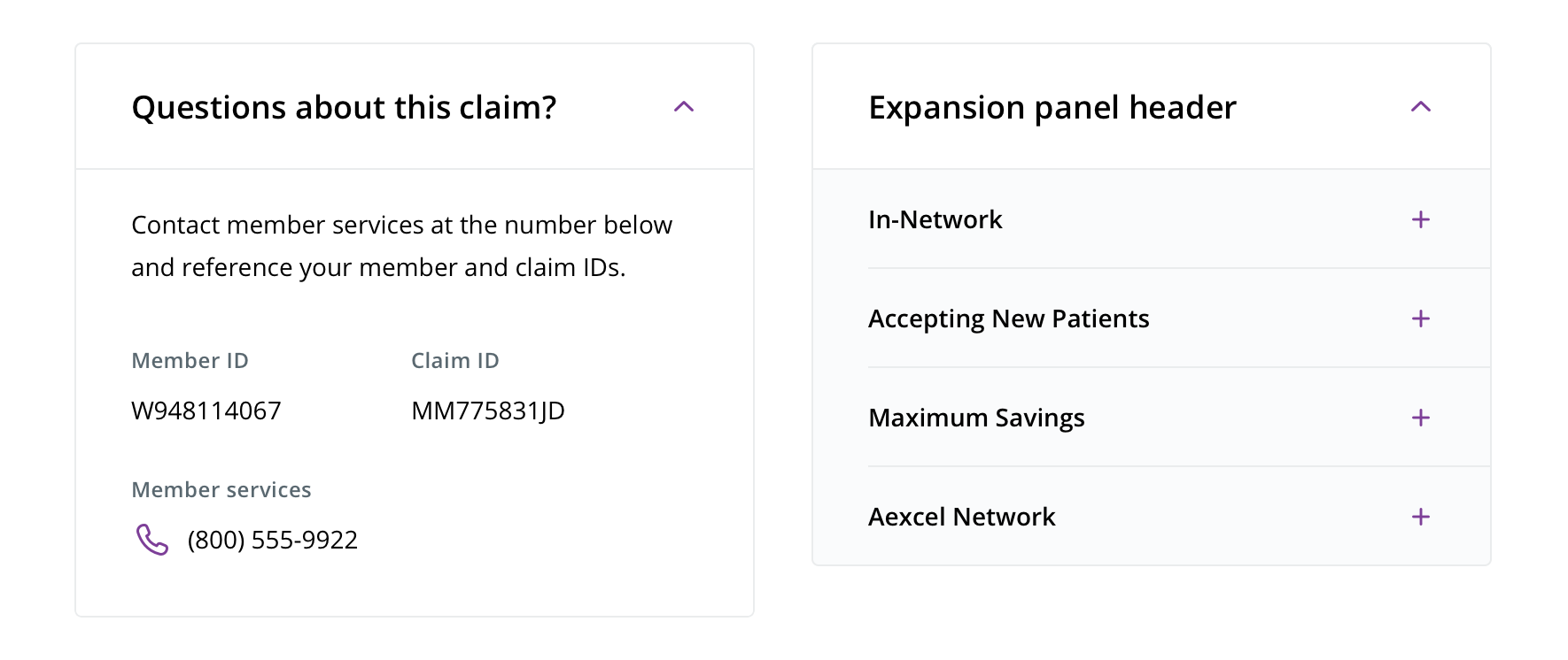
 Expansion panels can be used on their own or with more expandable list items under them

 List items can be used on their own outside of a parent expansion panel
Behavior
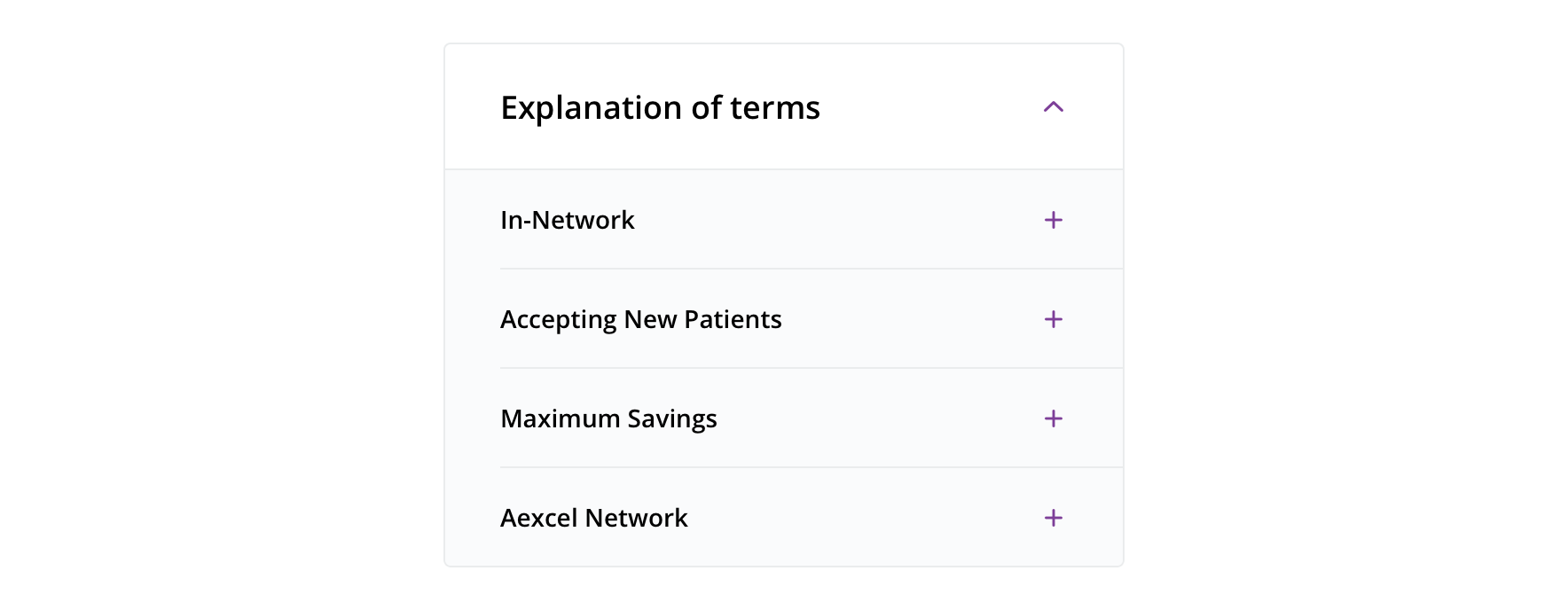
 If there aren’t many items together, default parent expansion panel is expanded on page load
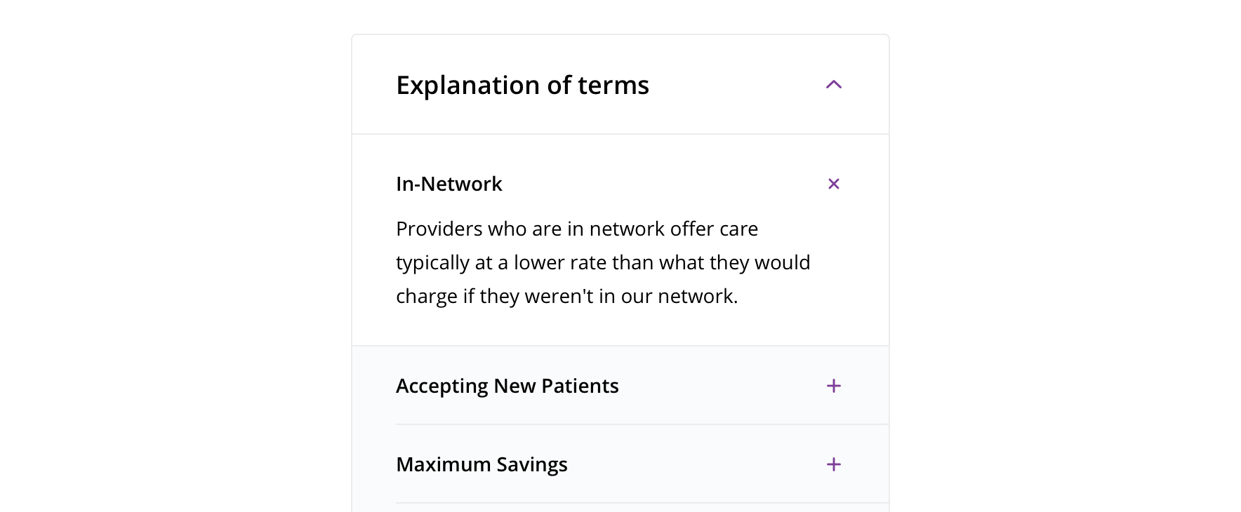
 Avoid having list items that are expanded on default
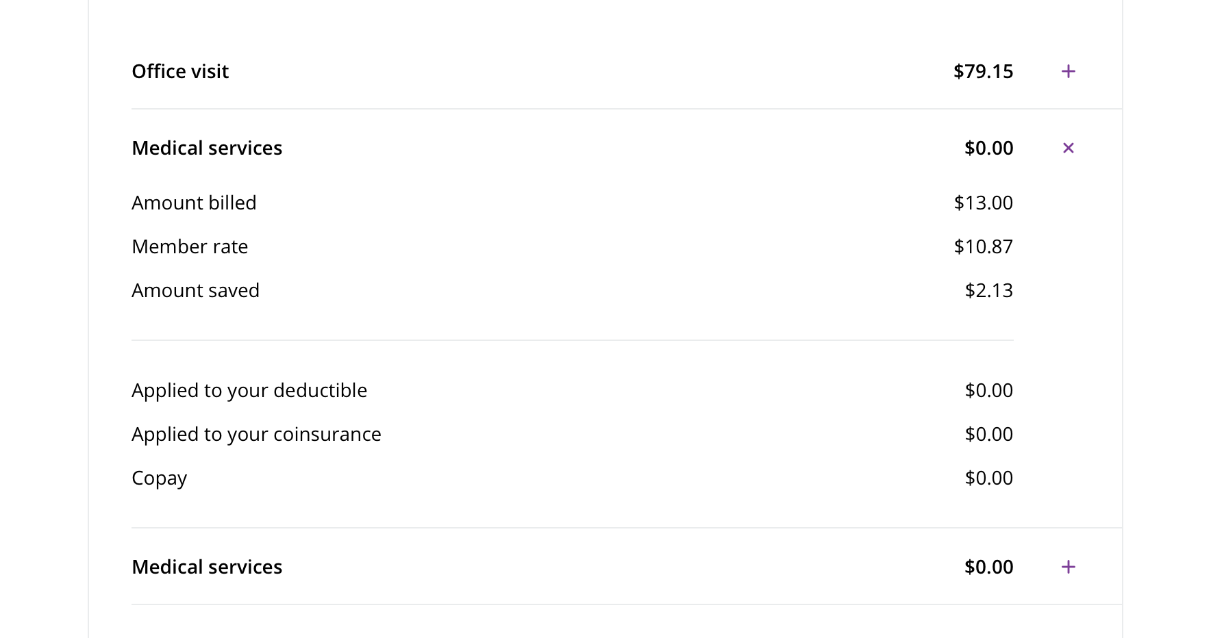
 Only one item should be open at a time. When an item is open and another is clicked on, the first list item should collapse.
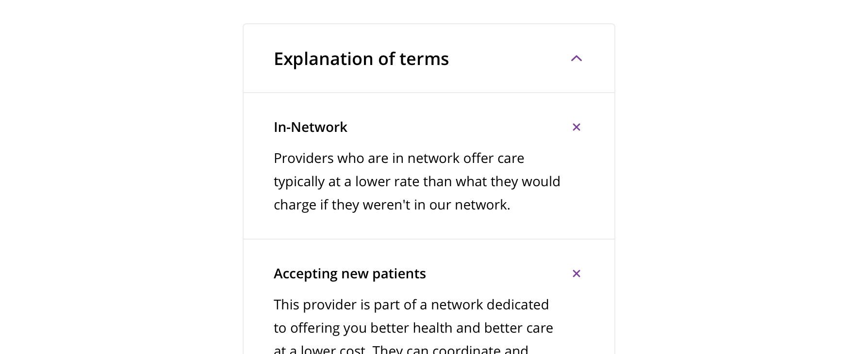
 Avoid multiple items being opened at once

 The entire item (expansion panel header or list item container) should be clickable, not just the icon
Visual style
Expansion panel
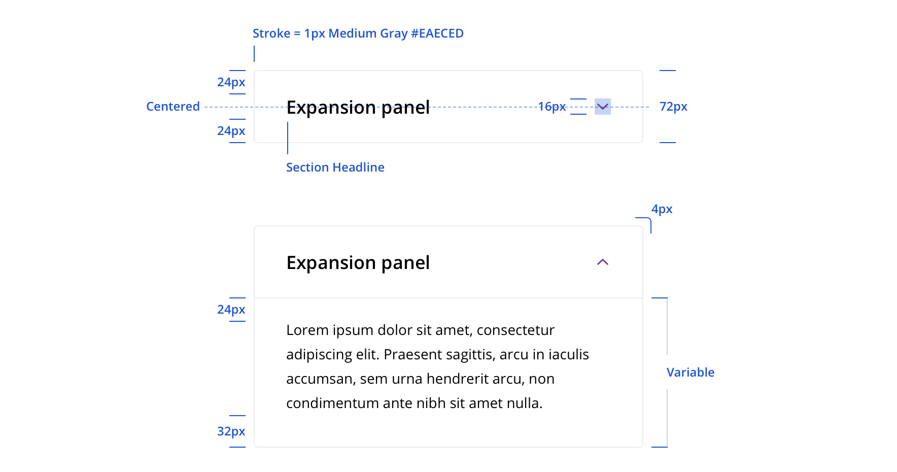

List item


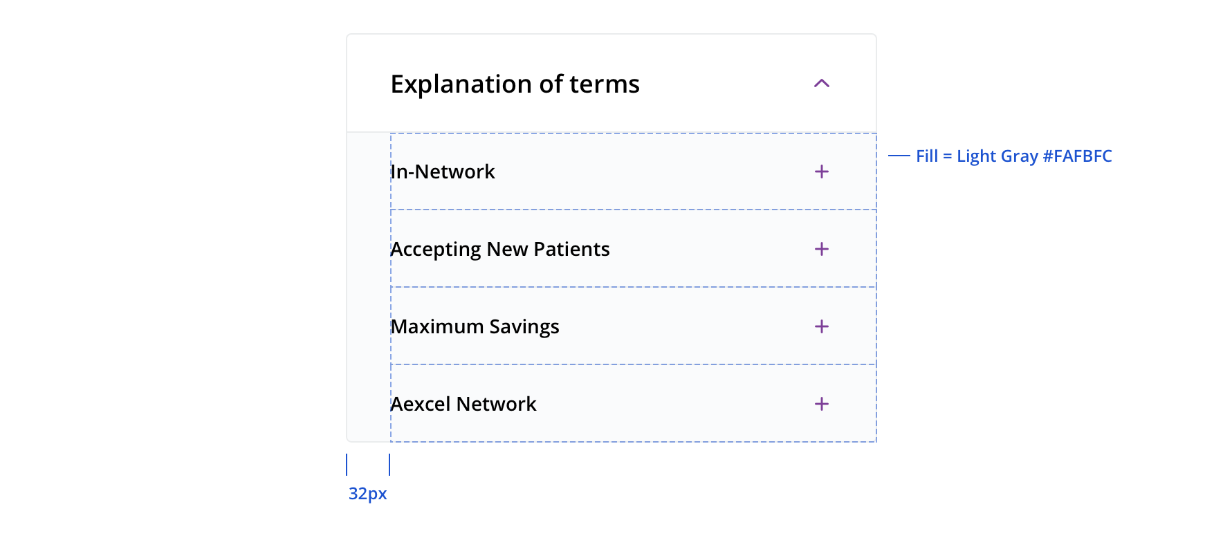
 List items contained within a parent expansion panel should be on a light gray background
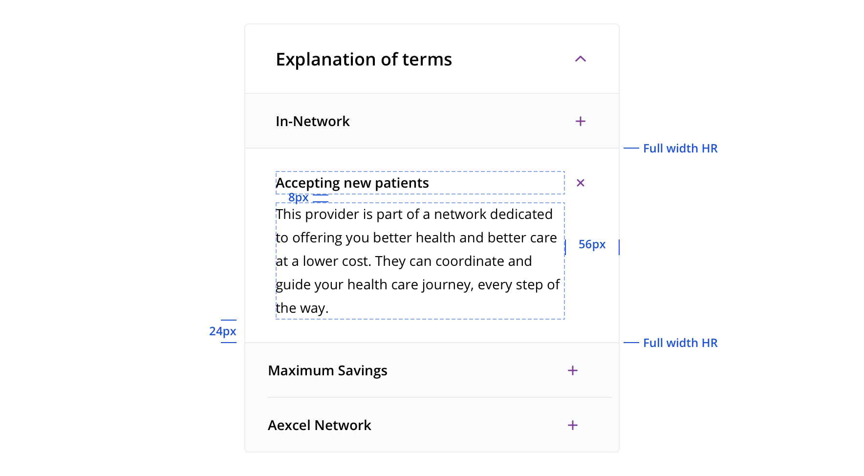
 Opened list items within a parent expansion panel have a white background

 Try to use “Small Body Emphasized” as the list item header
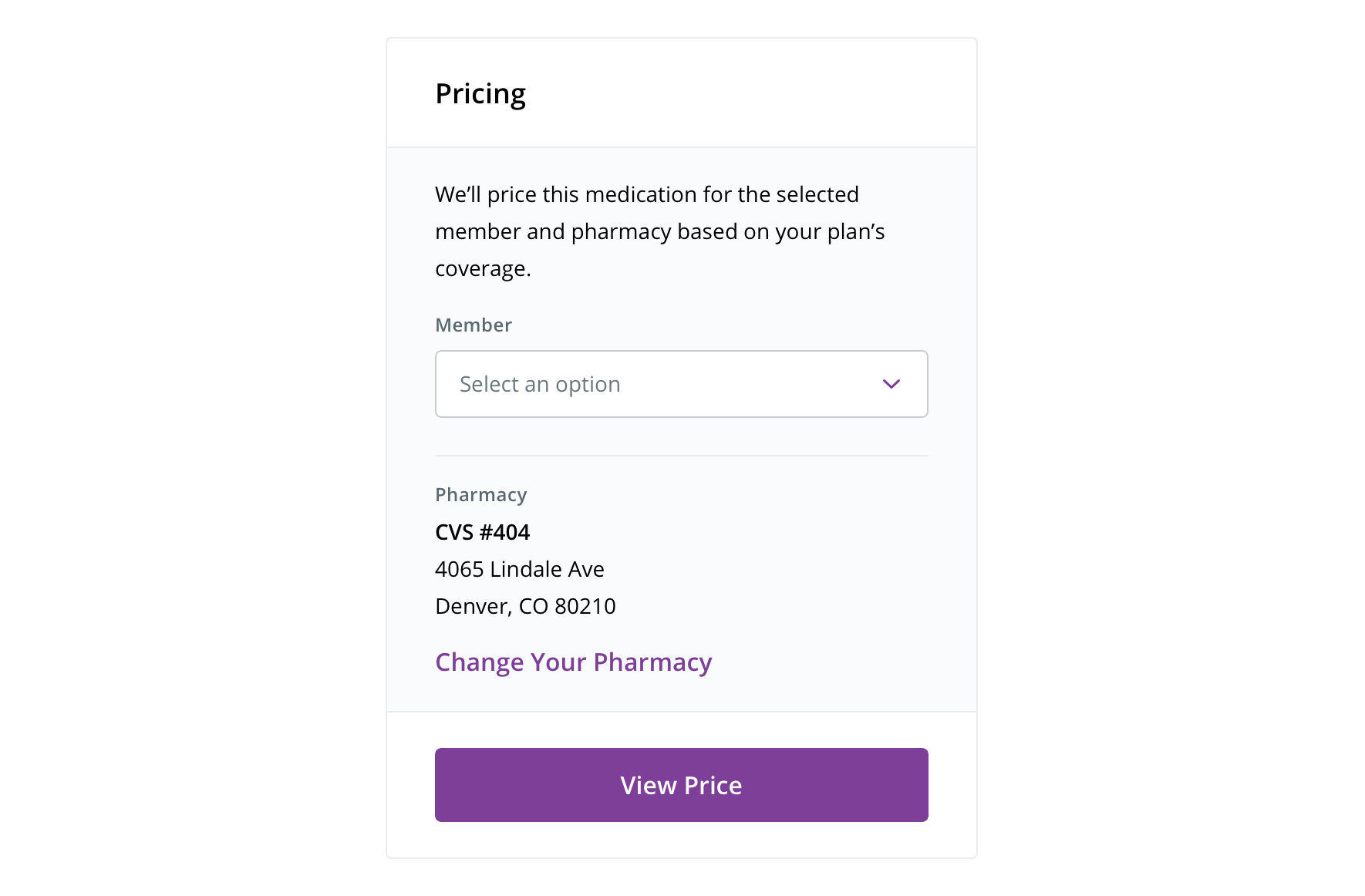
 Information can be contained in an expansion panel-looking container without the function of an expansion panel
Content strategy
- An Expansion Panel can include:
<h#>(Heading level) and body copy
Accessibility
Characteristics
- Two parts to an expansion panel:
- Panel Header – Button controlling the expand / collapse of panel
- Panel Body – Content that is visible/hidden content
Keyboard/focus expectations
- Tab - moves from one focusable element to the next.
- Shift + Tab moves from one focusable element to the previous.
- Note - Focus stays on the trigger when users activate it. In other words, when a user activates the trigger they will hear the collapse / expand state change and can elect to move anywhere they want to on the page.
Screen reader expectations
- Panel triggers are read out as “label, role, status”. Ex. “Explanation of Terms, button, collapsed”
- If we want to the content to be read out as section headers, we’ll need H tags in each trigger. This will make it possible for users to navigate the page with the screen readers by hearing the accordion triggers as headings. (H tags are not required for the component.)
