Textarea
A multiline Textarea input control most most commonly used for long text within a form.
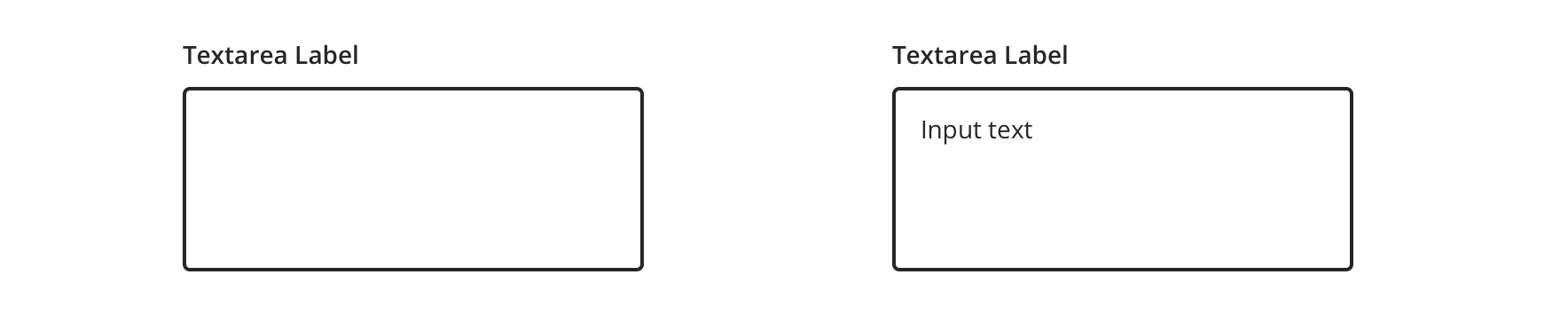
Type
Default

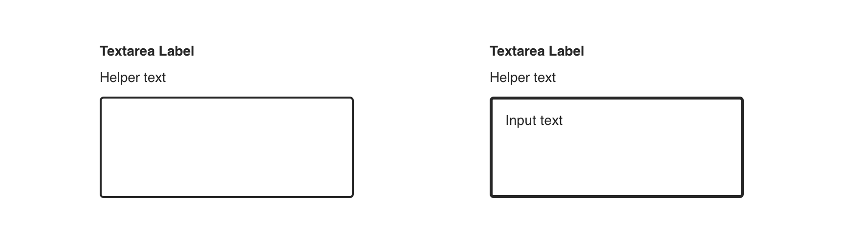
With Helper Text

Usage
Textareas are used for prompting the user to enter sizable amounts of free-form text such as:
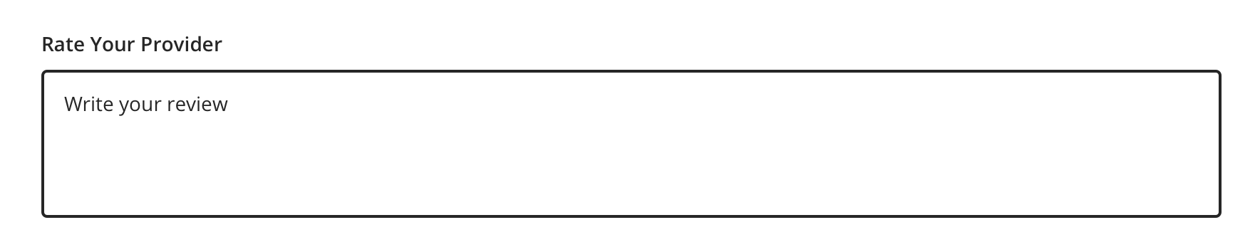
- Ratings
- Messages to providers
Avoid using Textarea for single-value text, like phone numbers or email addresses. Use Text Input instead.
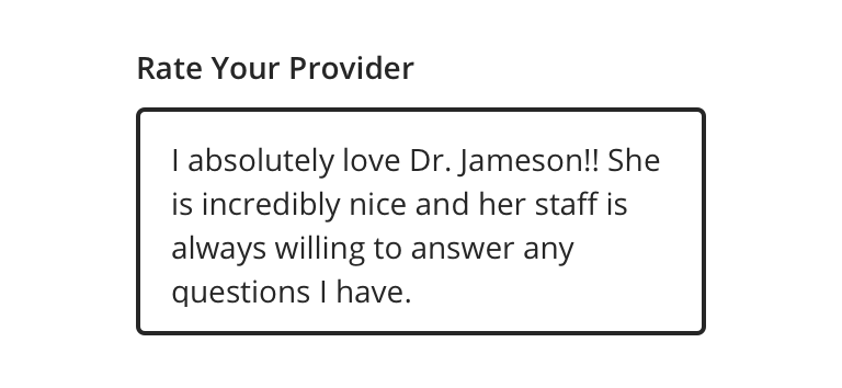
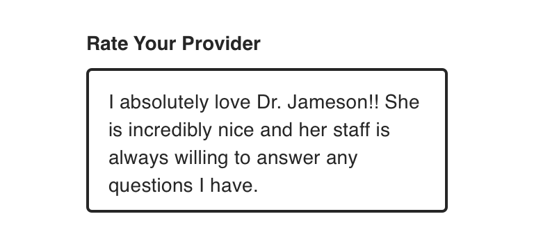
 Use Textarea for long-form text, like ratings
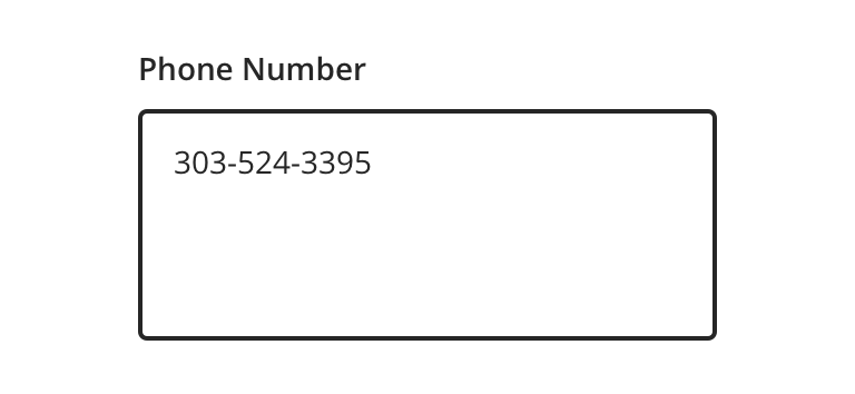
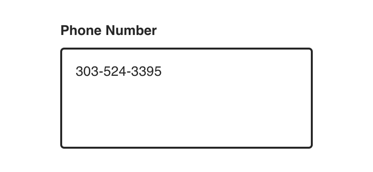
 Avoid using Textarea for single-value text
Behavior

 Textarea should automatically overflow and scroll to accommodate text
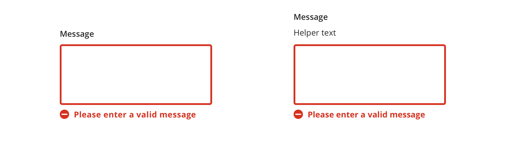
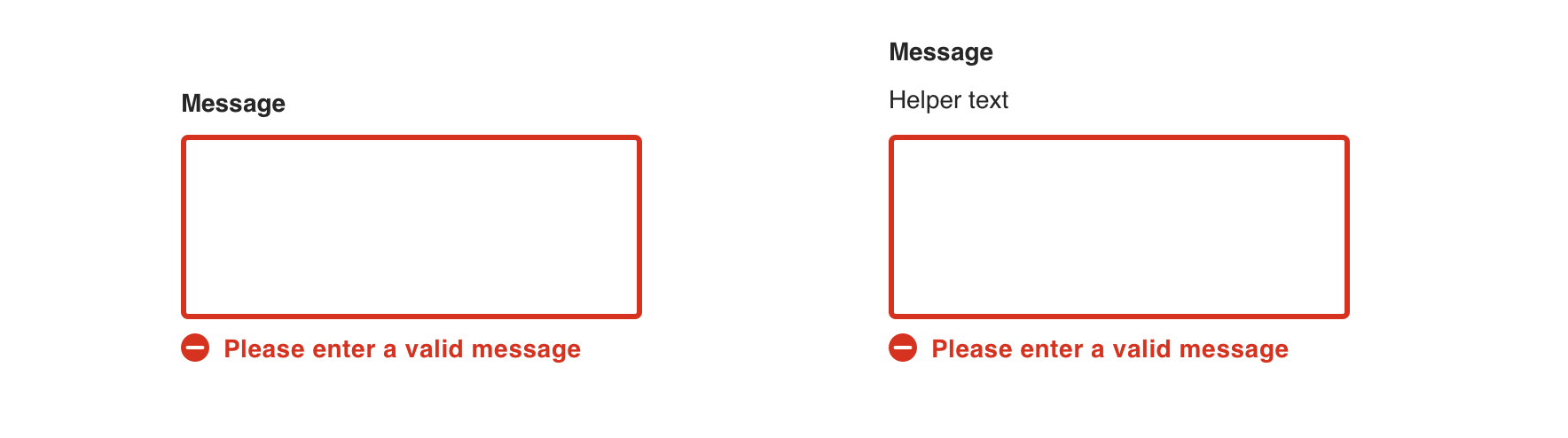
Validation & Errors
Upon validation, if the Textarea does not have valid input, an error message will be presented. Error messages should not replace helper text.
Visual style
Textarea’s can be variable width and should align to the content they’re paired with when appropriate.
 Never make a full page width Textarea on desktop

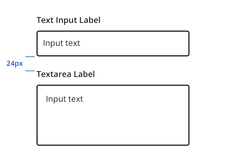
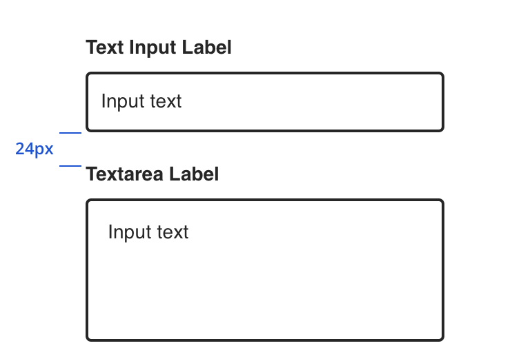
 Always use a label that clearly identifies the input content
 Vertically stack Textarea's when possible, even when used with Text Inputs

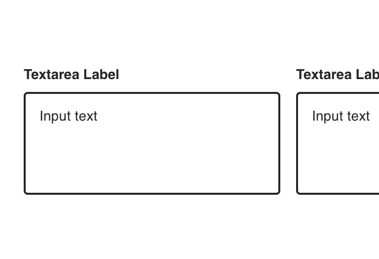 Avoid inputs that horizontally align
Content Strategy
Labels
- Unlike Text Input, Textarea labels often include more actionable, branded copy as the component prompts long-form responses.
- Aetna: Use Title case for consistency with Text Field labels
- Exceptions include long sentence-like labels
- CVS: Use Sentence case for labels
Placeholder & Helper Text
Placeholder text is not built into the Text Input component. Instead, use helper text above the field to give guidance, as needed.
Requirements & Errors
Mark optional fields as such. Otherwise fields are assumed required.
- Form views with multiple fields should display “All fields are required unless marked optional”
View Aetna’s error guidelines.
Accessibility
Characteristics
- Edit state: Label and helper text must be programmatically connected to Textarea
- Required or optional Textarea is indicated
- Completed: Valid data entered
- Error state: Textarea should only show error validation messages after a user has interacted with a particular field
Keyboard/Focus Expectations
- Pressing the tab key moves focus to the Textarea
- Clicking Label or field focuses the Textarea
- Error state announced upon focus and receives focus
Screen Reader Expectations
- Reading Order: “{Label Name}, edit multi-line, {Helper text}”
- Error: “{Label Name}, edit multi-line, {Helper text}, {Error message}”
*Note: This is a general experience expectation, but there are variations in how assistive technology responds on certain browsers and screen readers.