Radio Button
A common input control for users to select only one option from a number of choices.
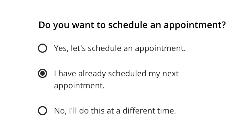
Type
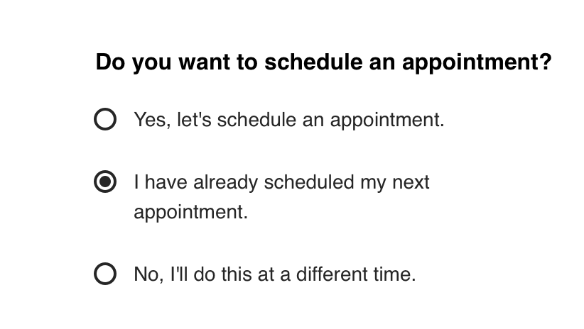
Default


Usage
Use for forms where users can choose a single item from a group of options.


 Radio Button groups should always have a Fieldset Legend that clearly defines or explains what the grouped options are for
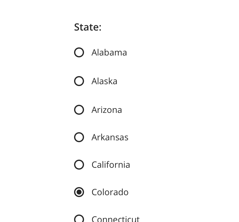
 Use for a small set of choices

 Avoid using Radio Buttons for items that have many choices. If available options can be collapsed, consider using a Select

 Never use a single Radio Button as a toggle control, such as, “I agree to Terms and Conditions”

 Avoid pairing with other interactive elements, such as a tooltip or link
Behavior
Validation & Errors
Upon validation, if any Radio Buttons within a Fieldset do not have a valid input, an error message will be presented.


Visual Style

 Always maintain 44px minimum hit area for each option
Content Strategy
The overall content goal of Radio Button is to present a set of selections with appropriate scope and style for the screen’s context.
Fieldset Legend
Because Radio Button appears in sets, a Fieldset Legend should be used to introduce the selections. Think of a Legend as a tone-setter for the content that follows.
Grammar & Punctuation
- Selections should follow best practices for capitalization and punctuation. For example, more complex selections should be Sentence case, and only full sentences should receive end punctuation
- Sets, simple and complex, should adhere to parallel syntax
Actions
- Because Radio Button is inherently selectable, actions are not required to highlight that behavior
- Instead, use actions to clearly define the selection’s intent. Distinct selections are especially important for Radio Button as users can select only a single option
Character Count
Radio Button can accommodate multiple lines, but as with all selection-related content, short and sweet options make it easier for users.
Errors
Radio Buttons presented in a Fieldset receive validation and require an error message for the set. View Aetna’s error guidelines.
Accessibility
Characteristics
- One Radio Button can be checked per group
- Once a Radio Button is checked, it can only be unchecked by selecting another Radio Button
- User interaction with label or icon checks/unchecks the Radio Button
- A label clearly identifies purpose for each Radio Button
- Radio Buttons are only presented as a group, use a Fieldset Legend to define group
Keyboard/Focus Expectations
- Enabled Radio Buttons receive focus with user interaction and keyboard navigation (tabbing, arrow keys)
- When tabbing into a Radio Button group and no option is selected, Spacebar selects a focused Radio Button
- Using up/left or down/right arrow keys within Radio Button group focuses the previous or next Radio Button, respectively
Screen Reader Expectations
- Reading Order: “{Radio Button Label}, selected/not selected, Radio Button, 1 of 2”
- Disabled Radio Button is not focused but findable using Browse Mode. When highlighting with Browse Mode: “Radio Button, unavailable, selected/not selected, {Radio Button Label}”
- Error on Fieldset: “{Fieldset Legend Label}, group, {Error message}”
- Error on Radio Button: “{Radio Button Label}, selected/not selected, Radio Button, 1 of 2, {Error message}”
*Note: This is a general experience expectation, but there are variations in how assistive technology responds on certain browsers and screen readers.