Button
A common action that can be easily performed with one click or tap.
Types
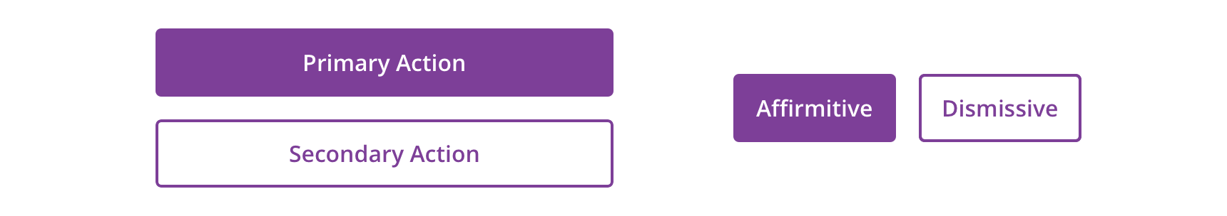
Primary


Secondary


Tertiary


Usage
Buttons represent actions, such as submitting data, launching elements, toggling visibility, etc. If navigating to a different site or page, a link should be used.
Overview
- Primary Button: Used to call attention to the main action of the page or large section. Though it should generally be used only once per page, Primary Buttons can be used multiple times if representing parallel primary actions, such as “Add to Cart.”
- Secondary Button: Used for general actions on a page or in a section
- Tertiary Button: Used for subtle actions on a page or in a section that are not a priority
Button Order
Primary actions should generally be presented first within a group of buttons.
 Avoid stacked buttons on responsive pages for directional navigation
For scenarios that require directional buttons in a horizontal group, the button type layout should appear in a more natural order.
Button Groups
Use button groups when you are presenting multiple priorities or emphasis.


 For button groups that have multiple priorities, use Primary along with Default or Tertiary Buttons pending on emphasis. These buttons usually perform complimentary actions.
Similar Priorities

 For actions that have similar priorities, group either Secondary Buttons or Tertiary Buttons together

 Avoid grouping Primary buttons together
Width
The width of the button will be defined by its content (text label).


Primary and Default Buttons should generally be full-width on mobile. On desktop, they also be full-width if they’re within small content regions.
Buttons may support variable width based on its label length for specific scenarios that may require a smaller CTA. Considerations of label length should be accounted for in addition to minimum touch target, which is 48px x 48px.


Behavior
Label Wrapping
Button will wrap labels that extend beyond the Button width bounds due to long character lengths or large font-sizes that may be dictated by the user’s font settings.


Button Labels will default to centered alignment when single line, and will display left aligned when wrapped for improved legibility.
Visual Style

 Buttons should have a minimum 16px margins between other objects in horizontal layouts, as well as, 16px above and below in relation to other content

 Avoid long labels
Icons
Icons can be added adjacent to the label as a decorative element that is relative to the action or purpose of the button.
 Icons can be leading or trailing relative to the label
Leading or trailing placement should be influenced by usability and context of the icon & action.
 Avoid using only an icon to communicate a button's purpose or action
Content Strategy
- Use Title Case
- Lead with a verb
- Aim for short actions, around 1-4 words
- Use simple global commands when possible: Save, Back, Next, Apply, etc.
- Add specificity with purpose (e.g. “Assign as Primary Care Physician” brings necessary meaning to the action, compared to the shorter “Assign”)
- For parallel-use button such as “Add to cart” there should be aria-label or aria-labelledby which allows assistive technology to distinguish between other buttons with the same name. The visible label should start, for example: “Add to cart <name of product>”
- For buttons that require more context which read individually, use aria-describedby to give assistive technology more information about what the button relates and its possible actions.
Accessibility
Characteristics
- Performs actions such as submitting a form, opening a dialog, cancelling an action, or performing a command such as inserting a new record or displaying information
- Operates with “Enter” key and “Spacebar” key
- Button Labels will default to centered alignment when single line, and will display left aligned when wrapped for improved legibility.
Focus Expectations
- Focus stays on button until action is performed
- Following button activation, focus is set depending on the type of action the button performs
Screen Reader Expectations
- This is a general experience expectation, but there are variations in how assistive technology responds on certain browsers and screen readers.
- “{Button Label}, button”
- Disabled state: “{Button Label}, dimmed, button”
- Icons don’t need alt text since they are decorative and accompany a label