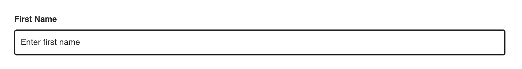
Text Input
An input element that accommodates single text entry. Most commonly used within a form.
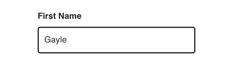
Type
Default


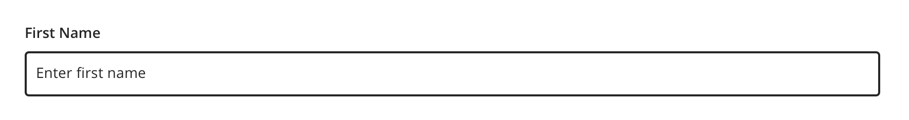
With Helper Text


Usage
Text Input can be used for prompting the user to enter text-based input values such as:
- Text (i.e. first name: alpha)
- Passwords (alphanumeric)
- Email Addresses (alphanumeric)
- Phone Numbers (numeric - 10 digits U.S.)
- A long phrase or paragraph (alphanumeric)
(please note that text is the only input type currently supported. Support for other types, such as tel and email
are coming soon)
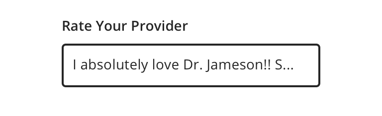
Avoid using text input for potentially multi-line text, like ratings or messages to providers. Use Textarea instead.

 Use Text Inputs for short text, like names
 Avoid using Text Inputs for longform text

 Always use a label that clearly identifies the input content
Visual style
Text Inputs can be variable width and should keep the width to the expected length for the content it’s intended for.
 Never make a full page width Text Input on desktop.

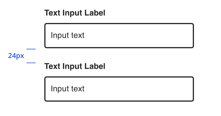 Vertically stack inputs when possible
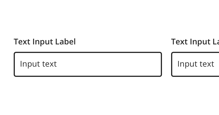
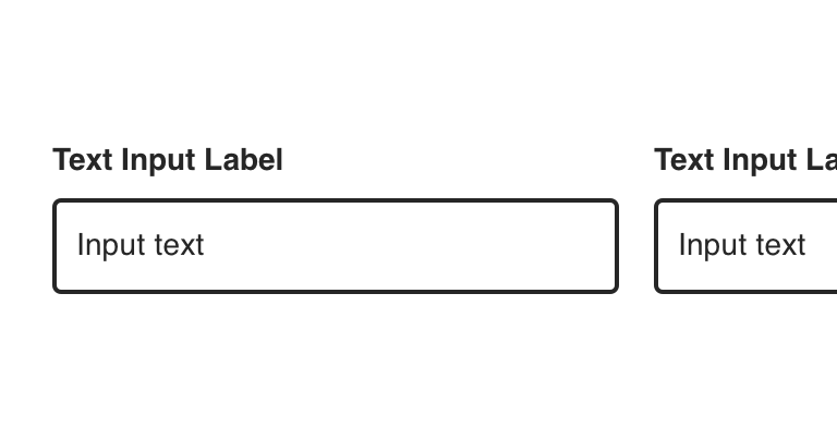 Avoid inputs that horizontally align
Content Strategy
Labels
Labels for Text Input are typically direct, putting clarity and brevity over brand voice in most contexts.
Text entry is implied, so omit actions. “First Name” suffices instead of “Add First Name”.
- Aetna: Use Title case for labels
- CVS: Use Sentence case for labels
Placeholder, Masking & Helper Text
Placeholder text and input masks are not built into the Text Input component. Instead, use helper text above the field to give guidance, as needed.
Requirements & Errors
Mark optional fields as such. Otherwise fields are assumed required.
- Form views with multiple fields should display “All fields are required unless marked optional”
View Aetna’s error guidelines.
Accessibility
Characteristics
- Edit state: Label and helper text must be programmatically connected to Text Input
- Completed: Valid data entered
- Error state: Text Input should only show error validation messages after a user has interacted with a particular field
Keyboard/Focus Expectations
- Pressing the tab key moves focus to the Text Input
- Clicking Label or field focuses the Text Input
- Error state announced upon focus and receives focus
Screen Reader Expectations
- Reading Order: “{Label Name}, edit text, {Helper text}”
- Error: “{Label Name}, edit text, {Helper text}, {Error message}”
*Note: This is a general experience expectation, but there are variations in how assistive technology responds on certain browsers and screen readers.