Link
A navigational element that takes users through websites and applications or to external URLs.
Overview
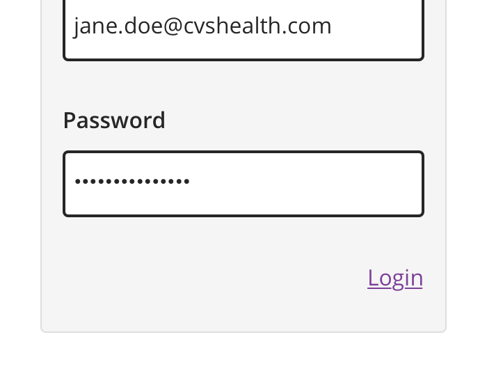
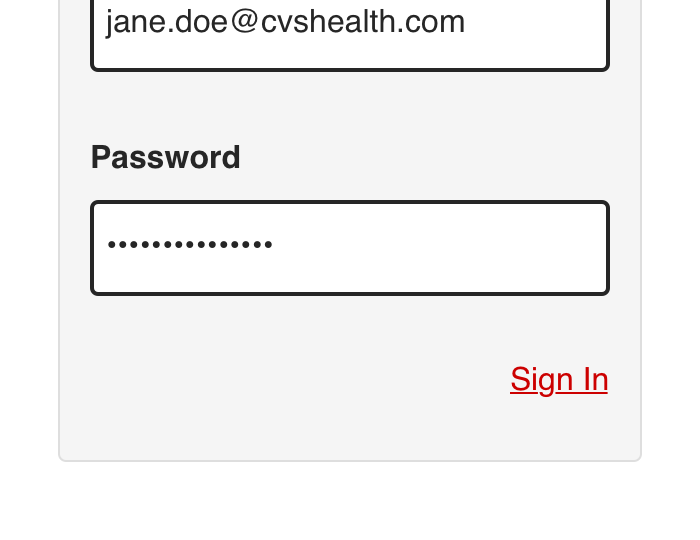
Links may appear on their own or within content. Links should only be used when the user is being taken to a new location, and not as a result in submitting information, launching modals or toggling visibility.


 Always use a link to navigate a user through a website or application or to external URLs


 Never use a link for actions, such as submitting information, launching modals, or toggling visibility
Types
- Inline
- Standalone
- CTA
Inline
Inline links are used in sentences or paragraphs of text and inherit, along with their icons, font sizes of the parent elements they live in.


Standalone
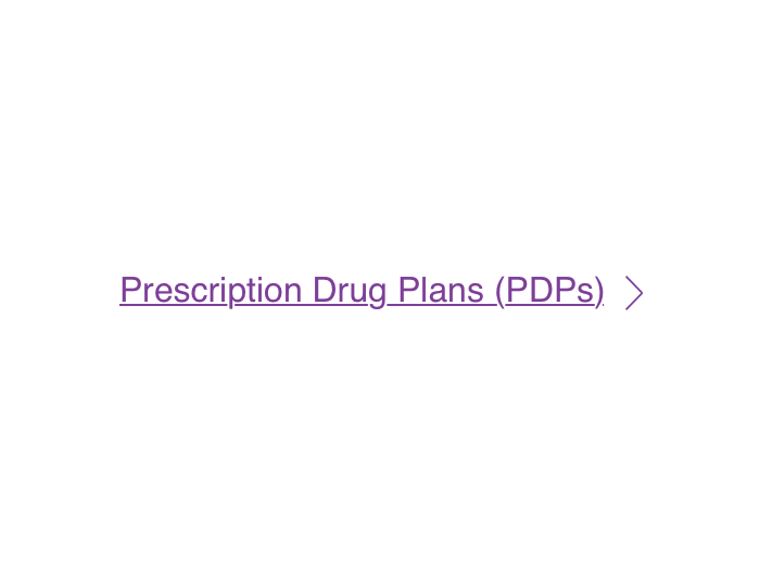
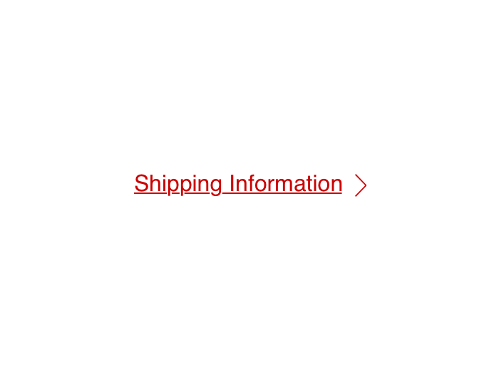
Standalone links appear on their own and can be paired with a leading or trailing icon.


CTA
CTA links appear on their own and are reserved for promotional content. They should be use sparingly within a single page.
CTA links are paired with a trailing, right angle icon only and have a background fill (similar to a button).


Usage
Links should only be used as navigational elements that appear as standalone or within sentences or paragraphs.
Links should be used when you want to:
-
Navigate to another page or website.
-
Jump to a particular element on the same page.
-
Direct links to phone numbers or email addresses.
-
Open resources such as PDFs.
If your use case is not listed here, you likely need to use a Button instead.
Behavior
Mouse or Touch
Users can activate a link by clicking or tapping anywhere along the target area of link text and associated icon.
Keyboard
Users can activate a link by tabbing to it and keying “Enter” or “Return” while the link is in focus.
Icons
Icons that are associated with link text are also part of the interactive area.
Visual Style
Inline


Standalone


CTA


Content Strategy
All Links
Link text should be short, concise and easily understood to the user, even out of context. When creating content for a link, always indicate to the user:
-
Where the link will be taking them.
-
What they can do there, if applicable.
-
If the link will open in a new window or tab
All links within the same page should have unique text. This helps users easily understand which links they are activating, especially those using assistive technology.
URLs
Avoid displaying full URLs in link content. This makes it difficult for users to easily scan, especially those using assistive technology. Instead, you could use the title of the page they are navigating toward.
External Links
Only some assistive technologies may identify and announce that a link is external if the href value is a fully qualified URL on a different domain. Therefore, it is recommended to visually identify a link as external.


 Always keep links short, concise and easily understood even out of context


 Avoid link content that is verbose or contains a full URL


 Avoid using undescriptive destinations such as “click here”

