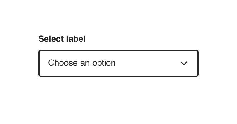
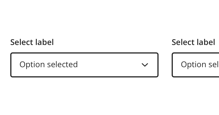
Select
A common input control for users to choose one option from an options menu..
Type
Default


Usage
Select is used in scenarios where users are choosing an option and submitting data. A form is a common example.
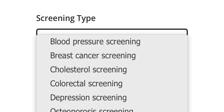

 Use for displaying multiple options from which a user can select only one. Select should only be used for lists of options between 5-15 options. An input field should be used for larger than 15 options in a list.

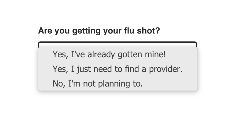
 Avoid using if the options are too wordy or long in content. Use Radio Buttons instead.
Behavior
Select relies on the browser default options menu for built-in accessibility benefits and mobile-friendly functionality. This is a Select on iOS and an Exposed Dropdown Menu on Android.
Validation & Errors


Visual style
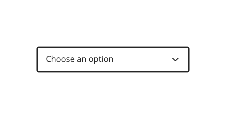
Select’s width can be variable, but should generally align to the content with which it’s paired.
 Never make a full page width Select on desktop

 The default option should be selected where possible, only use a placeholder if a logical default option is not available.
 Never rely on the placeholder text to explain the type of information intended for the Select. Always include a label

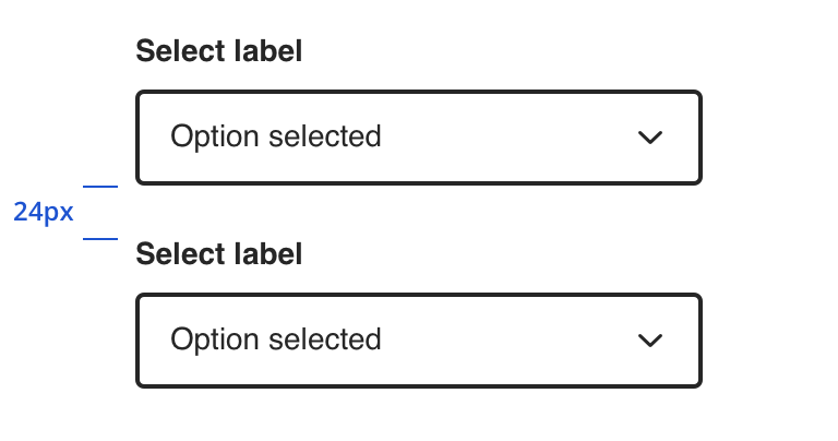 Vertically stack multiple Selects when possible
 Avoid multiple Selects that horizontally align
Content Strategy
Labels
Labels for Select are typically direct, putting clarity and brevity over brand voice in most contexts.
Selection is implied, so omit actions. “First Name” suffices instead of “Add First Name”.
- Aetna: Use Title case for labels
- CVS: Use Sentence case for labels
Placeholder & Options
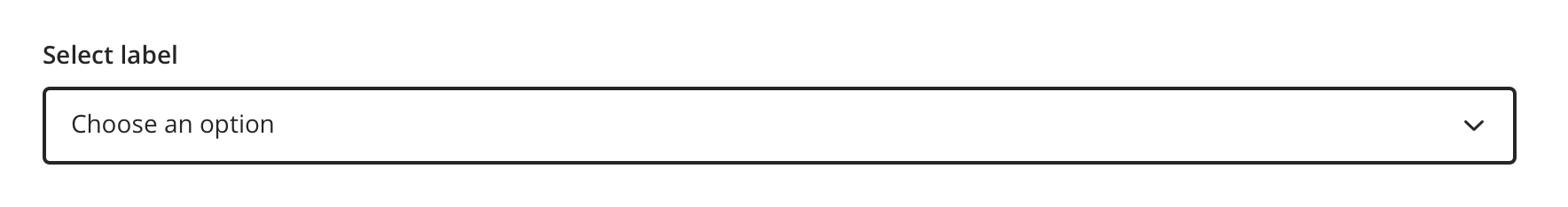
“Choose an option” is built into the component as a placeholder for scalability and regularity.
Options should be:
- Short and sweet
- Tip: Wordier options are better presented as Radio Buttons.
- Uniform
- Organized (e.g. alphabetical, when appropriate / possible)
Errors
View Aetna’s error guidelines.
Accessibility
Characteristics
- Best used to select a single option from a list between 5 - 15 options
- Label clearly identifies purpose for Select
- Options logically ordered, alphabetically if appropriate
- Use a default option when possible, only use a placeholder if a logical default option isn’t available
Keyboard/Focus Expectations
- Enter/Spacebar opens Select and activates focused option
- When expanded, Tab/Shift+Tab and Esc activates focused option
- When collapsed, Tab/Shift+Tab shifts focus to/away from select element
- Up/down arrows move between selectable options
Screen Reader Expectations
- Reading Order: “{Select label}, Combo Box, {selected value or placeholder text, if applicable}, collapsed/expanded, {Error message (if applicable)}”
- When expanded, option names and total number of options are read as user arrows through displayed list (e.g., “Option Value 1, 1 of 4”)
- Note: Selected option is confirmed when the screen reader reads the name, role and value of the component.
- When collapsed, option names are read as user arrows through (e.g., “Option Value 1”)
- If Disabled: Disabled Select is not focused but findable using Browse Mode. Because the label and the component are on different lines, they are not read together. When highlighting component itself with Browse Mode: “Combo Box, unavailable, collapsed/expanded, {selected value or placeholder text, if applicable}”
*Note: This is a general experience expectation, but there are variations in how assistive technology responds on certain browsers and screen readers.