Text Field
An input element that accommodates both single and multiline text entry. Most commonly used within a form.
Types
Text Fields can be used for prompting the user to enter text-based input values such as:
- Text (e.g. first name: alpha)
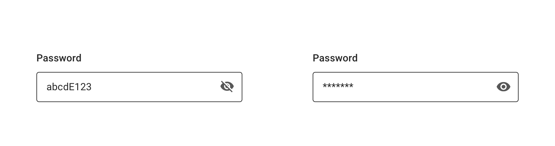
- Passwords (alphanumeric)
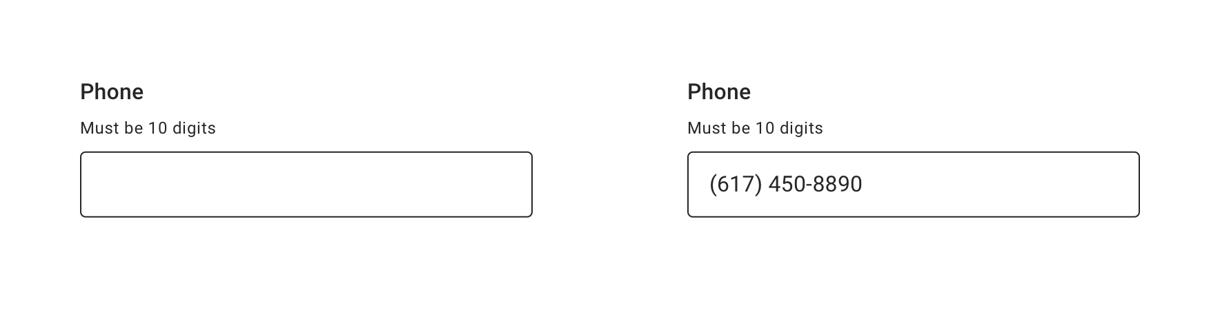
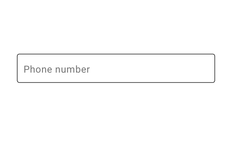
- Phone Numbers (numeric)
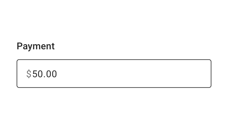
- Numbers Decimal (e.g. currency: prefix $ + numeric)
- Numbers (e.g. Credit Card or SSN)
Certain types can be combined, e.g a SSN field can have show/hide functionality similar to a password field.
Default

Password

Number Decimal


Usage


 Always use a label that clearly identifies the input content
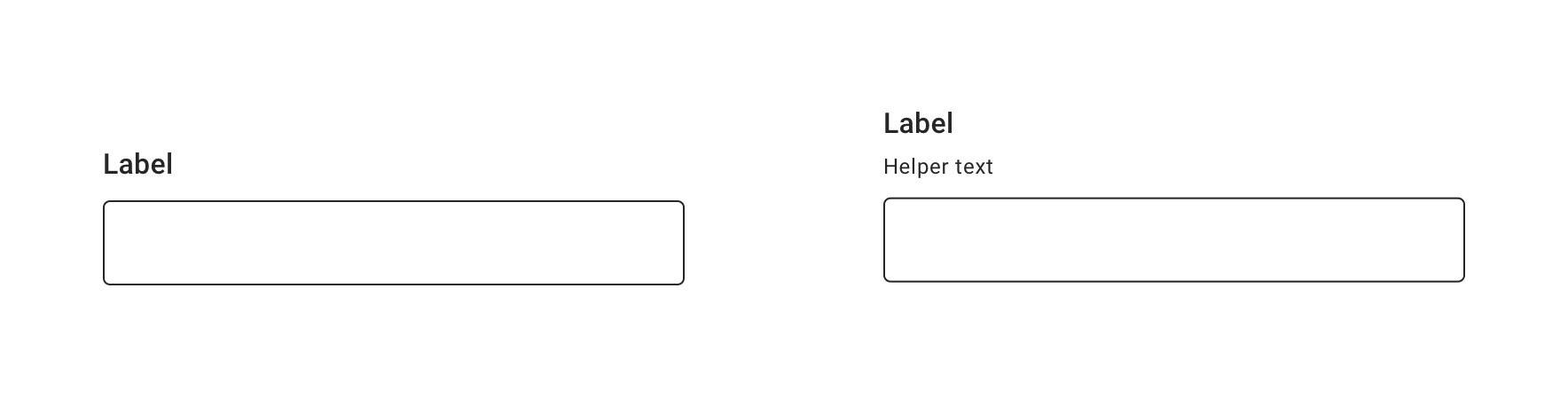
Helper Text
Helper text conveys additional guidance about the input field, such as how it will be used.

Multi-line Text Field
Multi-line supports large font sizes and/or lengthy amounts of free-form text (alpha and numeric) that wraps and extends beyond one line. The Text Field will automatically increase in height (from top-to-bottom) to accommodate wrapping text.

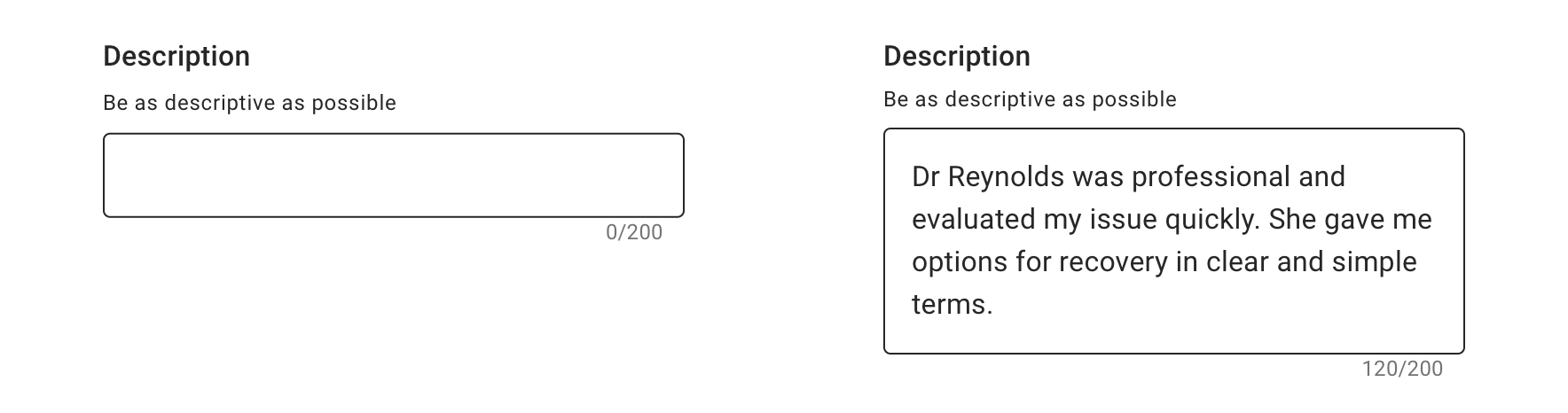 Use a multi-line Text Field for potentially multi-line text, like ratings or messages to providers. Use a character counter only when appropriate.
Input Masking
Prefix and Suffix

 Use affixes (prefix/suffix) when it’s supportive of input value

 Never use an affix as a label or a placeholder
Behavior
Typing
As soon as a user begins typing the first character, a clear button appears to allow users to clear any entered text.
Validation & Errors
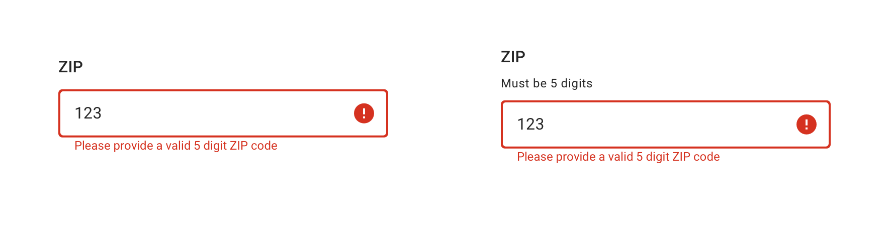
Upon validation, if the Text Field does not have valid input, an error message will be presented. Error messages should not replace helper text.

Visual Style
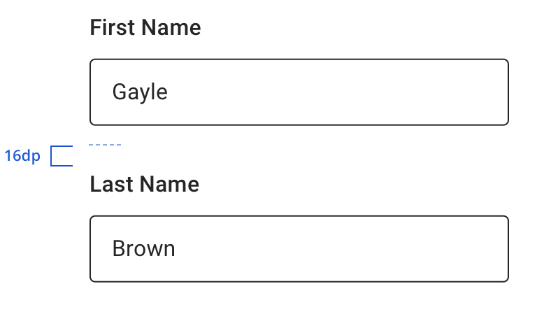
 Always maintain 16dp vertical spacing between Text Fields
 Never use an affix as a label or a placeholder
Character Counter


Content Strategy
Labels
Text entry is implied in Text Field, so omit actions for short-entry labels. You might consider more actionable, branded labels when prompting long-form responses.
- Aetna: Use Title case for labels
- CVS: Use Sentence case for labels
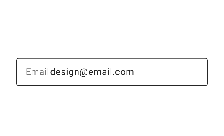
Placeholder, Helper Text & Masking
Placeholder text is not built into the Text Field component. Instead, use helper text above the field to give guidance as needed.
Use masking as appropriate to communicate expectations and formatting, reducing the chance for errors.
Requirement & Errors
Mark optional fields as such. Otherwise fields are assumed required.
- Form views with multiple fields should display “All fields are required unless marked optional”
View Aetna’s error guidelines.
Accessibility
Characteristics
- Edit state: Label and Helper Text must be programmatically connected to Text Field
- Error state: Text Field should only show error validation messages after a user has interacted with a particular field
- Only notify if character limit is exceeded, don’t use a total character remaining countdown
- Completed: Valid data entered and tap “done” or “next” within keyboard
Focus Expectations
- Swipe to move focus among Text Fields
- Tap to enter an input, edit content, and remove content
- Error state should be announced upon focus
- Tap “next” in keyboard to move focus to next Text Field, * if no additional Text Field, tap “done” to exit keyboard
- If applicable, input masks receive focus (i.e. password toggle button, affixes)
Screen Reader Expectations
Reading Order
- “{Label Name}, {Helper Text}, edit box”
- Disabled: “{Label Name}, {Helper Text}, edit box, disabled”
Error Handling
- Once an error is triggered within a Text Field, user should immediately hear the error message before moving focus to another Text Field
- If an error is already present on a Text Field, the error message should announce when focus is moved to the Text Field with the error
- Reading order: “{Label Name}, {Helper Text}, {Error Message}, edit box”