Date Picker
Date Pickers let users select a date.
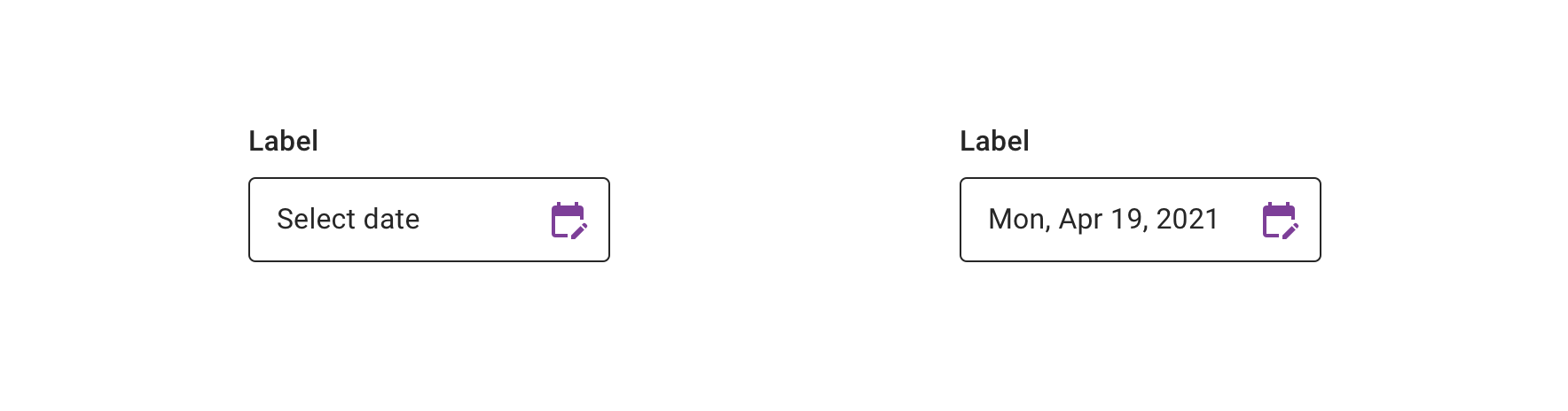
Date Picker Display
Date display is a TextView that displays the currently selected date or “Select date” when no date has been selected.
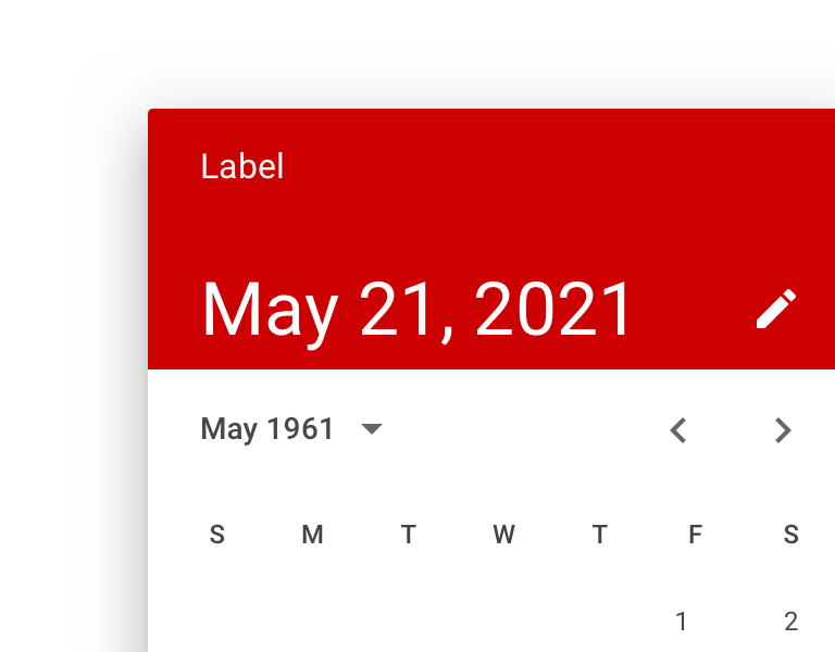
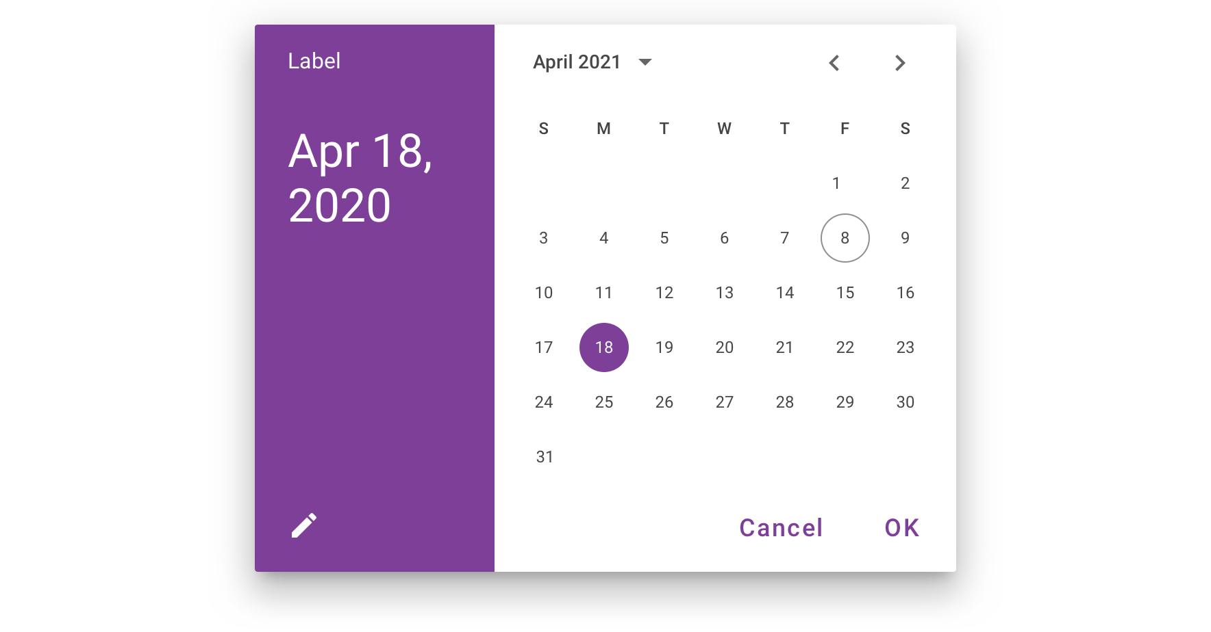
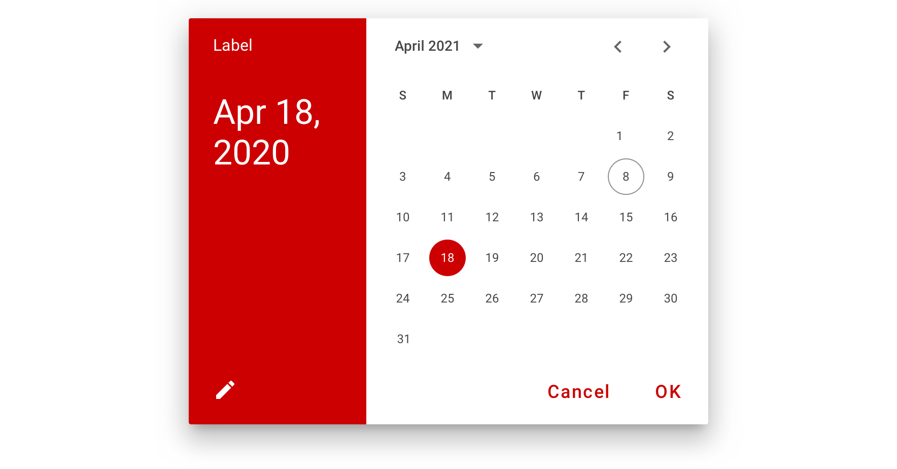
Calendar Picker
Date Input Picker
Usage
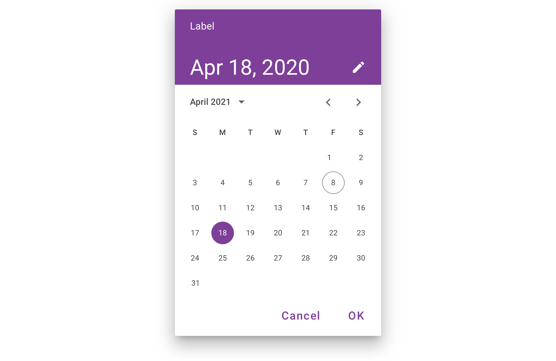
Calendar Picker
Calendar Date Pickers can be used to select dates in the near future or past, when it’s useful to see them in a calendar month format. They are displayed in a dialog.
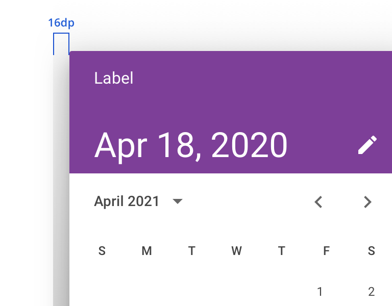
 Keep 16dp left and right padding from the edge of the screen. Date Picker should be vertically centered in the screen
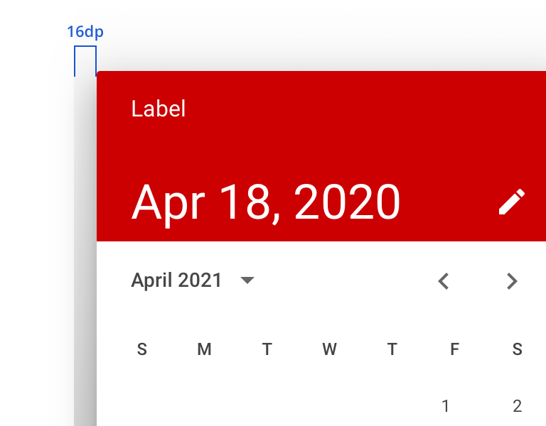
 Don’t use more than 16dp from the left and right screen edges, as it generates smaller touch targets
They aren’t ideal for selecting dates in the distant past or future that require more navigation, such as entering a birth date or expiration date.
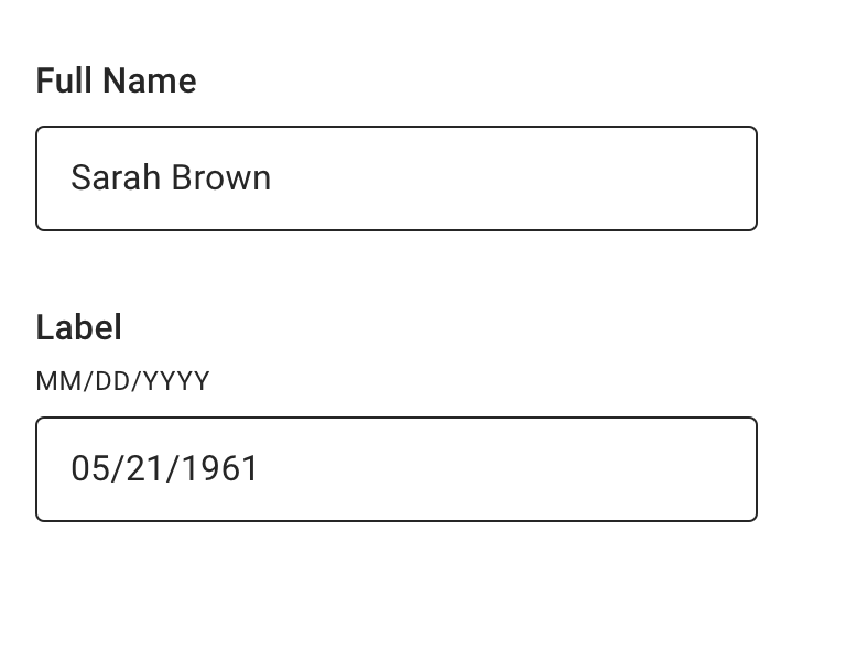
 Use a text field with appropriate helper text to prompt for dates in the distant past or future, such as a date of birth
 Don’t use a Calendar Picker to prompt for dates in the distant past or future
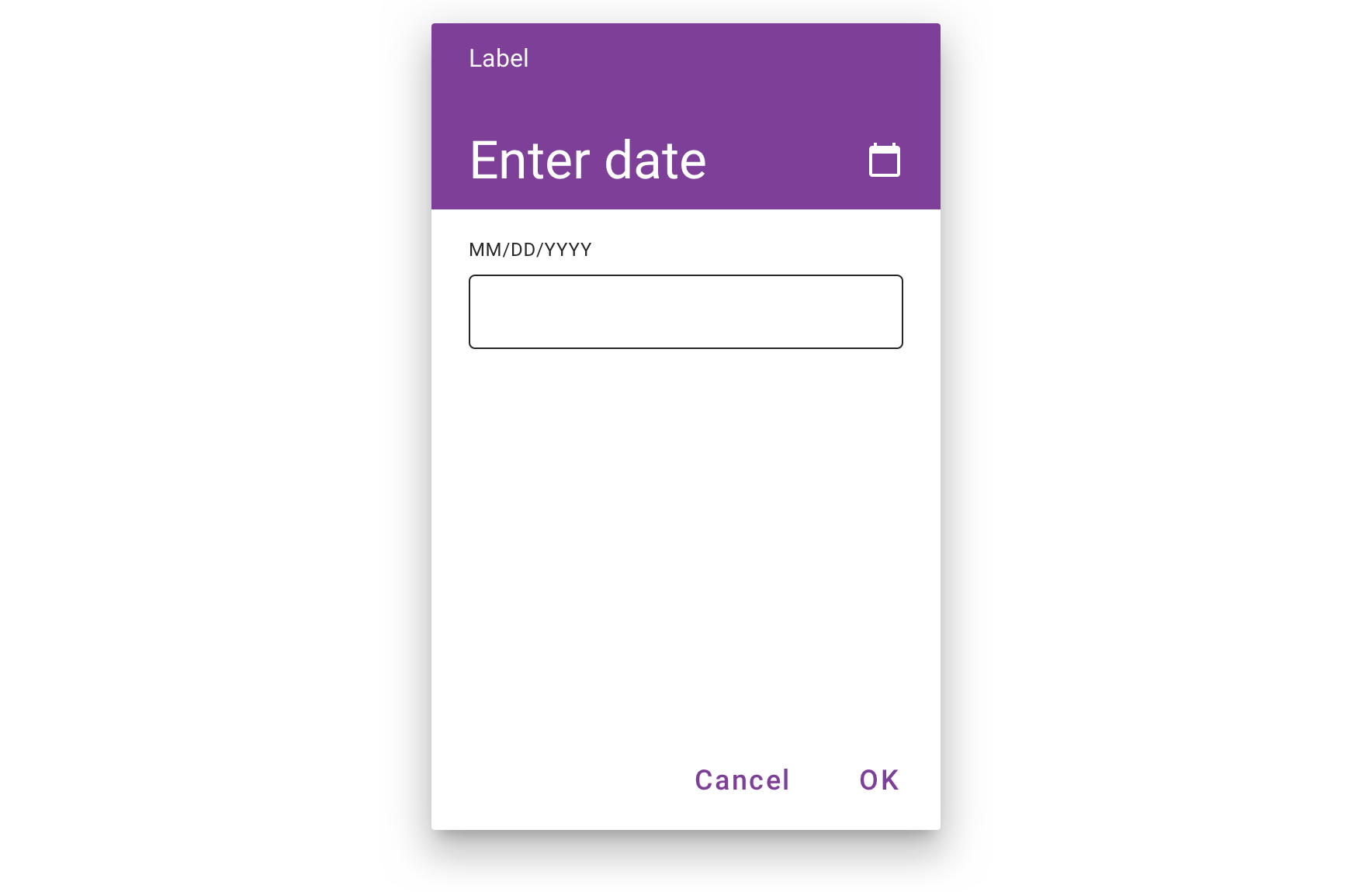
Date Input Picker
Date Input Pickers allow the manual entry of dates using the numbers on a keyboard. Users can switch to the Input Picker view from the Calendar Picker.
Input Picker should not be opened for dates in the distant past or future (e.g., date of birth). Instead, use Text Field with “MM/DD/YYYY” helper text to streamline the input process.
Behavior
Calendar pickers navigate across dates in several ways:
- To navigate across months, swipe horizontally
- To navigate across years, scroll vertically
- To access the year picker, tap the year
Calendar pickers adapt to a device’s orientation.
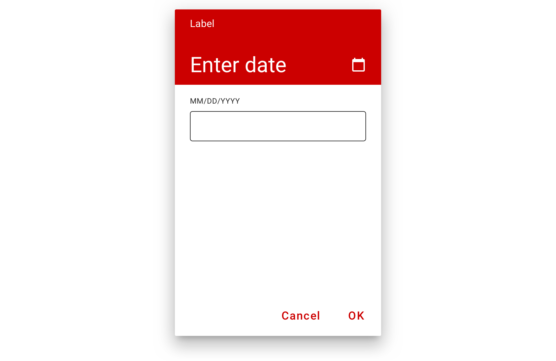
Visual Style
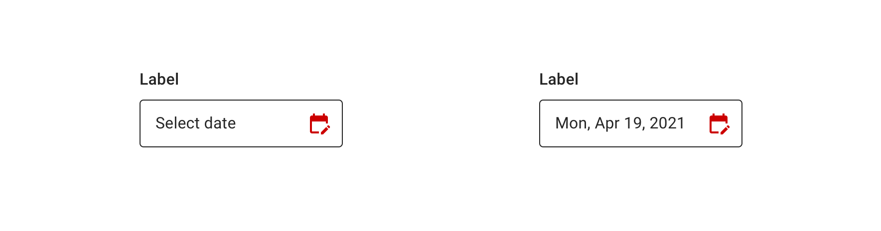
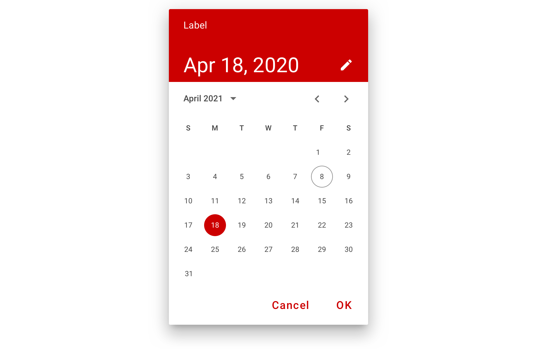
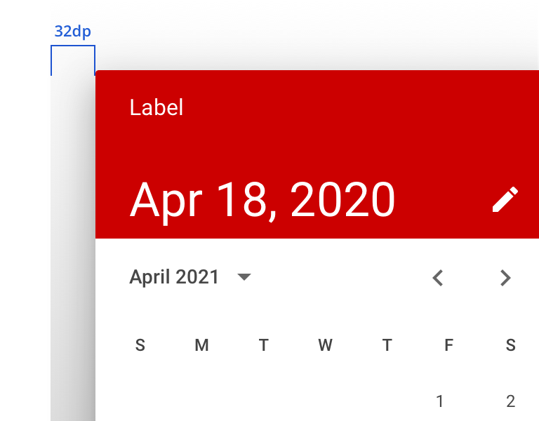
Pickers can be customized to express your brand identity by altering their layout, typography, shape, color, and motion.

 Always maintain 16dp vertical spacing between Form elements
Content Strategy
The main content goal of Calendar Picker is to support the selection of date in the near past or future.
For dates in the distant past or future, use Text Field with “MM/DD/YYYY” helper text to streamline the input process.
Calendar Picker comprises a few standard pieces of content.
Labels
Used above the field that opens Date Picker, labels should be carried through to the dialog header for consistency. Labels will wrap in the dialog if necessary, but as with all labels, brevity is better whenever possible.
- Aetna: Use Title Case for labels
- CVS: Use Sentence case for labels
Placeholder
Always use “Select date” as placeholder text for the default state of the Date Picker. Placeholder text should not be used in the Date Input Picker field or a Text Field used for something like date of birth.
Date
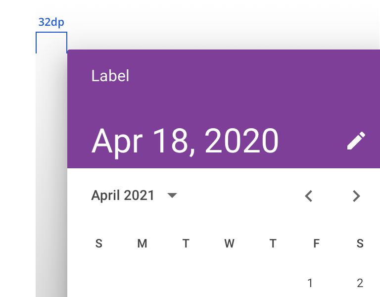
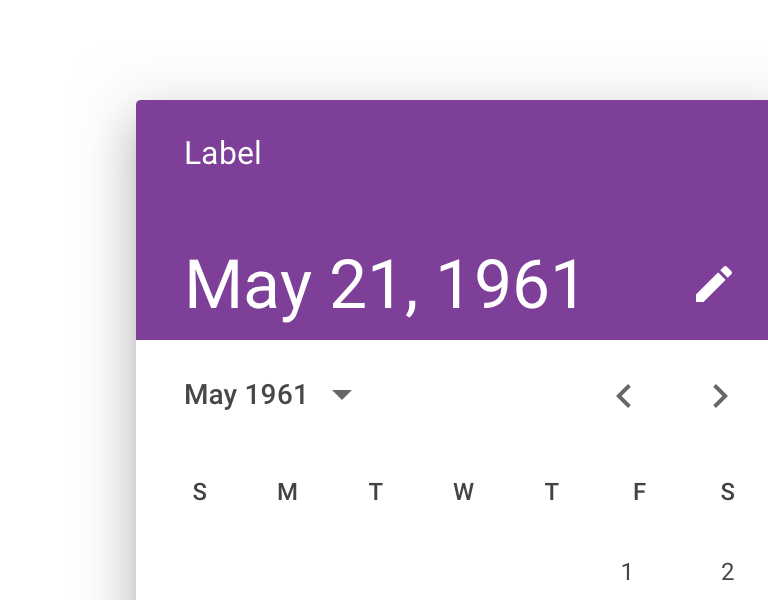
The date displayed in the dialog follows Material’s standard format for Calendar Picker: {abbreviated month} {day}, {year}: Dec 21, 2021
When a date is selected (or entered) and the dialog is closed, the Date Picker Display highlights the date in the following format, including day of week: {abbreviated day of week}, {abbreviated month} {day}, {year}: Mon, Dec 21, 2021
CTAs
“Cancel” and “OK” will always appear as the dialog’s actions.
Accessibility
Date pickers are complex components from an accessibility perspective. Made more complicated by the fact that Android doesn’t have proper Table semantics. This means that designing our own date picker would involve a lot of hack work around data and relationships. To this end we preferred the Native Date Picker, even though it had a few minor Accessibility issues, as designing a perfect Android Date Picker isn’t really supported by the APIs Android provides.
Characteristics
- Should force the user to select a Valid Date, both in GUI mode and Text Entry mode.
- The control that launches the data picker should contain both the date and the calendar icon.
- When utilizing the date picker it should be associated with a TextView using the LabelFor attribute.
- TextView
- Text: Birthday
- LabelFor: DATE_PICKER_ID
- DatePicker Button
- ID: DATE_PICKER_ID
- TextView
Keyboard/Focus Expectations
- After selecting a date focus should return back to the control that launched the DatePicker.
- When activating the DatePicker focus should go to the
- The currently selected date
- OR the current day of the week if nothing has been selected yet.
Screen Reader Expectations
- Various Screen Reader and TTS Engine combinations may or may not expand the short hand dates. This is okay.
- When interacting with Date cells the Day of the Week, Day Number, and Month are all shared.
- When interacting with Date cells swiping up changes the current month
Known Issues
The Android Native Date Picker has the following issues and resolutions.
- The cell that is highlighted as the current active day doesn’t share this state. We have addressed this providing an Accessibility Delegate which
- Marks the current date as “selected”.
- Marks the currently selected date as “selected”.
- Announces the current date as “today”.