Button
Buttons allow users to take actions, and make choices, with a single tap.
Types
Primary


Secondary


Tertiary


Usage
Buttons represent actions, such as submitting data, launching elements, toggling visibility, etc. If navigating to a different site or page, a link should be used.
Overview
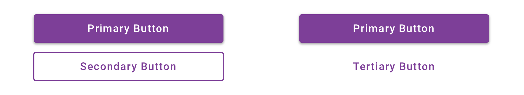
- Primary Button: Used to call attention to the main action of the page or large section. Though it should generally be used only once per page, Primary Buttons can be used multiple times if representing parallel primary actions, such as “Add to Cart.”
- Secondary Button: Used for general actions on a page or in a section
- Tertiary Button: Used for subtle actions on a page or in a section that are not a priority
Button order
Primary actions should generally be presented first within a group of buttons.
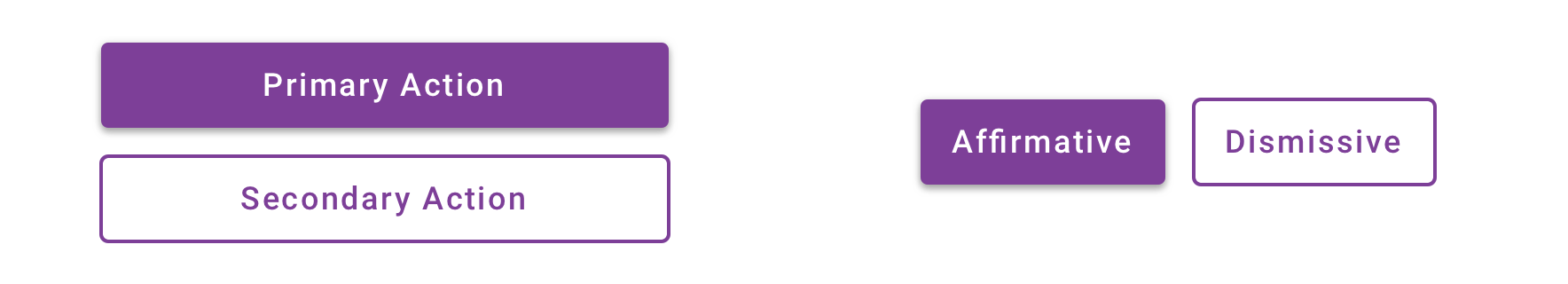
Use a primary button in a bottom sheet next to other important details.


A Primary Button can also be used when needing to call attention to directional actions. Don’t use a “back” button when you can go back using natural navigation elements (“back” link in the top left corner).


Button groups
Use button groups when you are presenting multiple priorities or emphasis. A good practice is that you should always use fewer buttons and only when they are really needed.
 For button groups that have multiple priorities, use Primary along with Secondary or Tertiary Buttons pending on emphasis. These buttons usually perform complimentary actions.
 For actions that have similar priorities, group either Default Buttons or Tertiary Buttons together
Similar priorities
For actions that have similar priorities, group either Default Buttons or Tertiary Buttons together

 Avoid grouping Primary buttons together
Width
The width of the button will be defined by its content (text label), but it will always have a minimum width of 64dp.


Buttons can be full-width of the view or parent container with minimum 16dp margins.


Behavior
Label Wrapping
Button will wrap labels that extend beyond the Button width bounds due to long character lengths or large font-sizes that may be dictated by the user’s font settings.


Visual Style

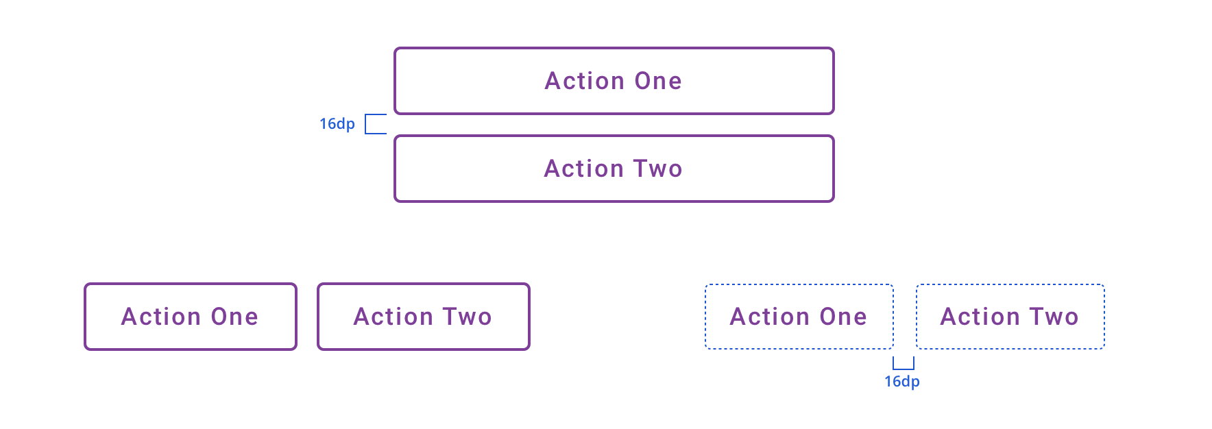
 Buttons should have a minimum of 16dp margin above and below in relation to other content

 Avoid long labels
Icons
Icons can be added adjacent to the label as a decorative element that is relative to the action or purpose of the button.
 Icons can be leading or trailing relative to the label
Leading or trailing placement should be influenced by usability and context of the icon & action.
 Avoid using only an icon to communicate a button's purpose or action
Content Strategy
- Use Title Case
- Lead with a verb
- Aim for short actions, around 1-4 words
- Use simple global commands when possible: Save, Back, Next, Apply, etc.
- Add specificity with purpose (e.g. “Assign as Primary Care Physician” brings necessary meaning to the action, compared to the shorter “Assign”)
- Accessibility Delegate added when action label doesn’t provide enough context. (Example: {Button label}, “Confirm Quantity”, “tap to activate”, but if an AccessibilityDelegate is added, the button will read {Button label}, “Confirm Quantity”, “double tap to confirm amount and review order”)
Accessibility
Characteristics
- Performs actions such as submitting a form, opening a dialog, cancelling an action, or performing a command such as inserting a new record or displaying information
- Operates with “Enter” key and “Spacebar” key if user is navigating with a keyboard
Focus Expectations
- Focus stays on button until action is performed
- Following button activation, focus is set depending on the type of action the button performs
Screen Reader Expectations
- Operating system might announce different variations depending on the manufacturer and software versions.
- “{Button Label}, button and/or {operating system hint}”
- Operating system hint = “Double tap to activate”
- Disabled state: “{Button Label}, button, disabled”
- Icons don’t receive focus since they are decorative