Alert Dialog
A dialog is prompted when the system needs the user action or to give the user urgent information concerning their current workflow.


Usage
Alert dialogs interrupt users with urgent information, details, or actions.
When to use a dialog
- Use to focus the user’s attention.
- Use for short task completion.
- Use to gather input from the user.
- Use to display relevant information.
When not to use a dialog
- Don’t use if the content is unrelated to the current workflow.
- Don’t use to display complex or large amounts of data.
- Don’t recreate a full app or page in a dialog.
Behavior
Interaction
Dialogs appear without warning, requiring users to stop their current task. They should be used sparingly.
Position
Dialogs retain focus until dismissed or an action has been taken. They shouldn’t be obscured by other elements or appear partially on screen.
Dismissing
A user must choose a dialog action to proceed.
Actions
Dialogs must present a clear choice to users through their title, message, and actions. Dialog actions are represented as buttons and allow users confirm or dismiss something.
There are three types of dialog actions:
- Confirming
- Dismissive
- Acknowledgment
Dialogs should contain a maximum of two actions.
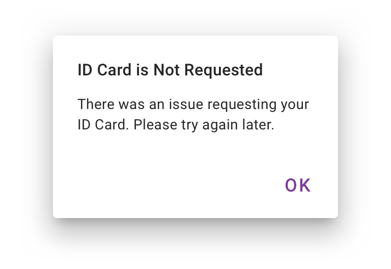
- If a single action is provided, it must be an acknowledgement action.
-
If two actions are provided, one must be a confirming action, and the other a dismissing action.

 A single action may be provided only if it’s an acknowledgement
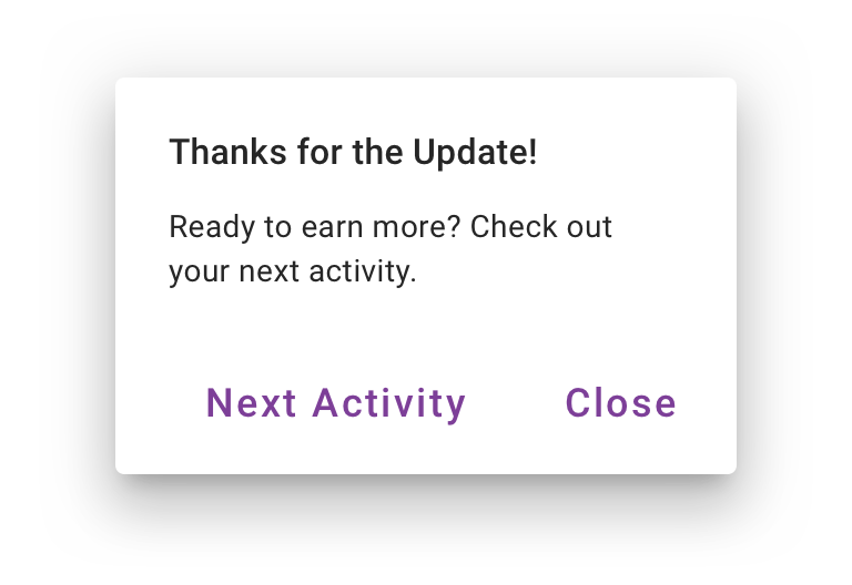
 Don’t place dismissive actions to the right of confirming actions
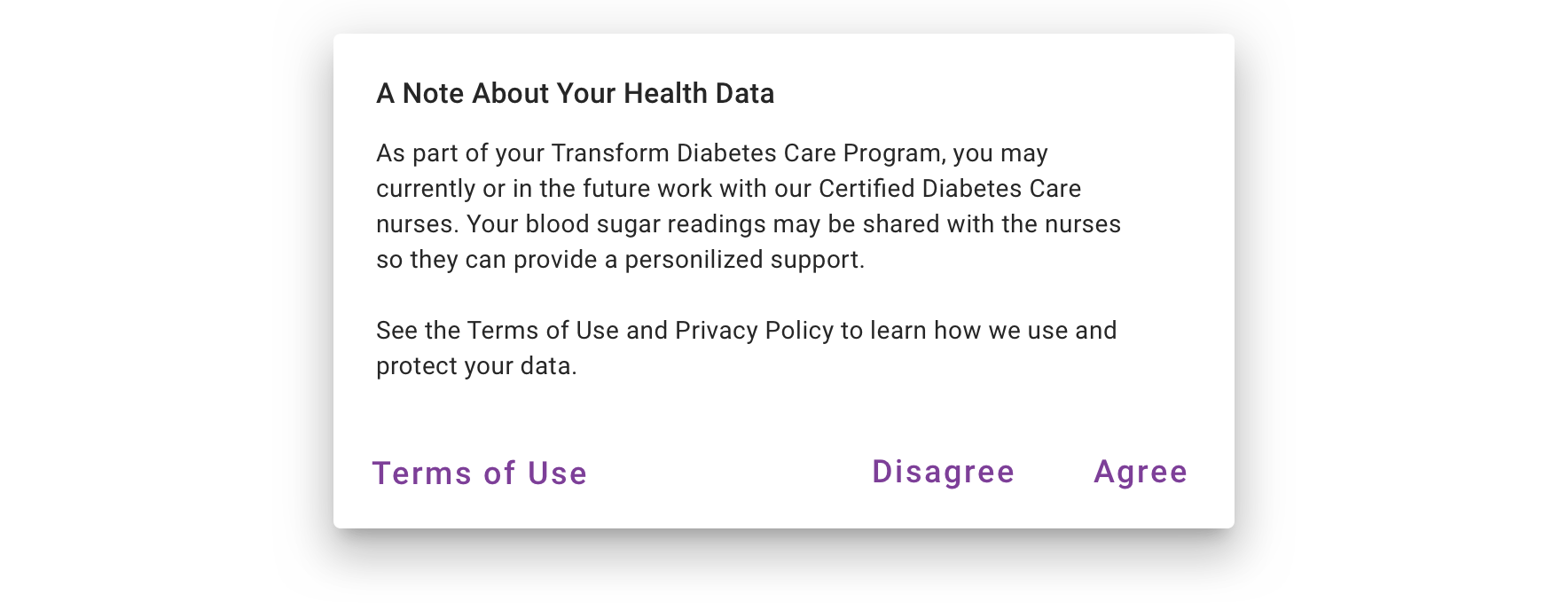
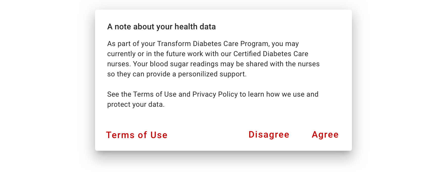 Providing a third action such as “Terms of Use” is not recommended as it navigates the user away from the dialog, leaving the dialog task unfinished
Visual Style
We utilized the Material Alert Dialog component and use our own buttons for all types of actions.
Stacked buttons accommodate longer button text. Confirming actions appear above dismissive actions.


Content Strategy
A dialog’s purpose should be communicated by its title and button text.
Title
A dialog’s title should be a brief, clear statement or question. It should explain what’s involved in the request. Avoid apologizing, raising alarm (Warning!) or saying something ambiguous like, “Are you sure?”.
Body
For a dialog that’s seeking to confirm an action, provide clarifying information that will help someone decide whether or not to proceed. If the dialog is simply requiring acknowledgement of information, use the body to provide the necessary details.
Buttons
Button text should work together with the title so that the purpose of the dialog is clear. A dialog asking for confirmation of an action should have 2 buttons, 1 to confirm and 1 to cancel or decline. Start with “Cancel” for the default of the latter, but feel free to use something different if it increases clarity. For a dialog prompting acknowledgement, there should only be 1 button. In many cases, a simple “OK” should be fine.
Accessibility
Alert Dialogs offer a mechanism to support High Importance status updates. By behaving as a Modal, trapping users within the interaction, we know that all types have received the update and performed an acknowledgment of some kind. This makes Alert Dialogs a WCAG Compliant mechanism for acknowledging legally binding agreements and is a preferred method for doing so.
Keyboard/Focus Expectations
- Focus should be kept within the Dialog while user is interacting with it, even touch to explore gestures outside of the component should not move focus away from the dialog.
- Focus should move to the body content of the Dialog when it is launched.
- Focus should return to the triggering element OR the last element that was focused before the Dialog was launched.
Screen Reader Expectations
- The Title of the Dialog is read, along with the main body content because of the focus transition, when the dialog is opened.