Progress Indicator
Progress Indicator notifies a user that loading of content is underway.
Types
Linear


Circular
Progress indicators may be determinate or indeterminate:
- Determinate Indicators should be used when the process completion rate can be detected
-
Indeterminate indicators should be used when progress isn’t detectable


Usage
Progress indicators inform users about the status of ongoing processes, such as loading an app, submitting a form, or saving updates.
Use a progress indicator whenever the wait time is anticipated to be longer than three seconds.
Linear
- A linear indicator at the top of the screen can indicate loading all screen content
- Expanding items can place a linear indicator along their expanding edge to draw user attention to where new content will appear
Circular
- A circular indicator at the center of the screen can indicate loading all screen content
-
A circular indicator attached to a container, such as a card or a button, can indicate the process applies to that particular item
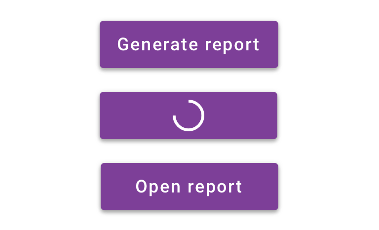
 Use circular indicator inside a button to save space and draw user attention


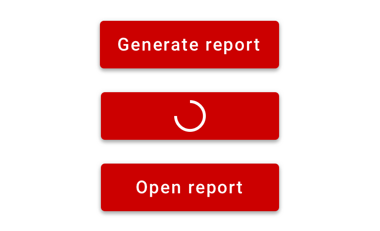
 Don’t use against dark colored background
Behavior
The behavior of the indicator is dependent on whether its’ determinate or indeterminate.
On Android, the “swipe to refresh” gesture displays a circular progress indicator to indicate that the UI is being refreshed.
Linear
Linear progress indicators display progress by animating an indicator along the length of a fixed, visible track.
Circular
Circular progress indicators display progress by animating an indicator along an invisible circular track in a clockwise direction.
Visual Style
We utilized the Material progress indicator component and applied primary brand color.
An optional message can be customized by a user.


Accessibility
Progress indicators inform the user of an action that is going to take some time to complete. They can be both modal, in which case they would block interaction and take up the entire screen while some global wait is being enforced, or only show up on part of the screen while some particular bit of user interface is updating.
Characteristics
- When global progress indicators should be modal and the only focusable element on screen.
- Otherwise they behave like an image with an optional animation simply informing the user of some delay.
Keyboard/Focus Expectations
- Progress indicators do not accept input focus.
- In the event of a modal progress indicator focus should go to either the element that was focused prior to the indicator being presented OR to the first content element, as if a screen change has occurred, depending on the nature of the UI update after the progress indicator is dismissed.
Screen Reader Expectations
- When focused directly a progress indicator should behave similarly to an image, without the “image” role announcement.
- The description of the progress indicator should denote progress and, when the context is not apparent from other elements on the page, describe what action the user is waiting for.
- Progress indicators may also come with a percentage of progress. When appropriate such progress announcements should be shared with the user via Accessibility Announcements or the use of Live Regions.