Text Field
An input element that accommodates both single and multiline text entry. Most commonly used within a form.
Types
Standard
If your design aesthetic uses a style that is more conventional to web and Android, consider using this type.


Table Cell
If your design aesthetic uses a more conventional iOS Table Group layout for forms, consider using this type.


Usage
Text Fields can be used for prompting the user to enter text-based input values such as:
- Text (alphanumeric)
- Email addresses (alphanumeric)
- Phone numbers (numeric)
- Credit card number (numeric)
- Currency (numeric)
- Sizable amounts of free-form text (multiline alphanumeric)
-
Passwords (alphanumeric secure text entry)


Always use a label that clearly identifies the input content
Keyboard Types
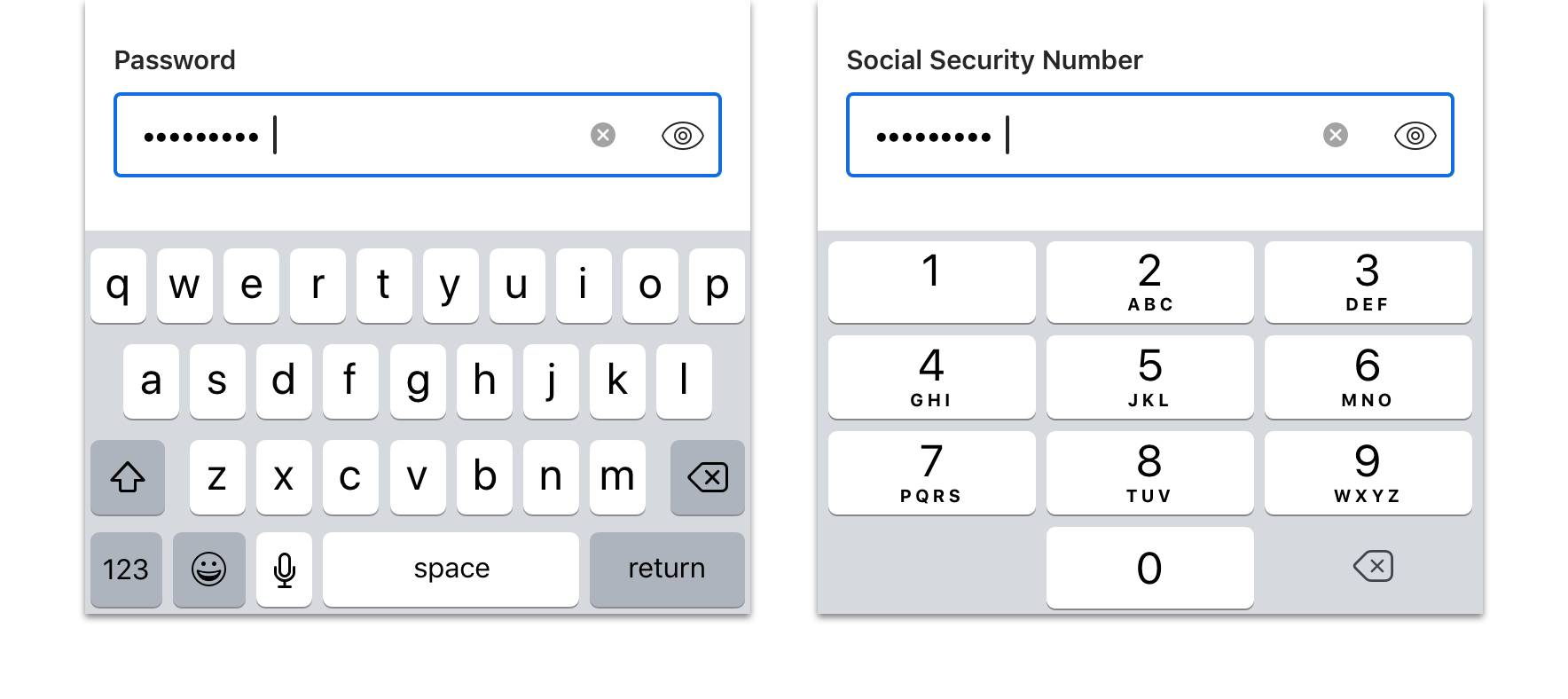

 The keyboard type and label should map to the data type requested
Multiline (word-wrap)
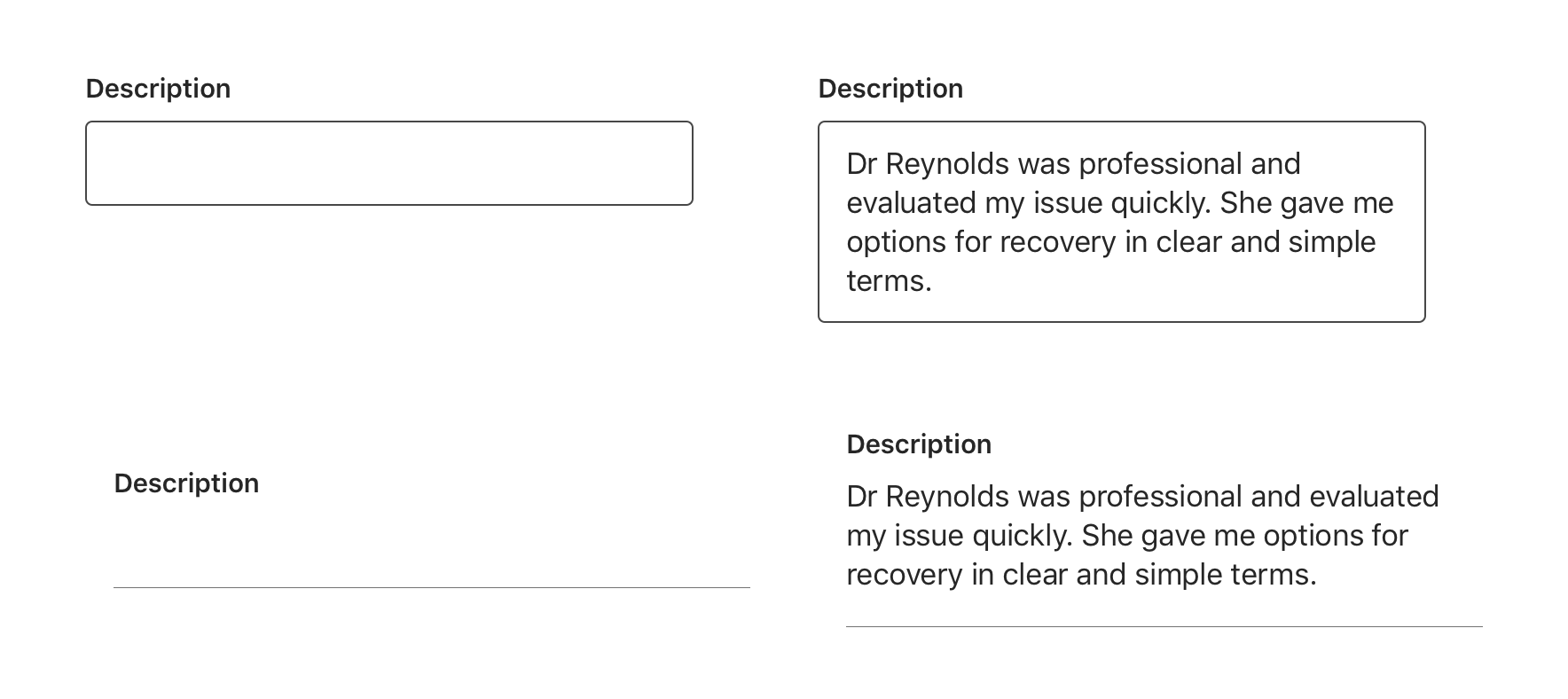
Multiline supports large font sizes and/or lengthy amounts of free-form text (alpha and numeric) that wraps and extends beyond one line.

Secure Text Entry and Visibility Toggle
A property that allows the user to show or hide sensitive data entries via a toggle button. Commonly used for password, social security and other sensitive data entry fields.
The show/hide toggle button can be removed if desired.


Functionality
- Hidden (Hide): The default presentation is “hidden,” where the data would be masked as bullet characters
- Visible (Show): When the user toggles the visibility button to “visible”, the data will become unmasked and presented as their normal characters
Helper Text
Text Field supports helper text.


Behavior
Clear Button
As soon as a user begins typing the first character, a clear button appears to allow users to clear any entered text. This can be enabled as needed.


Multiline
The Text Field will automatically increase in height (from top-to-bottom) to accommodate wrapping text.
For Multiline, provide option to “return” within keyboard to add larger amounts of text and move to a new line.


Input Masking
Input masking can be applied to better control input format, display the correct keyboard, and apply relevant validation logic.
Options include:
- Email address: name@domain.com
- Number: 0-9 (limited to numbers only)
- Phone number: 555-555-5555
- Credit card number: 0000-0000-0000-0000 (format specific to credit card network)
- Currency: $9,999.99 (currency symbol prepended)
- Secure text entry (mask the input content such as a password)
Validation & Errors
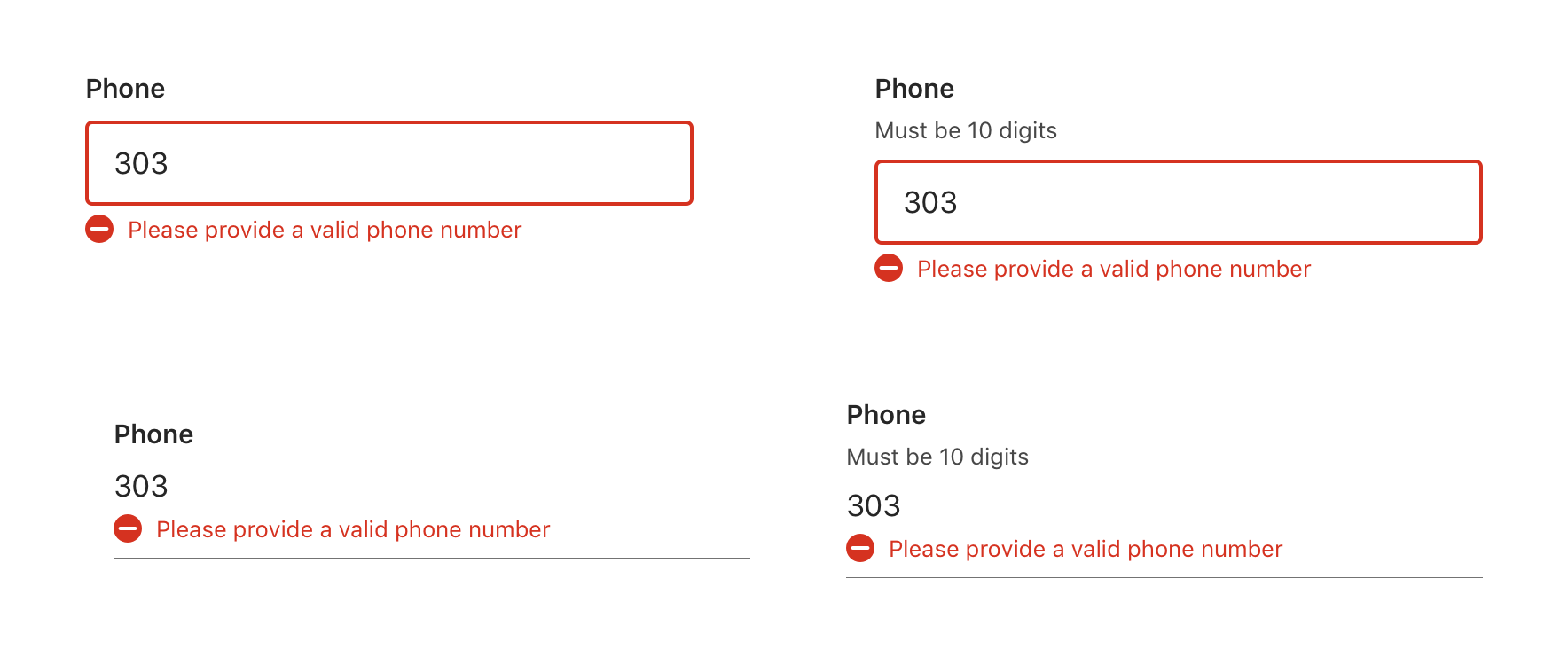
Upon validation, if the Text field does not have valid input, an error message will be presented. Error messages should not replace helper text.

Accessibility
For detailed accessibility experience notes for various user groups, please visit iOS Text Field - Enterprise Digital Design System
Visual Style
Text Field Standard
Width
Text Field is 100% width of the parent view respecting any left and right parent container padding or margin or it should have a minimum 16pt left and right margin applied.


Vertical Spacing
Text Field should have enough vertical margin between adjacent elements to ensure that the proceeding elements are not pushed or moved upon the introduction of inline validation messaging (single-line).


Text Field Table Cell
Width
Text Fields are 100% width of the parent container (i.e. Table view).


Single Row
If Text Field is presented in a Table with a single row it should have edge-to-edge (full-width) Separators on both top and bottom (determined by parent Table).


Table Groups
Text Field Cell should be used in Table Groups.
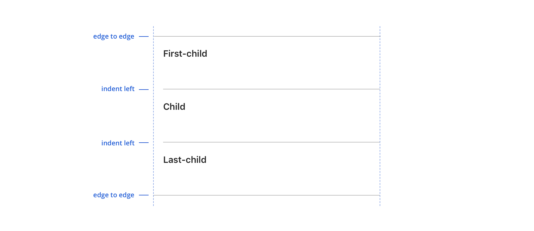


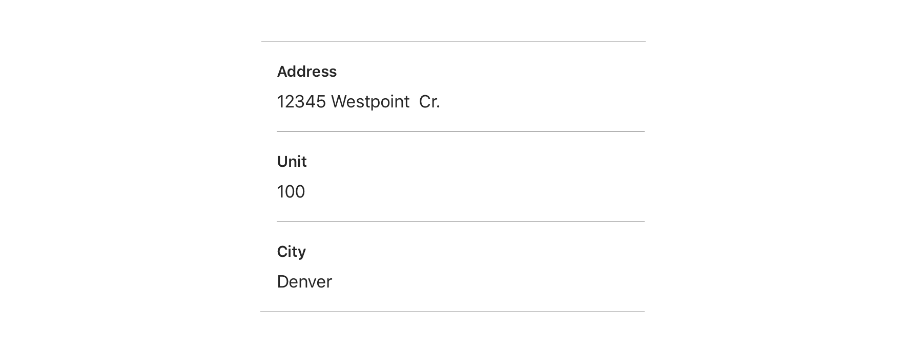
 There is no vertical margin between Text Fields if they are in the same Table group/section
Content Strategy
Labels
Text entry is implied in Text Field, so omit actions for short-entry labels. (e.g. “Email” not “Enter email”).
You might consider more actionable labels when prompting long-form responses.
- Aetna: Use Title case for labels
- CVS: Use Sentence case for labels
Placeholder, Helper Text & Masking
- Placeholder, Helper Text & Masking Placeholder text is not built into Text Field. Instead, use helper text above the field to give guidance as needed.
- Use masking to communicate expectations and formatting, reducing the chance for errors. Review the Input Masking section above for more information.
Requirement & Errors
- Form view with no optional fields should display: “All fields are required.” at the top of the form.
- Form views with optional fields should display: “All fields are required unless marked optional.” at the top of the form.
- Mark optional fields in the label: “{Label} (optional)”
View Aetna’s error guidelines

