Divider
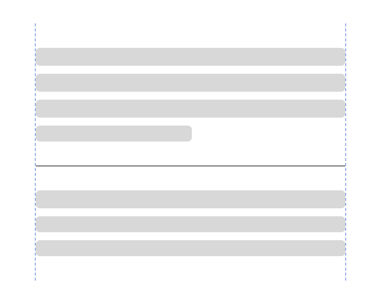
A divider is a graphical line that visually separates groups of content.
Type
Default


Usage
Overview
Dividers are used to separate related content into distinctive groups or regions.

 Use Divider to provide visual separation between related content and groups when white space may not be strong enough

 Do not use a Divider in place of Separators within lists, tables, table cells or other table elements

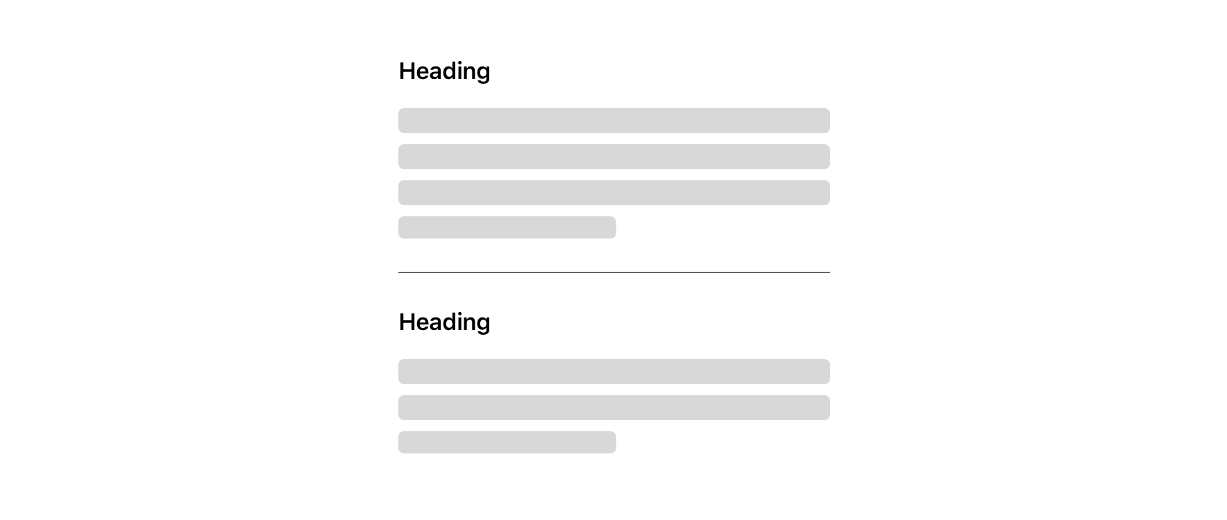 Use a section heading following a Divider to identify the next section of content

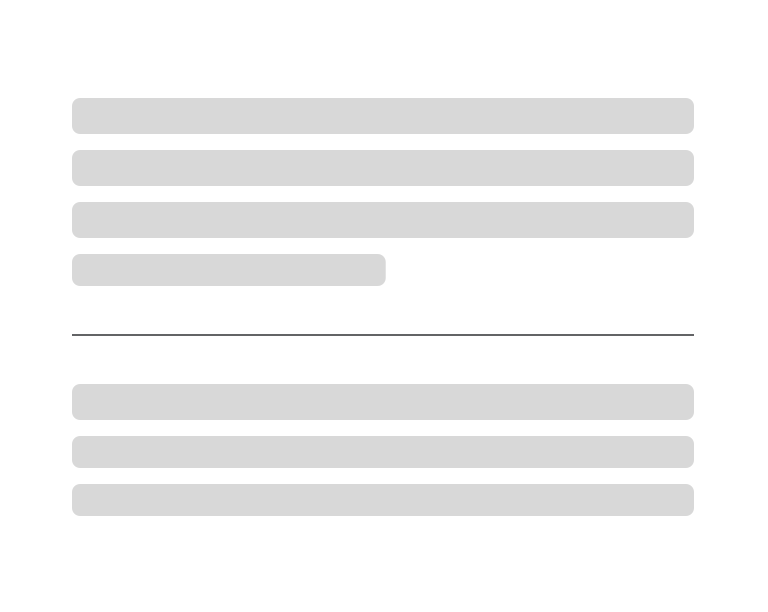 Use white space between content and Divider

 Do not use a Divider as an underline
Alignment
 Left and right margins of Divider should align with associated content
 Do not use Divider edge-to-edge, consider using containers for stronger divisions between content groups
Visual Style
Divider should be 100% width in relation to adjacent content.


Dividers should have a minimum 24pt above and below in relation to other content.


Content Strategy
Divider has no content guidelines itself, but plays a role informatively and semantically around how content should be grouped and separated.
- Overall scope of content: Is there enough differentiation to require a visual division between related content? How can Dividers be organized to highlight content hierarchy and improve legibility?
- Options around Divider: What additional elements do you need to include with other content to provide the best experience? What other elements may be used to ensure proper flow of content? e.g. are you meeting a11y navigational needs with section headlines?
- Precedents & best practices: Are there content models to match if you’re adding a new Divider to an existing page or flow? Have you consulted with design and a11y on usability?
Accessibility
Characteristics
- A divider is informative so must be perceivable to all users
- Must have at least 4.5:1 contrast with its background
- Content guidance is key to ensuring a divider is properly used
- A screen reader experience needs to mirror the visual experience to let the user know that a new “section” has been started after a divider is visually presented
- A divider pauses the screen reader from continuing to read content in a new section. Users need to swipe forward to move past the divider and indicate the start of a new section of content.
- Dividers should be used sparingly and only if content cannot be separated by white space
- Divides content into clear groups
- Content should dictate the correct usage of a divider, a section heading or similar clear content change should be present to denote the reason for a divider, making it clear for all users
Screen Reader Expectations
- Headline, swipe to Paragraph, [Divider location] swipe to next Headline, swipe to Paragraph
- Note: Divider doesn’t announce to a screen reader, only pauses the read out of content*