Switch
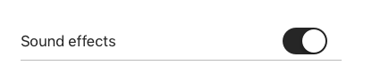
A switch is a visual toggle between two states, on and off. Switches are the preferred way to define local settings and behavior on mobile devices that do not require immediate API communication.
Types
Table Cell

Usage
- Switches provide two mutually exclusive choices.
- For iOS mobile devices, always use in a UITableViewCell.
- Switches are designed for immediate user settings changes.
-
All switches have a visible label that clearly conveys what option will turn on.


 Do use switches on the right side of table-view cell


 Do not use switches on left side of table-view cells
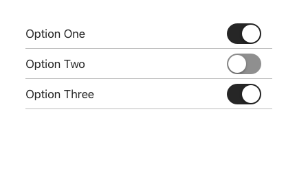
 Do use switches to change local settings and behavior, immediately.
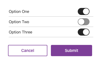
 Do not use switches with submit buttons or forms. Prefer checkboxes or radio buttons instead.
Additional Notes:
- If immediate API communication and input validation is required, prefer use of Forms and Submit buttons (i.e: Radio buttons, Checkboxes, etc.). Form components are built for error handling where Switches are not. Prefer not using Switches in forms with submit buttons.
- If Switch is preferred and need to communicate to backend service, use of Switches is appropriate only if programmed optimistically.
- Use Switches in table rows. If an “on/off” state control is desired in other containers (navigation or toolbars) prefer a button or icons.
OPTIMISTIC PROGRAMMING: User sees “Receive weekly newsletter” with a Switch control and decides to turn it ON. We need to collect that choice in our database so user can receive emails. First, store choice locally for persistence so users expectations are visually met, but optimistically send that data in the background until successful. Programmers must ensure error logs are populated with fail states and correct issues as needed.
Behavior
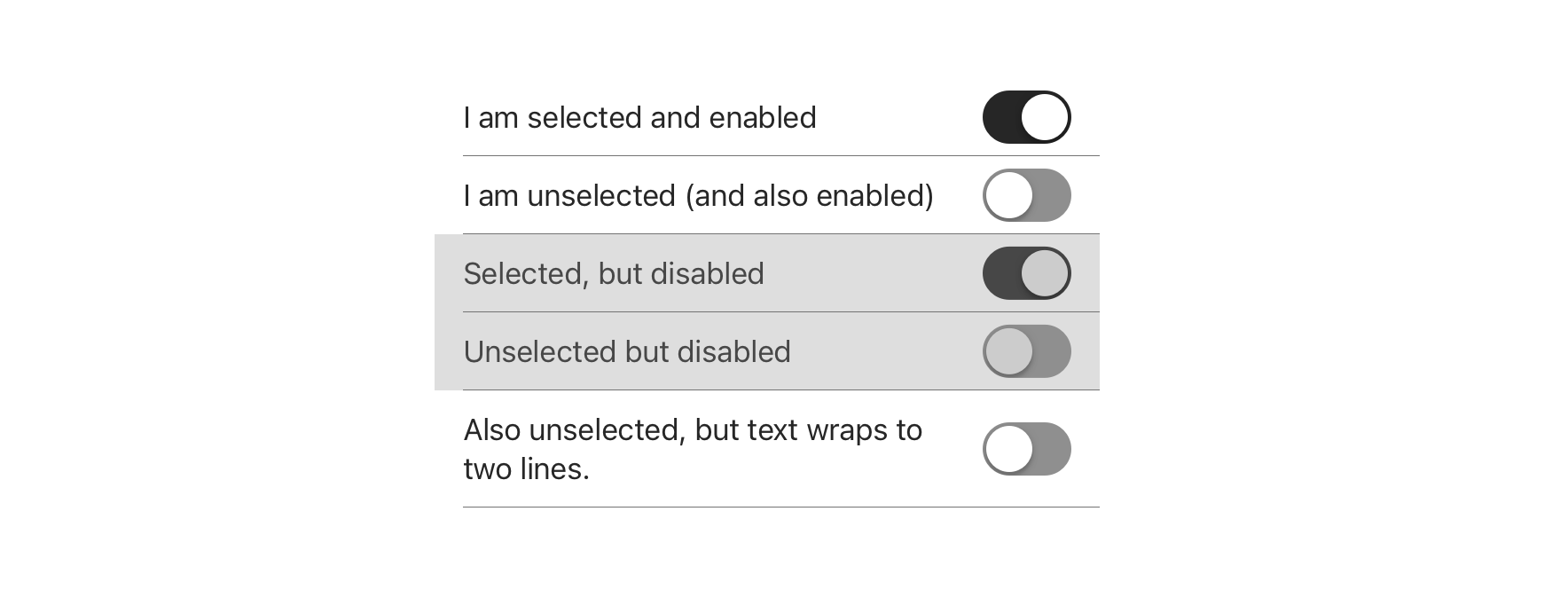
A Switch is used to enable or disable a mode, feature, or function. The action has an immediate effect on the system. Switches are designed to be used within TableViewCells. They can be used in four states.
- ON-ENABLED
- OFF-ENABLED
- ON-DISABLED
- OFF-DISABLED
Disabled states effect the background color of the TableViewCell and the switch knob. The switch control is always vertically aligned within the TableViewCell.

Accessibility
For detailed accessibility experience notes for various user groups, please visit iOS Switch - Enterprise Digital Design System.
Visual Style
A Switch must have a visible label that clearly conveys what option a user is enabling/disabling.

 Do clearly label what action the switch performs

 Do not use switches without labels
Content Strategy
Because Switch is inherently an on/off toggle, actions are not required to highlight that behavior.
Instead, keep labels concise by focusing on the thing itself that’s getting switched on or off — adding actions only when they’re essential to the switch’s meaning (e.g. Offload Unused Apps).
- Aetna: Use Title Case
- Exceptions include longer sentence-like labels
- CVS: Use Sentence case