Select
A common input control for users to choose one option from an options menu.


Option Menu
Select is used to reveal a view that presents a menu list of options. These option list items can be toggled as the selected item.


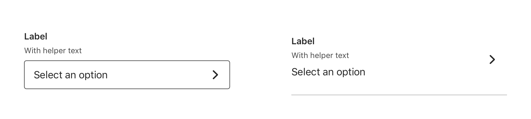
Types
Standard
If your design aesthetic uses a style that is more conventional to web and Android, consider using this type.
Table Cell
If your design aesthetic uses a more conventional iOS Table Group layout for forms, consider using this type.


Usage
Select can be used when presenting the user with more than 5 and less than 15 options to choose from.
If a list requires more than 15 options, consider using a design pattern with text input capabilities to improve usability.
Helper Text
Select supports helper text.

Behavior
Selecting Options
When a user taps on Select, a new view with a list of options to choose from will be presented to the user (The Title of Select Option list view and label for Select should be identical).

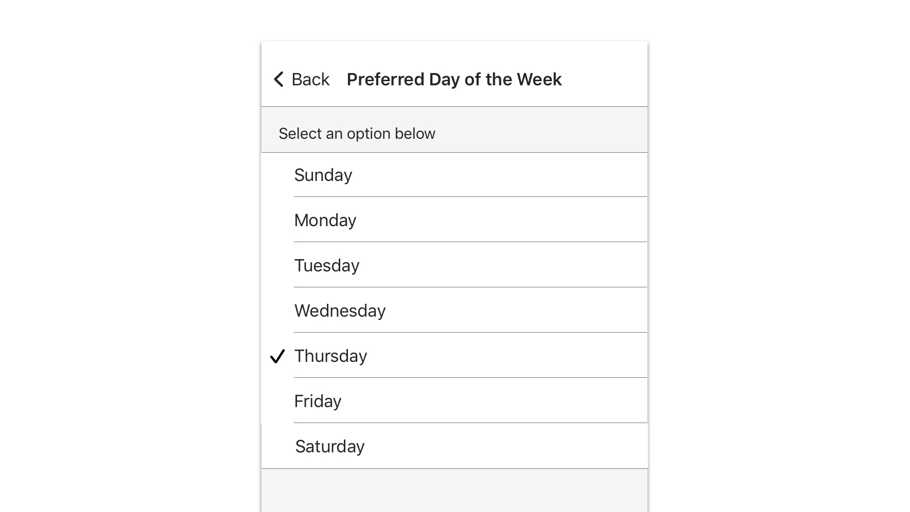
The user will be returned to the previous view upon selecting an option. The selected option value is displayed beneath the label of the respective Select input.


Wayfinding
The user can exit the Select Option list view by tapping on the “Back” button in the top left to return to the previous screen without any changes.
The “Back” button label should be short and concise, indicating to the user that they can return to previous screen.


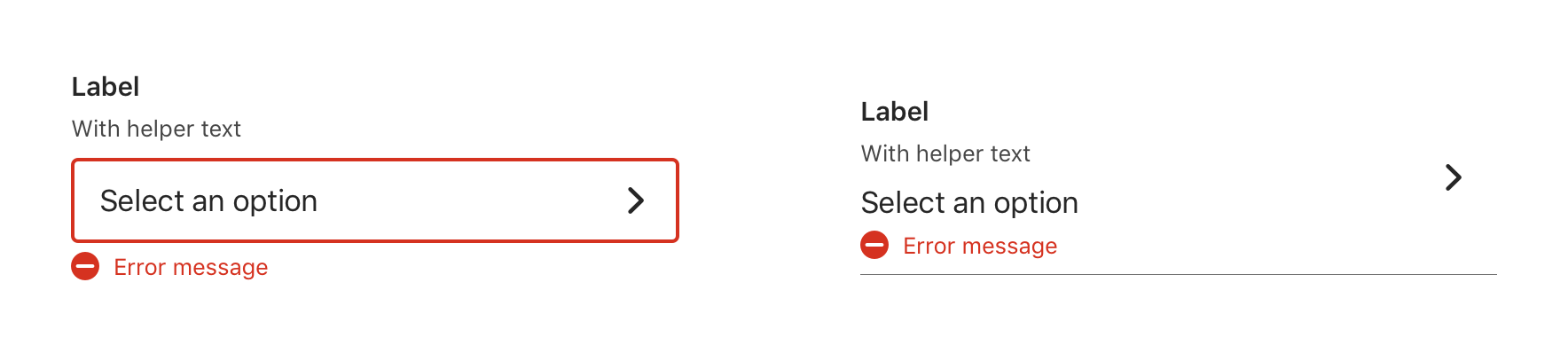
Validation & Errors
Upon validation, if Select does not have a valid input, an error message will be presented. Error messages should not replace helper text.

Accessibility
For detailed accessibility experience notes for various user groups, please visit iOS Select - Enterprise Design System
Visual Style
Select Standard
Width
Select is 100% width of the parent view respecting any left and right parent container padding or margin or it should have a minimum 16pt left and right margin applied.


Vertical Spacing
Select should have enough vertical margin between adjacent elements to ensure that the proceeding elements are not pushed or moved upon the introduction of inline validation messaging (single-line).


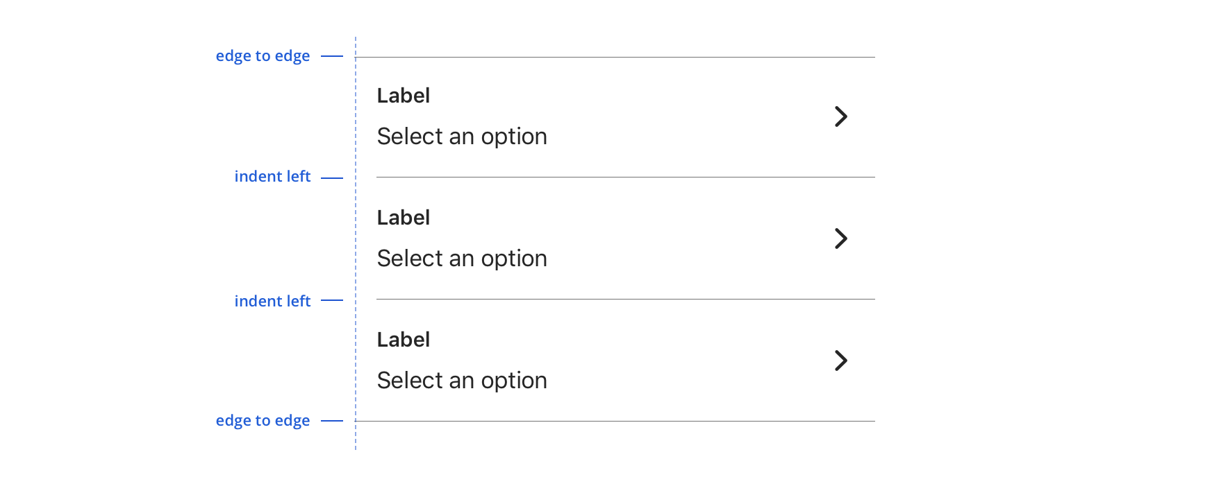
Select Table Cell
Width
Select is 100% width of the parent container (i.e. Table view).


Table Group

Parts
Select Option
The Select Option is list item presented in a Table Group that can be toggled to indicate the desired selection.
Width
Select Option is 100% width of the parent container (i.e. Table view).


Table Group


Content Strategy
Labels
- Labels for Select are typically direct, putting clarity and brevity over brand voice in most contexts.
- Selection is implied, so omit actions. “First Name” suffices instead of “Add First Name”.
Placeholder & Options
“Select an option” is built into the component as a placeholder for scalability and regularity. Options should be:
- Short and sweet
- Tip: Wordier options are better presented as Radio Buttons.
- Uniform
- Organized (e.g. alphabetical, when appropriate / possible)
Title of Select Option List View
- The title of Select Option list view be identical to the Select label
Back Button
- “Back” button label should be short and concise to indicate an option to return to the previous screen without making a selection
Casing & Punctuation
- Use Title Case for labels
- Use Sentence case for helper copy and errors
- Follow normal punctuation practices (e.g. errors that are full sentences receive periods)
Requirement & Errors
- Mark optional fields as such. Otherwise fields are assumed required.
- Form views with multiple fields should display “All fields are required unless marked optional”
Accessibility
Characteristics
- Used to select from a list of 5 - 15 options, can select single or multiple
- Label clearly identifies purpose for Select
- Options logically ordered, alphabetically if appropriate
Focus Expectations
- Move focus to Select and see/hear label, helper text, placeholder
- Tap moves user to options menu header, “Select an option below”
- User navigates through option list and makes a selection or multiple selections by tapping
- Selected option(s) shows a checkmark
- User can also escape by tapping back arrow at top of screen
- In multi-select: User taps “done” in top right of screen to complete a selection
- If a selection is made, user is taken back to Select within form and will see/hear the label with selected option(s) in field
- If after making a selection, the user returns to the options list, the selected option(s) will show as such but allow user to make an update by selecting another option
Screen Reader Expectations
Reading Order
- Initial interaction: “{Label Name}, {Helper Text}, “Select an option”/{Selected Option}, button, double tap to select”
- Options menu item: “unselected/selected, {Menu Item Label}, button, double tap to select”
- Disabled: “{Label Name}, {Helper Text}, “Select an option”, dimmed, button”
Error Handling
- If an error is triggered within a Select, focus stays in the component and user hears the error message. Error message also receives focus before a user swipes to a new component.
- If an error is already present on a Select, the error message should announce when focus is moved to the Select with the error.
- Reading order: “{Label Name}, {Helper Text}, “Select an option”/{Selected Option}, {Error Message}, button, double tap to select”