
Text field
An input element that accommodates both single and multiline text entry. Most commonly used within a form.
Page sections
Types
Default

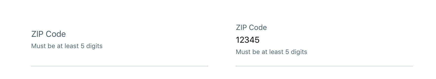
With helper text
Usage
Text fields can be used for prompting the user to enter text-based input values such as:
- Text (i.e. first name: alpha)
- Passwords (alphanumeric)
- Email Addresses (alphanumeric)
- Phone Numbers (numeric - 10 digits U.S.)
- Describe Your Visit (alphanumeric)
Behavior
Float label
Once a user taps into Text field to initiate focus, the placeholder text immediately morphs upward and decreases in font-size to become the label and a blinking cursor will appear signifying the area where input text values can be entered by the user.

Clear button
As soon as a user begins typing the first character, a clear button appears to allow users to clear any entered text.
Consideration: We recommend that if the user enters a large amount of text, you may want to define an alert confirmation upon clearing the input since this is a destructive behavior and all entered text will be deleted.
Input masking
Input masking can be applied to better control input format, display the correct keyboard, and apply relevant validation logic.
Options include:
- Email address: name@domain.com
- Number: 0-9 only
- Phone number: 555-555-5555
- Credit card number: 4444-4444-4444-4444 (format specific to credit card company)
- Currency: $9,999.99 (dollar symbol automatically prepended)
- Expiration date: dd/mm/yyyy
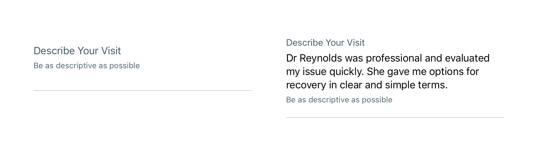
Multiline (word-wrap)
Multiline supports large font sizes and/or lengthy amounts of free-form text (alpha and numeric) that wraps and extends beyond one line. The Text field will automatically increase in height (from top-to-bottom) to accommodate wrapping text.
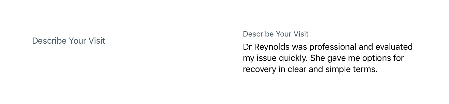
Multiline with helper text
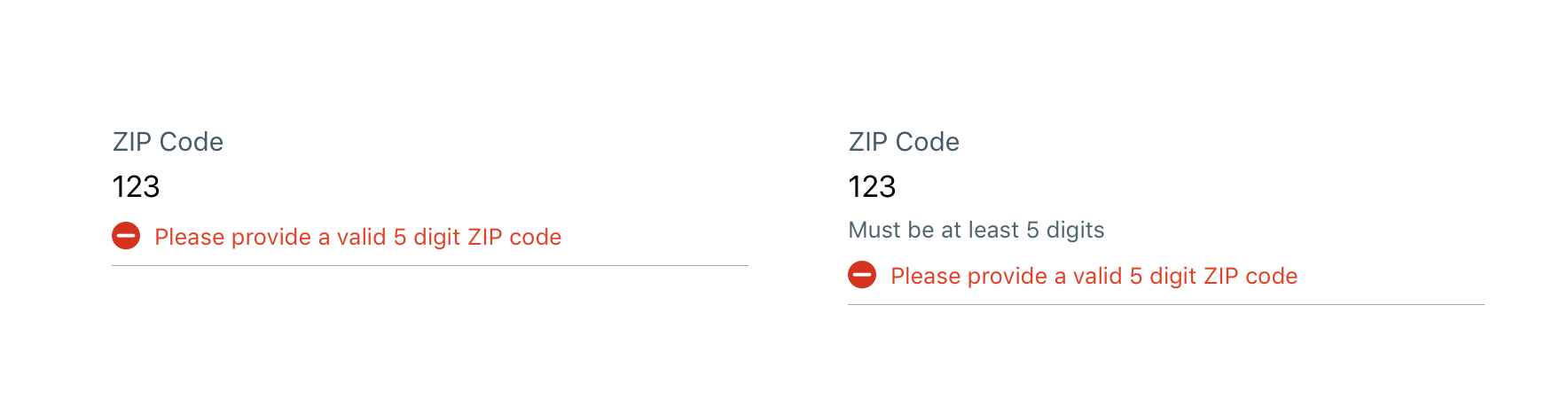
Validation & errors
Upon validation, if the Text field does not have valid input, an error message will be presented. Error messages should not replace helper text.
Visual style
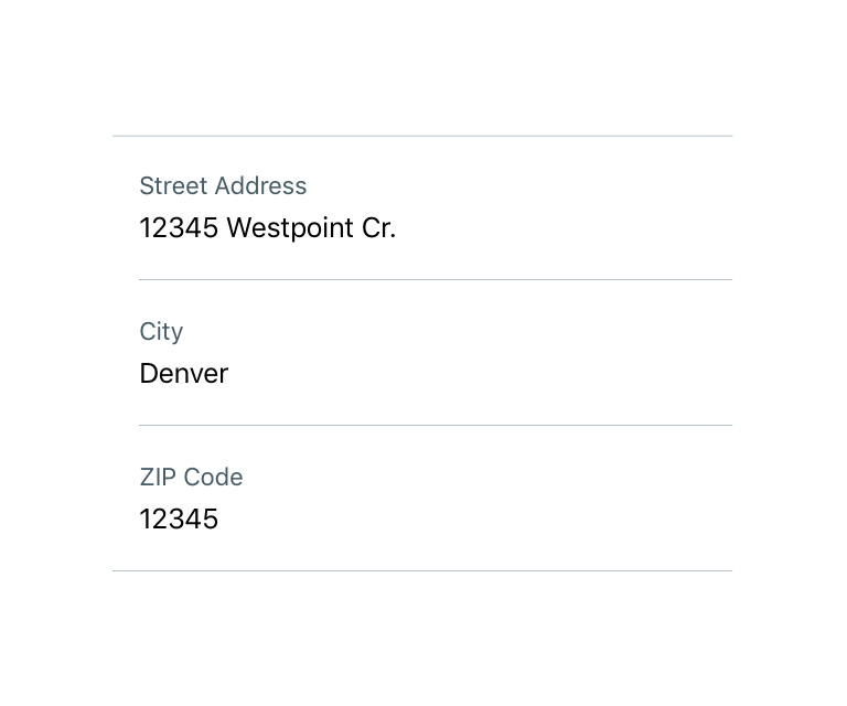
Text fields are 100% width of the parent container (i.e. Table view).

Stand alone
If Text field is stand alone it should have edge-to-edge (full-width) Separators on both top and bottom.

Text field groups
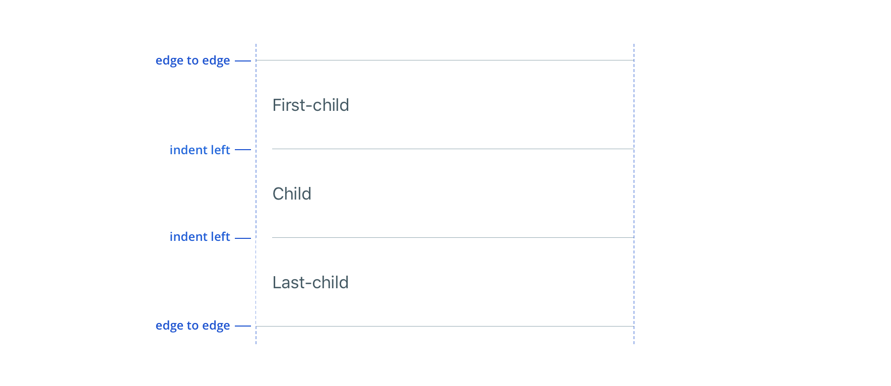
 There is no vertical margin between TextFields if they are in the same Table group/section
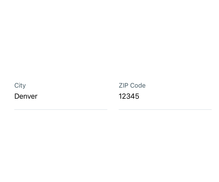
 Avoid text fields that horizontally align
Placeholder
Ensure placeholder text works just as well as a label

Content strategy
Casing & punctuation
- Use Title Case for labels
- Use Sentence case for helper copy and errors
- Follow normal punctuation practices (e.g. errors that are full sentences receive periods)
Requirement & errors
- Mark optional fields as such. Otherwise fields are assumed required.
- Form views with multiple fields should display “All fields are required unless marked optional”
- Use masking when appropriate to communicate expectations and formatting, reducing the chance for errors
- View Aetna’s complete field error content guidelines
Accessibility
Characteristics
- Edit state: Label must be programmatically connected to input field
- For Multiline, provide option to “return” within keyboard to add larger amounts of text and move to a new line
- Completed: Valid data entered and tap “done” within keyboard or resigns focus to another object in the view.
Focus expectations
- Swipe to move focus among input fields
- Double tap to enter an input, edit content, and remove content
- Error state should be announced upon focus
- Only notify if character limit is exceeded, don’t use a total character remaining countdown
Screen reader expectations
Reading order
- Label, Placeholder/Input text, “Text field”, Helper text, “double tap to edit”
Error handling
- Once an error is triggered within an input field, user should immediately hear the error message before moving focus to another input field
- If an error is already present on an input field, the error message should announce when focus is moved to the Text field with the error
- Reading order: Label, Input Text, “Text Field”, Helper Text, Error message, “double tap to edit”