
Pills
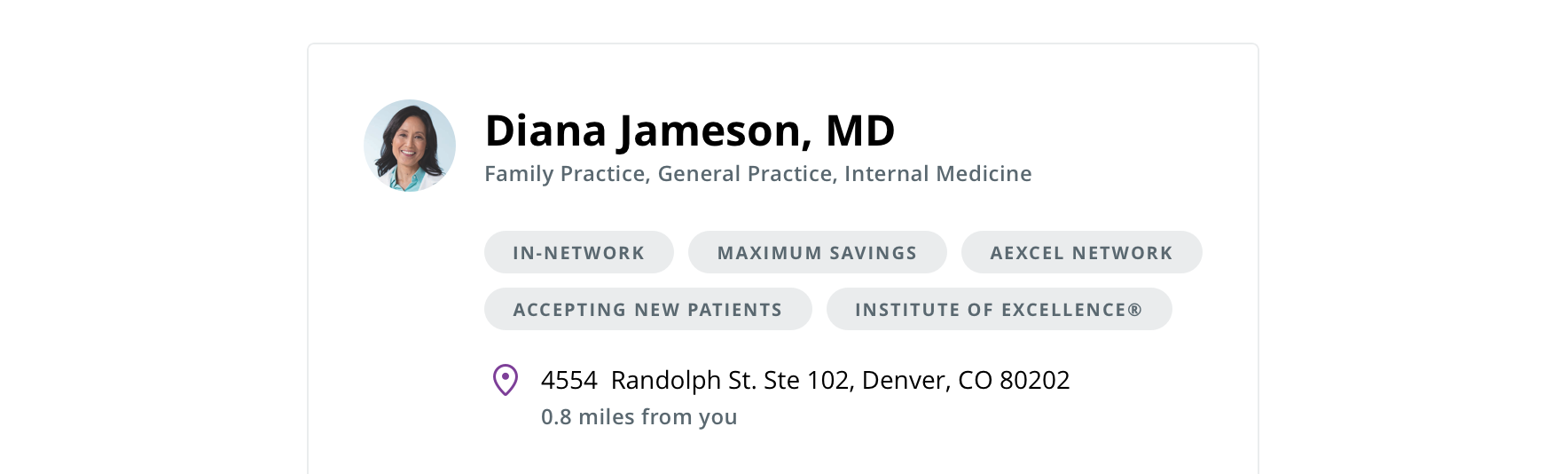
A pill is used to display an attribute that provides more context about an object.
Type
Default

Usage
A pill is used to display an attribute that provides more context about an object.
 Use in moderation as excessive pills add visual noise
Behavior
 Disclose the pill’s explanation content in a tooltip
 Pills begin to stack if they exceed their container width
Visual style
 Always keep 16px of left and right padding
 Always keep 8px between adjacent or stacked pills
 Never wrap pill text to two lines
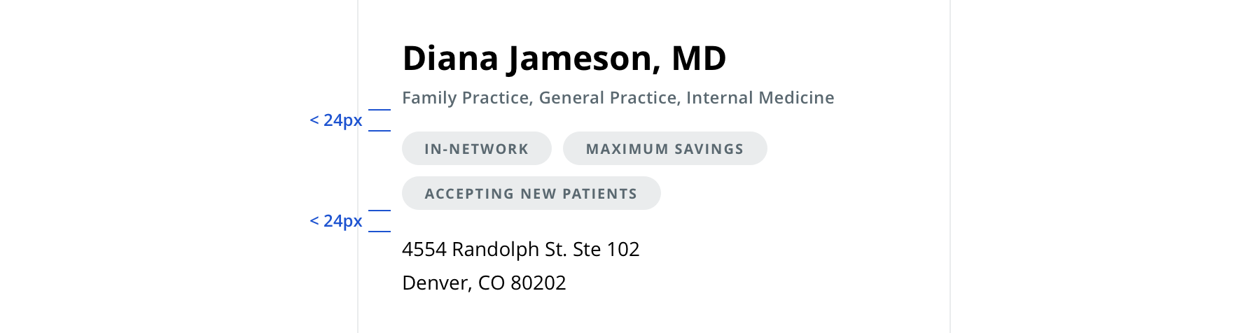 Avoid top and bottom margins less than 24px adjacent from other content
Editorial
- Limit to 1 – 2 words
- Consult existing content resources before writing copy
- Pills most always encompass sets of copy, as opposed to one-off custom copy
- Strive for parallelism when authoring a copy set
Accessibility
Behavior
- Pills are made up of two parts:
- Trigger = Link / Button / Image
- Popover container
Keyboard expectations
- Trigger element receives keyboard focus.
- Pressing Enter / Spacebar (varies by screen reader) to activate trigger (do not use a hover event).
- Users can move on from trigger without triggering the popover.
- Focus must be trapped within popover container.
- Focus is placed on the popover’s close button. (In the future if we add another action in the popover we will need to revisit this rule.)
- Pressing ESC or activating the close button dismisses the popover.
- Focus must return to the popovers trigger element.
Screen reader expectations
- Screen Reader must announce presence of the popover. (how it announces will be determined as component is being made.)
- Close button must be identified to user as a close button.
- User must be notified the popover has been closed / dismissed (done by placing focus back on trigger).