
Dropdowns
A common control that allows users to choose one option from a list of options.
Types
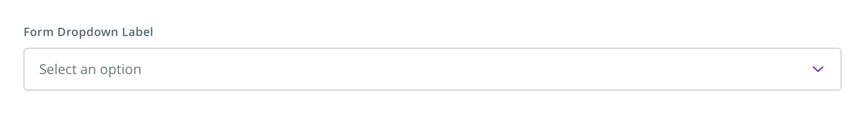
Form dropdown

Text dropdown

Group dropdown

Usage
Form dropdown

 Use for displaying multiple options within a form that a user can select one option from
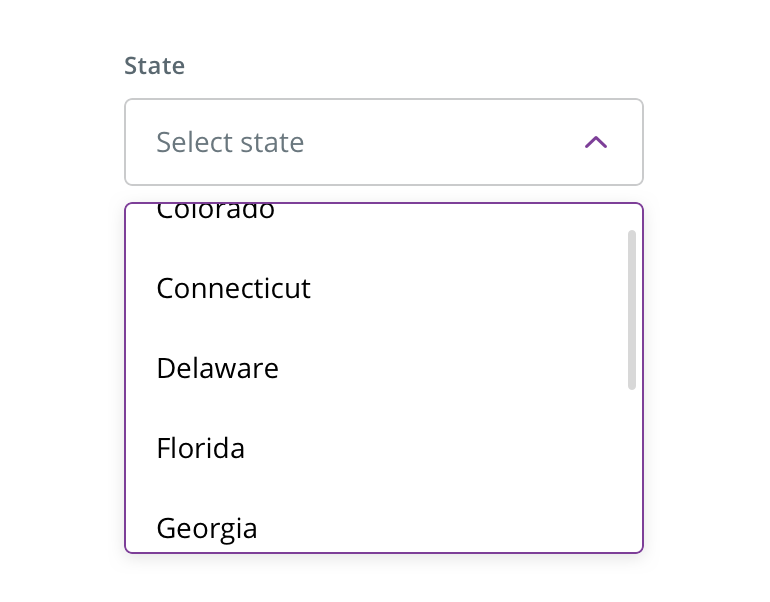 Consider using a dropdown instead of radio buttons when users' options exceed four or five
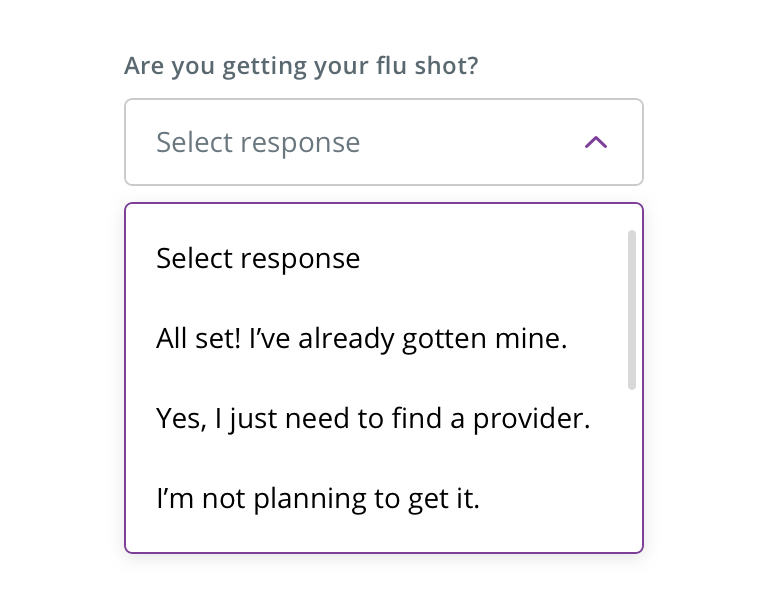
 Avoid using if the options are too wordy or long in content. Use radio buttons instead
Text dropdown
 Text dropdowns can be used to switch views of something, like information within a card or table
Group dropdown
 Group dropdowns can be used for related selections, such as indicating a birth date
Behavior
 Expanded dropdown scrolls if there are more than four options
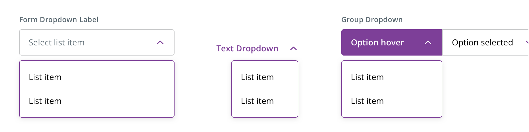 Dropdown arrows flip on-click / -tap
Dropdowns should use native selects on mobile devices.
Visual style
Dropdowns can be variable width and should align to the content they’re paired with when appropriate.
Form dropdown
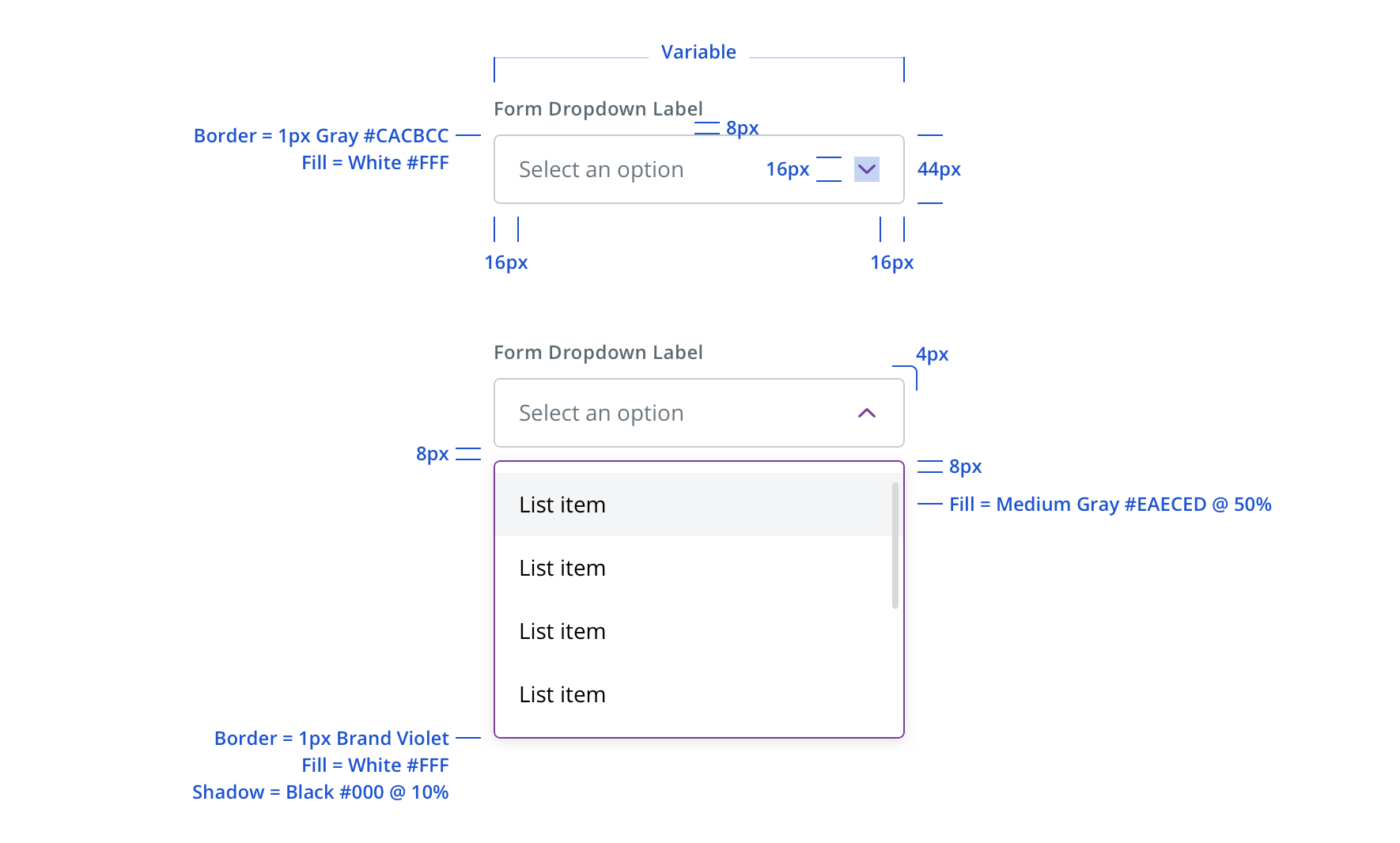
 Never make a full page width dropdown on desktop
 Never rely on the placeholder text to explain the type of information intended for the form dropdown. Always include a label.
 Never size the dropdown below 160px wide


Text dropdown

 Select answers for text dropdowns can align either left or right, depending on the context of the text dropdown
 Text dropdowns need a minimum 44px touch target area

Group dropdown
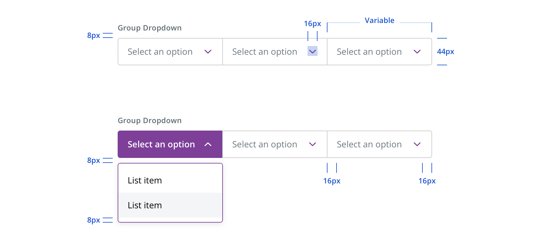
Group dropdowns follow similar specs and states of the form dropdown.
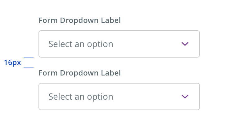 Vertically stack dropdowns when possible
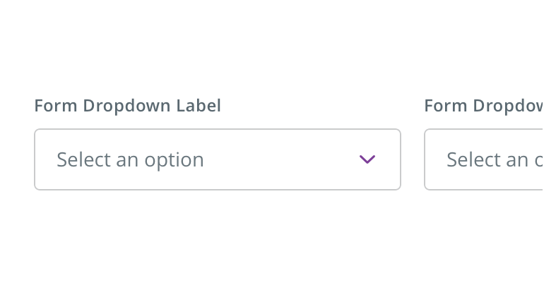 Avoid form dropdowns that horizontally align
Editorial
- Use Title Case for dropdown labels
- Keep labels short (~1 – 2 words)
- Exceptions include necessary differentiation (e.g. New Password, Confirm New Password) and dropdown placeholder copy, which typically guides the user with a more editorial action (e.g. Select a time)
- For text dropdowns, use Title Case
- Do not punctuate dropdown options
- Generally, use Title Case for short (~1 – 3 word) dropdown placeholder and options. Sentence case is acceptable for more editorial phrasings, but opt for shorter options when possible (e.g. Mail Order vs Receive prescription by mail)
- Similar to how body copy supports short headlines, look for other opportunities on the page / screen to inject voice or instructions
Accessibility
Characteristics
- Single select, users select one option from a series of options
- Multi-select, users are able to select more than one option from a list of items
- User clicks label to shift focus to select element
Keyboard/Focus Expectations
- Enter/Spacebar opens select element and activates selected option
- Tab/Shift+Tab shifts focus to/away from select element
- Up/down arrows move between selectable options
Screen Reader Expectations
- Element is announced as a select element. Ex. “Select” / “Picker” (Voice Over iOS)
- Required/optional is announced
- Options are read as user arrows through.Ex. “Option 1…”
- Selected option is announced. Ex. “Option 3, selected”