
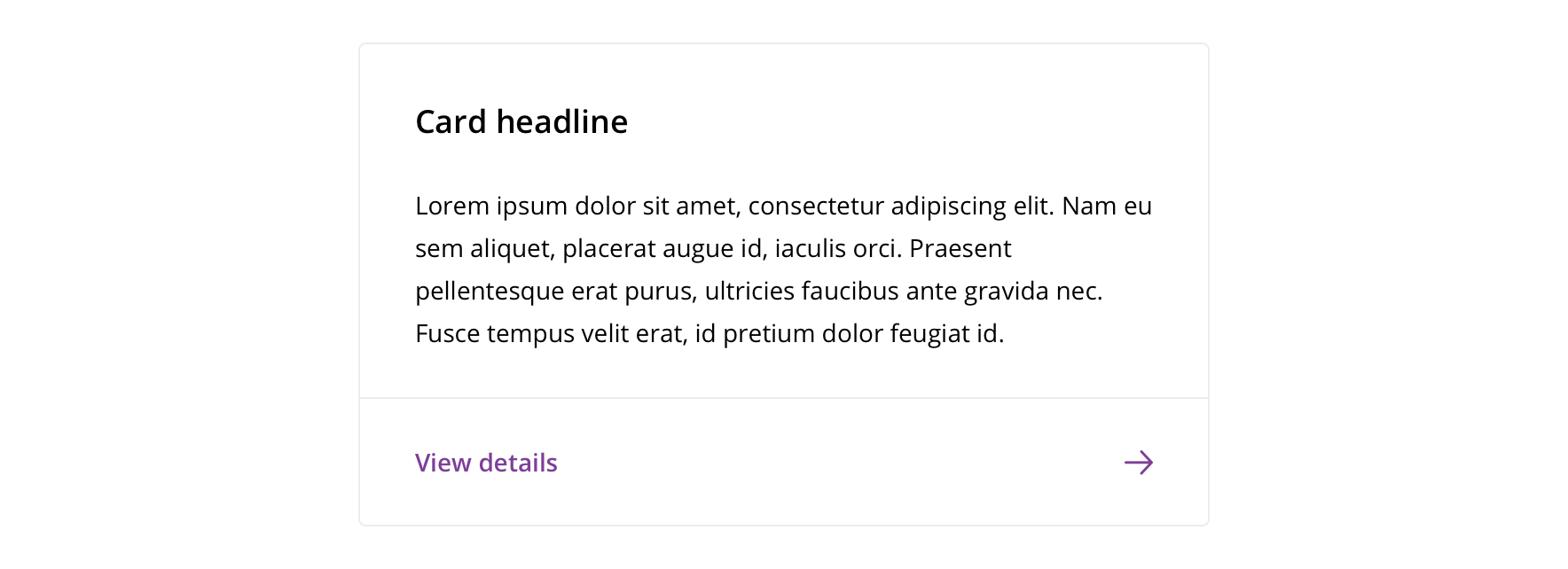
Cards
A visual container that groups related content together.
Types
Default
Callout

Usage

 Use cards to group related content, such as details about a provider
Visual style
Default

Callout

Accessibility
Characteristics
- Containing element
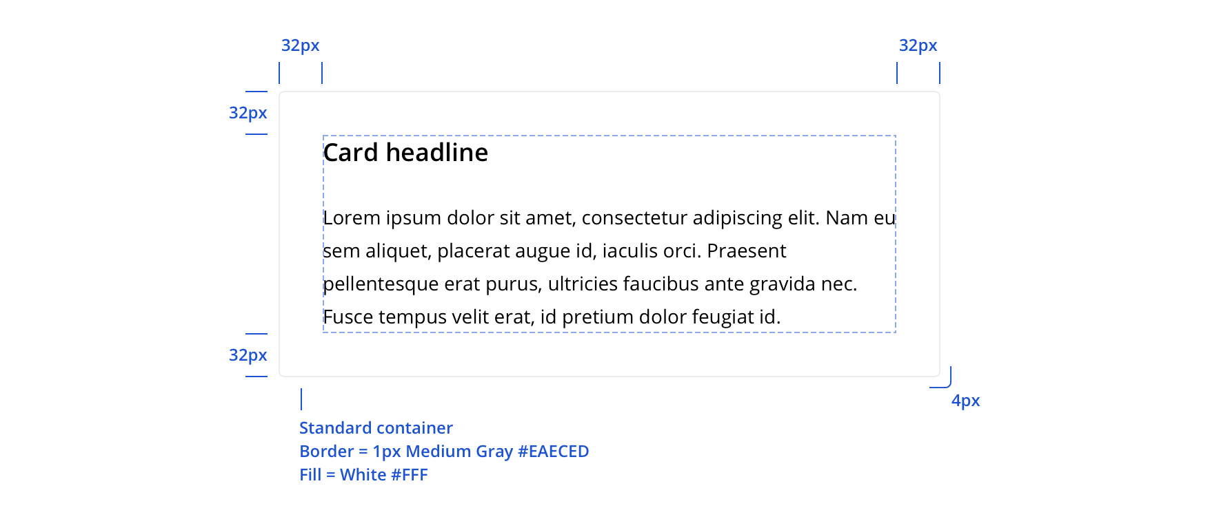
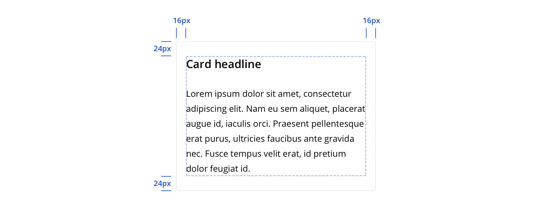
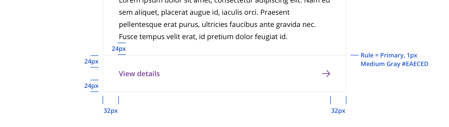
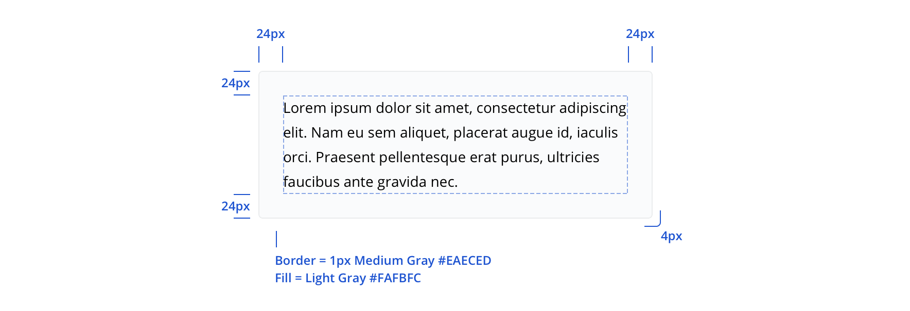
- Contains:
- Card Header a container at the top of the card which holds:
- Card Headline contains the title of the card
- Card Sub Headline contains the subtitle of the card
- Card Header a container at the top of the card which holds:
- Card Body in the middle of the card containing the main content of the card
- Card Body Section is a section of content within the card body
- Card Footer, section at the bottom of the card which can hold CTA buttons or links
- Sufficient contrast allowing text and other elements within the card, to be distinguished from the background
Keyboard/Focus Expectations
Card is a containing element and does not affect how content is consumed by assistive technologies.
Screen Reader Expectations
Card is a containing element and does not affect how content is consumed by assistive technologies.