
Buttons
Button is a common action that can be easily performed with one click or tap.
At risk for deprecation
Small and large buttons are being considered for deprecation from Anatomy. Please consider using the standard size.
Types
Primary
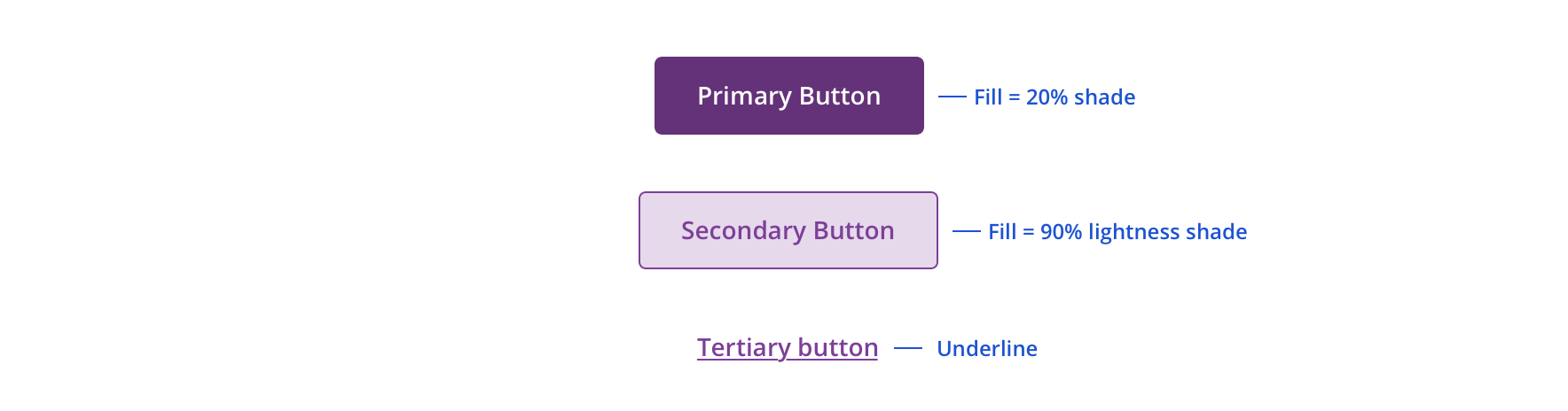
Primary buttons are the most important actions to which we want to draw users’ attention.

Secondary
Secondary buttons are good for actions that require less emphasis but still require users’ attention.

Tertiary
Tertiary buttons represent less important actions a user can take.


Sizes
Standard

Small

Large

Usage
Primary buttons are used to highlight the most important action in a view or experience.

 Never include more than one primary button together
Secondary buttons are used for offering non-primary actions to users (i.e. Cancel, Reset Filters, etc.)

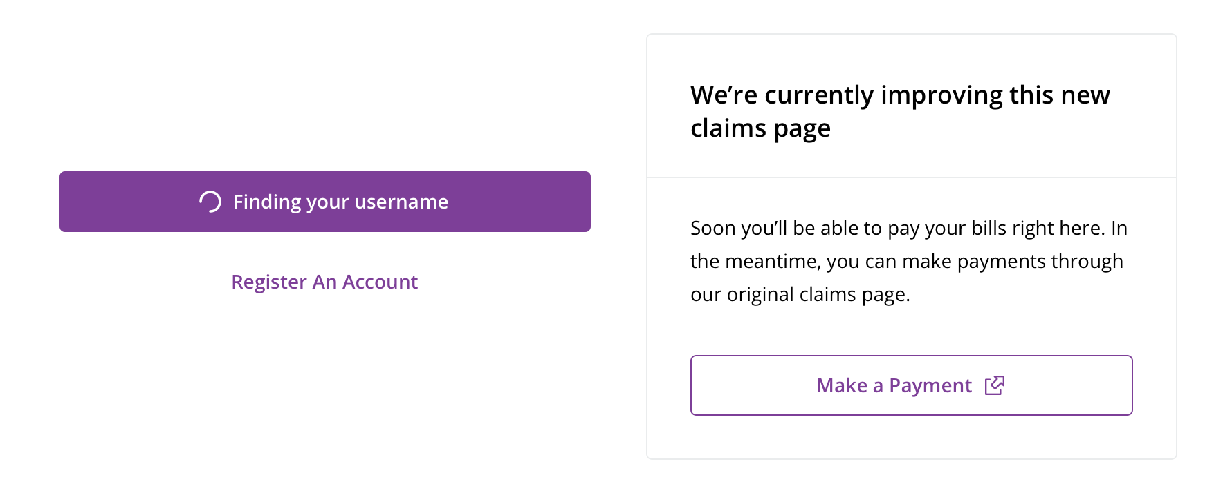
 Button with icon can be used for actions that require a loading or time affordance after click or tap or for external links
Though similar in style, tertiary buttons are different than text links in that they typically represent actions with button-like labels. Text links, on the other hand, are typically links to additional content and found in a sentence.
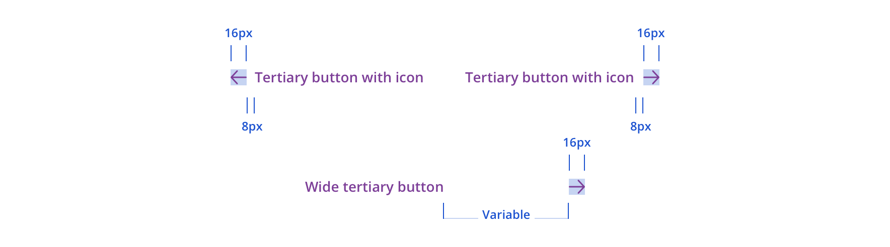
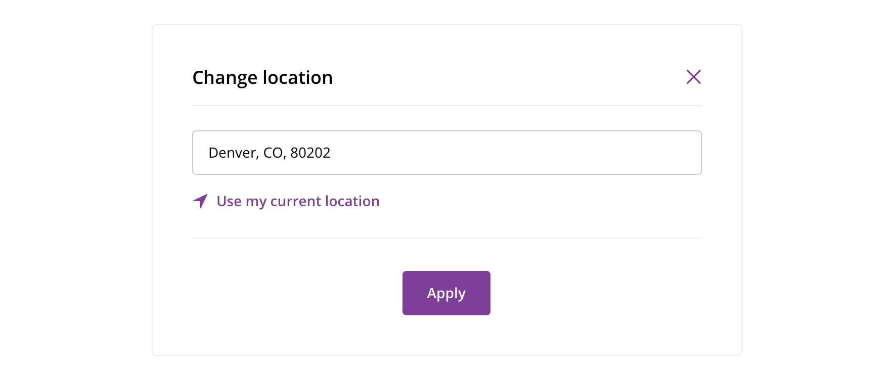 Use tertiary buttons for displaying less important actions a user can take, such as "Use my current location"
Wide tertiary button is most often used in card footers.
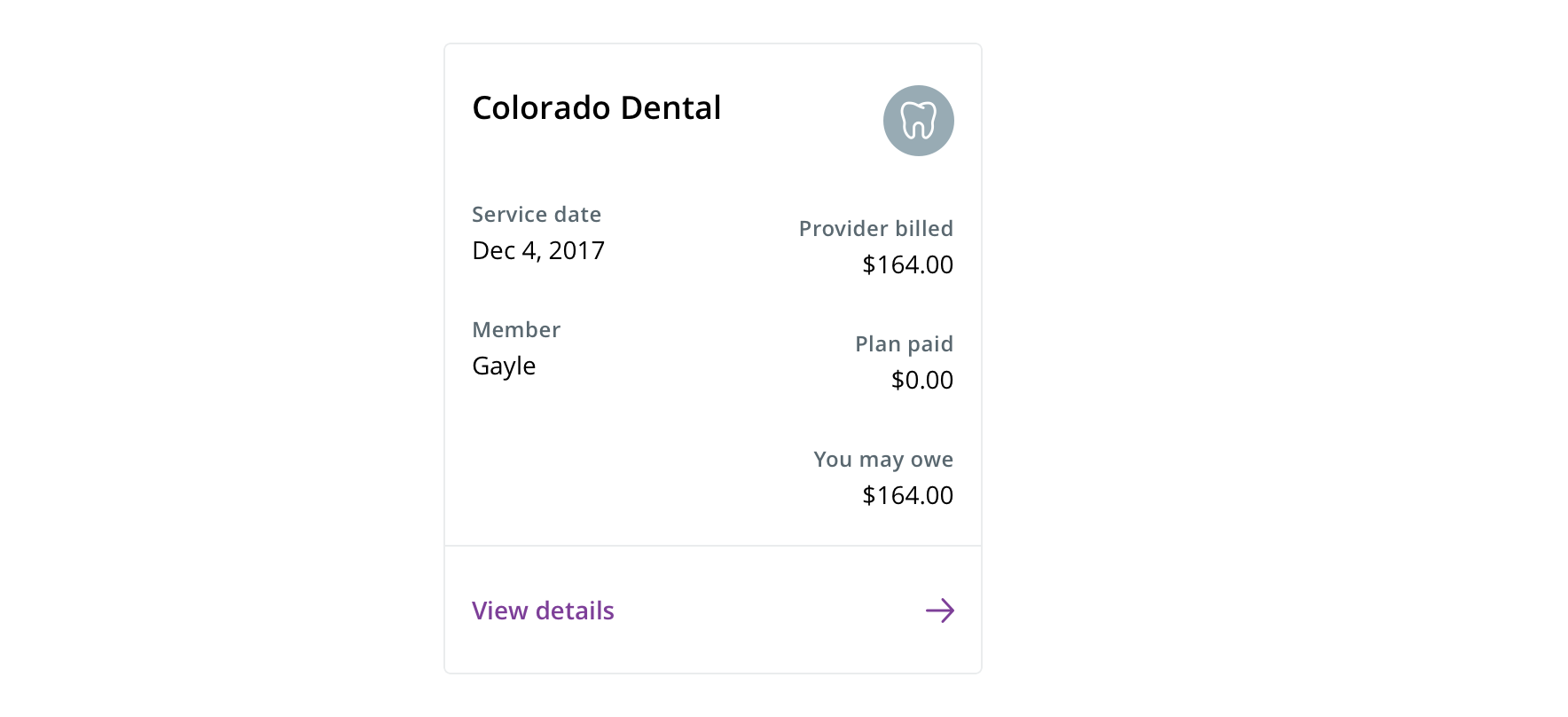 Use wide tertiary buttons for cards that have a primary action, such as "View details"
Visual style
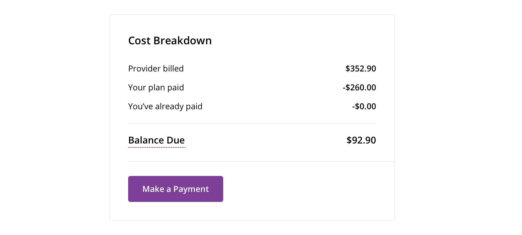
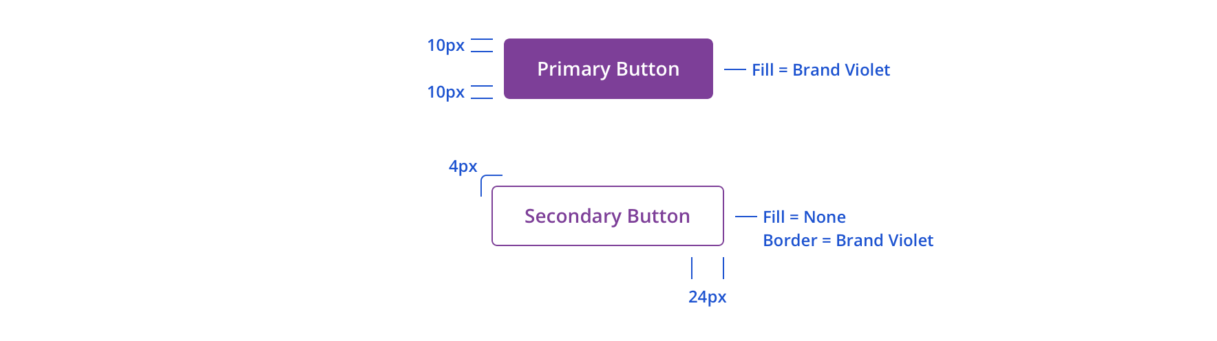 Always maintain internal padding of primary and secondary buttons
Focus states utilize the browser default focus.
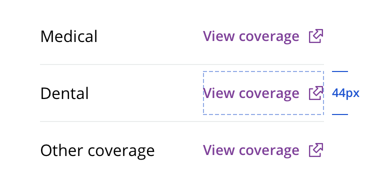 Make sure tertiary buttons have enough space for a minimum 44 x 44px touch target
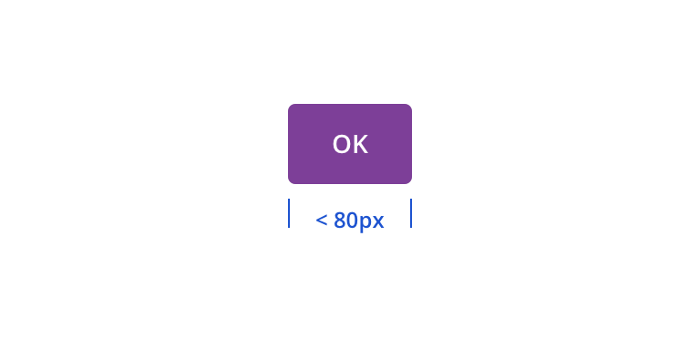 Avoid sizing buttons below an 80px width
 Full-width buttons can be used, but use caution. They should be used in instances where they would fill a clearly defined content area. They also can be used more extensively on mobile.
 Avoid sizing full-width buttons above 336px
 Avoid wrapping a button to two lines
Horizontal button groups should be center aligned or right aligned. Consider the situation and assess which alignment makes the most sense.
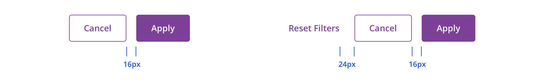 For horizontal button groups, the most important action should be to the right of the secondary or tertiary buttons
Stacked button groups can be left aligned or center aligned. Like horizontal button groups, this should be situationally determined.
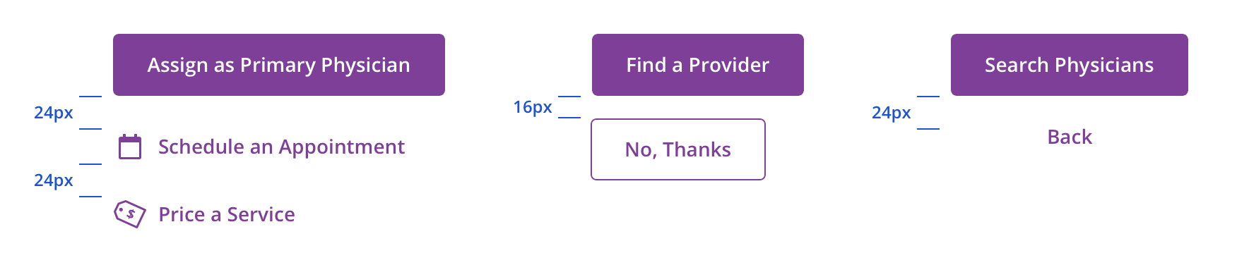 For stacked button groups, the most important action should be above the secondary or tertiary buttons
Editorial
- Use Title Case for all primary and secondary buttons
- Tertiary buttons should be sentence case, unless they are grouped with a primary and/or secondary button, where they should be Title Case
- Lead with a verb
- Limit to 1 – 4 words (~16 characters)
- Add specificity with purpose
- e.g. if a member is in a physician search flow with no headers or float labels to reinforce that’s what they’re searching for, a “Search Physicians” button is more purposeful than a simple “Search”
- Use simple global commands when possible: Save, Back, Next, Apply, etc.
Accessibility
Characteristics
- Performs an action when activated
- May contain text and/or images
Keyboard/Focus Expectations
- Receives Tab Focus: Yes
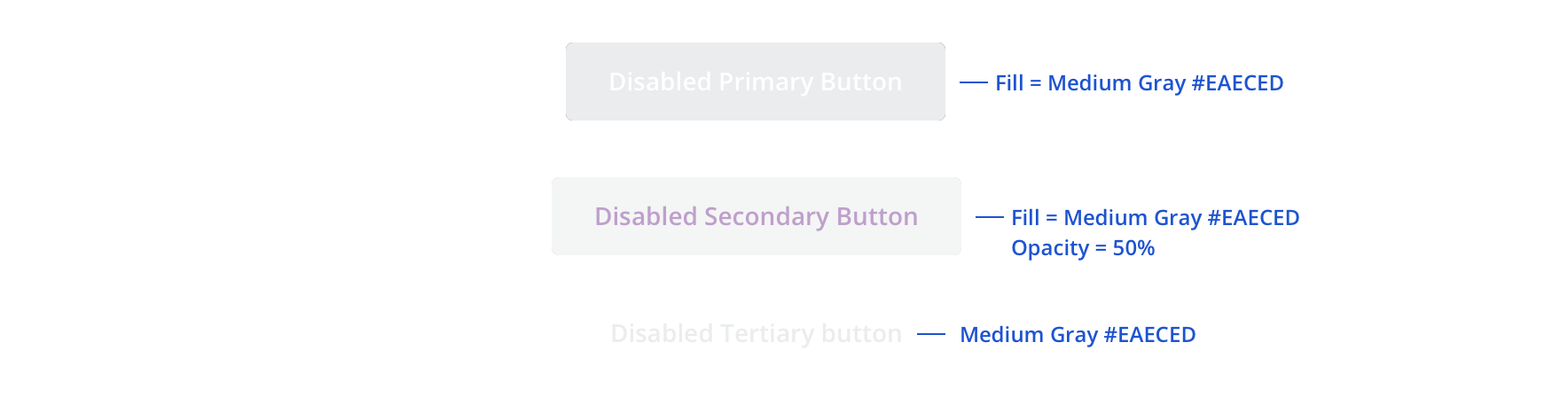
- Disabled buttons may also receive tab focus
- Activation: Enter or Spacebar
- Watch State Behavior: Focus shifts to spinner and remains until action is performed or error message is displayed
Screen Reader Expectations
- Name: A clear, unique label indicating purpose of the button
- Ex: “Assign Physician, button.”
- Role: Indicates that the element is a button
- Ex: “Assign Physician, button.”
- State (if applicable): The state of a button, such as disabled, or in a watch state.
- Ex: “Assign Physician, button, disabled.”
- Ex: “Assign Physician, button, assigning physician.”
- Description (if applicable): Additional descriptive text for the button.
- Ex: “Assign Physician, button, Assigning a physician will replace any previously assigned physician.”